Watercolor floral tattoos last longer when you choose clear shapes, sensible placement, strong black structure, and serious sun protection. I learned that after watching my first delicate floral tattoo soften sooner than expected. The color didn’t disappear. It changed. Here’s what I’d do differently now.
Here’s what it looked like before:
Before the appointment, I had clean skin and too many saved references. I wanted something feminine and personal, but I also wanted the flowers to remain readable years later.
The design looked simple. It wasn’t.
My folder held tiny sprigs, bright petals, and bold botanical pieces. Some were graceful and minimal.
Others were intricate but too crowded for the size I had in mind. If you’re choosing your first design, study the actual skin, placement, and line weight.
Don’t judge the picture alone.
I compared small floral tattoos with delicate floral tattoos before making a decision. Those examples showed me which petals stayed clear at a small scale. That changed everything!
- I Chose My First Watercolor Floral Tattoo
- I Collected Small Watercolor Floral Tattoo Ideas
- I Matched Flowers With Personal Meaning
- I Sketched Unique Watercolor Floral Tattoo Concepts
- I Tested Color Blends On Paper
- I Selected A Visible Wrist Placement
- I Compared Delicate And Bold Linework
- I Prepared For Watercolor Tattoo Pain
- I Followed My Floral Tattoo Healing
- I Checked The Faded Color Balance
- I Protected My Finished Floral Tattoo
1I Chose My First Watercolor Floral Tattoo

I chose a small wildflower sprig for my ankle because the shape felt meaningful without looking overly planned. The fine black stems followed the curve of the bone.
Tiny petals gave the design a delicate rhythm. I didn’t want a huge bouquet competing with every shoe.
The artist showed me a wildflower sprig with black stems and touches of terracotta, olive, and warm cream. I liked the soft color, but I asked for darker centers.
That decision mattered. If you’re choosing a similar design, keep the flowers recognizable before chasing a watercolor effect.
I also studied tiny floral tattoos and fine line floral tattoos. I didn’t copy one image. I borrowed the spacing from one, the petal shape from another, and the restrained color plan from a third.
A small tattoo needs breathing room. That sounds obvious, but it’s where many designs lose their charm.
Choose two or three flower shapes, not ten. Your artist can make the piece feel intricate without becoming crowded.
The ankle was visible, but it wasn’t an easy spot. The skin moved with every step. The bone made the session sharper than expected.
Still, the placement felt elegant and symbolic. I’d rather have one crisp flower than six muddy petals I need to explain.
2I Collected Small Watercolor Floral Tattoo Ideas

I collected small watercolor floral tattoo ideas with one rule: every reference needed a shape I could describe without pointing at it. That eliminated several pretty but vague images. The strongest options had an expressive outline and open skin between petals.
One rib reference showed a fine-line floral tattoo with clay-toned washes and muted gold accents. The design looked delicate against medium ivory skin, but its structure stayed visible. If you’re saving ideas, compare examples on different skin tones.
Pigment can look crisp, subtle, or muted depending on the surface.
I kept returning to unique watercolor floral tattoos and fine line floral tattoos. I didn’t copy one piece. I combined the spacing from one, the petal shape from another, and the restrained color palette from a third.
A small tattoo needs room around its main shapes. That’s where many designs lose their charm.
Choose two or three flower forms, not ten. Your artist can make the final piece feel ornate without packing every millimeter.
I also checked how each reference looked from several feet away. A tattoo can seem sharp at arm’s length and vague at normal distance. That test helped me favor crisp outlines over pale washes.
3I Matched Flowers With Personal Meaning

I matched flowers with personal meaning before choosing a palette.
4I Sketched Unique Watercolor Floral Tattoo Concepts

I sketched unique watercolor floral tattoo concepts on paper before the appointment. The first version ran vertically down the spine.
It had a long stem and uneven flowers. It was striking, but the placement felt more formal than I wanted.
The second sketch used a hand-drawn stencil with three flowers and a loose wash behind them. That version felt more playful.
If you’re working with an artist, ask for several silhouettes, not several color swaps. The silhouette controls how the tattoo reads.
I looked through unique watercolor floral tattoos for ideas using negative space. The best references weren’t the loudest ones. They had one bold gesture, a few imperfect edges, and enough uninked skin to prevent visual heaviness.
My artist suggested shifting the lowest flower by half an inch. The stem then followed my body more naturally.
That small change made the piece more graceful. I’d trust that kind of adjustment over forcing a reference onto your anatomy.
The final sketch was flowing and understated. It didn’t need extra petals. That restraint made the design feel more intentional.
5I Tested Color Blends On Paper

I tested color blends on paper because watercolor tattoo pigment doesn’t behave like paint in a sketchbook. The flash sheet showed black outlines with emerald, gold, and cream accents. I wanted a vibrant result without making it sugary.
The artist placed a traditional tattoo flash sheet on aged off-white paper. We marked the combinations that would stay distinct. Emerald beside gold looked daring.
Cream needed a darker outline.
If you’re testing colors, put them beside black ink. Don’t judge them only beside each other. Black structure showed me which shades had enough contrast to stay readable.
I saved the watercolor sunflower tattoo guide because it showed how larger petals can hold stronger color. My design was smaller, so I chose fewer shades. The final palette became crisp, vibrant, and slightly edgy.
I didn’t ask for every color I liked. That was the right call.
Too many soft shades can blur into one pale field as the tattoo settles. Your artist should explain which colors carry the design.
That decision made the piece feel polished rather than overloaded. It also gave the black lines more authority.
6I Selected A Visible Wrist Placement

I selected a visible wrist placement for a second floral tattoo because I wanted to see it while I worked.
7I Compared Delicate And Bold Linework

I compared delicate and bold linework on the upper back before choosing the final balance. Fine lines made the flowers feel graceful and feminine. The thinnest version looked vulnerable beside the watercolor wash.
The final stencil used single-needle linework for small stems and a firmer grouping for the petals. I liked that contrast.
If you’re choosing between delicate and bold, don’t treat them as opposites. Your tattoo can use both.
I studied delicate floral tattoos beside fine line floral tattoos. The examples looked similar at first.
The stronger ones had intentional variation. Some lines were whisper-thin, while the main stem stayed visible.
My first instinct was to make every line delicate. I was wrong. The stronger outline kept the flowers readable after the color softened.
That choice made the tattoo feel sharp and timeless.
The contrast also made it more fierce and confident. I didn’t expect such a small change to matter so much!
8I Prepared For Watercolor Tattoo Pain

I prepared for watercolor tattoo pain by asking about placement. I didn’t assume the color would make the session easier. The shoulder felt manageable.
Ribs, feet, hands, and sternum tend to feel more intense.
The artist kept fragrance-free tattoo aftercare nearby, but my main preparation was simple. I ate beforehand.
I drank water. I wore clothing that wouldn’t rub the area.
If you’re nervous, tell your artist. You don’t need to perform toughness. A calm conversation can make the session feel more controlled.
A small watercolor floral tattoo may take one to three hours. Detail, placement, and pace all change the timing. I’d rather plan extra time than rush a clean, intricate outline.
The pain came in sharp bursts. Then it became dull and manageable. I expected one long wave, but the sensation changed as the artist moved across the shoulder.
If you’re choosing your first piece, the outer shoulder, upper arm, thigh, and forearm are often more tolerable than ribs or feet. That doesn’t mean they’ll feel painless. It means the experience may be easier to manage.
9I Followed My Floral Tattoo Healing

I followed my floral tattoo healing closely because the first few days can make the color look louder than the final result. The shoulder piece looked bright, raised, and raw at first. That stage passed.
The artist applied protective tattoo film and explained when to remove it. After that, I used gentle washing, light moisturizing, and clean hands. I didn’t pick at the skin.
If you’re healing a tattoo, avoid soaking it in a pool or bath. Keep strong sunlight away while the surface settles. Follow your artist’s instructions if they differ from general advice.
The surface usually heals in two to three weeks. Complete healing can take two to three months.
That difference matters. Your tattoo may look finished before the deeper layers recover.
I kept the aftercare simple because elaborate routines made me more likely to overdo it. My skin felt dry and itchy for a few days. Then it became calmer.
If you’re tempted to add heavy products, pause. Gentle care is the safer choice for a crisp, refined finish.
10I Checked The Faded Color Balance

I checked the faded color balance by comparing the original stencil with the healed inner-arm design. The change was obvious.
The flower shape remained. The palest wash had softened.
The healed watercolor pigment still worked because the black centers and stems carried the composition. If you’re worried about fading, look at healed portfolio examples. Fresh appointments can look vibrant and misleading.
Fine lines may spread slightly as skin ages. Solid black structure often remains more readable.
Placement matters, too. I’d rather have softer pink around a clear flower than intense color without visible form.
I used the watercolor floral tattoo meaning page again when I considered a touch-up. The design still felt personal, so I didn’t want to redraw it just because the color changed.
Fading isn’t always failure. Sometimes it becomes more understated, romantic, and elegant. That softer stage surprised me!
I also compared black floral tattoos to see how stronger structure holds up. The difference made my next design decision easier.
11I Protected My Finished Floral Tattoo

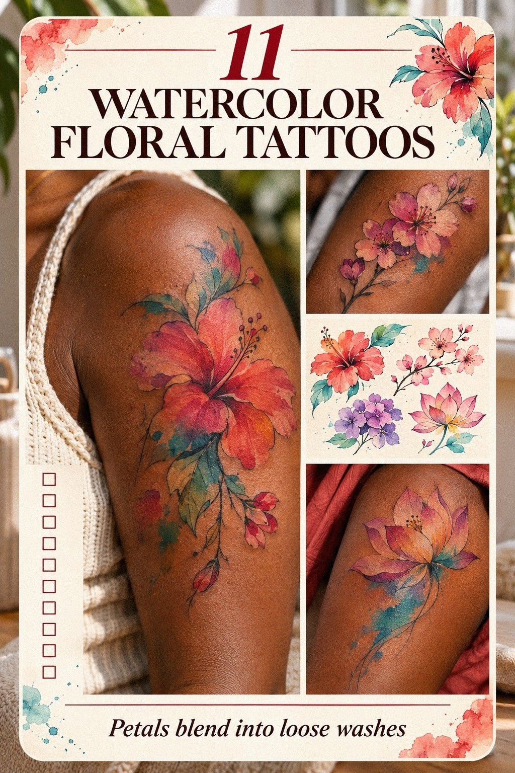
I protected my finished floral tattoo by treating sunlight as the main long-term threat. The thigh design used delicate stems and small five-petal flowers. Richer color gave the piece a vibrant, grounded character.
I applied broad-spectrum sunscreen only after the tattoo had fully healed. I also covered it when I knew I’d be outside for hours. If you’re protecting fresh ink, follow your artist’s instructions first.
Once healed, regular sun protection can help lines and color stay clearer. I don’t treat sunscreen as optional anymore. It’s part of keeping the tattoo legible.
I also stopped rubbing the area with rough fabric. I chose softer clothing during long walks. That sounds minor, but repeated friction can leave a placement irritated.
Your tattoo doesn’t need constant attention. It needs consistent habits. Covering it became a simple, practical routine.
The most effective protection isn’t dramatic. It’s covering the tattoo, avoiding unnecessary UV exposure, and checking the skin before assuming it needs more pigment.
Which details keep watercolor flowers readable?
The strongest designs use a clear focal flower, a visible main stem, and enough uninked skin around the petals. Those choices matter more than adding every shade in the artist’s palette.
I now look for readable flower shapes before I look at color. If the outline works in black, the watercolor effect has something stable to support.
Small petals need separation. Tiny details can merge after healing. A slightly larger shape may feel less dainty at first, but it often stays more expressive over time.
Ask your artist which details are likely to soften. A good conversation can protect the design’s meaningful structure before the appointment begins.
Placement and Sunlight: The Real Tradeoff
Placement affects more than pain. It changes sun exposure, friction, movement, and how often you’ll see the design. I didn’t understand that fully before my first tattoo.
The ankle gave me a delicate visible placement, but shoes and sunlight added pressure. The thigh offered more coverage. The wrist gave me daily visibility but needed more protection.
If you’re choosing between two locations, list the habits each one will face. Don’t decide from a reference alone. Your anatomy and routine should guide the final choice.
A protected tattoo may hold color better than a covered design that experiences constant rubbing. There isn’t one perfect location. There’s only the location you can care for consistently.
The Wildflower Sprig Changed My Standard
My wildflower sprig changed how I judge tattoos. I used to focus on fresh color first. Now I look for a timeless black framework underneath it.
The design became softer, but it didn’t become meaningless. The stems still pointed toward the petals. The flower still felt personal.
That mattered more than keeping every wash bright.
I’ve also become more careful with trendy references. A design can be iconic online and still fail to suit your skin, scale, or daily routine.
My favorite tattoos now feel personal, polished, and quietly powerful. They don’t need to shout to stay memorable.
Fresh Color vs. Healed Color
Fresh color is exciting. Healed color tells the truth. I didn’t understand that difference until I compared the fresh and healed versions side by side.
The fresh tattoo had bold saturated pigment and sharper edges. The healed version looked gentler. Some pale color had faded, but the main forms stayed clear.
Ask to see healed work before choosing an artist. Look for similar sizes, skin tones, and color choices. A fresh portfolio alone can’t show how the tattoo settles.
I’d rather choose an artist whose healed work looks balanced than someone whose fresh work looks dazzling. That choice feels more sensible and empowering every time I make it.
How much it cost
The typical US cost for a watercolor floral tattoo depends on the artist, region, size, placement, and session time. A small piece may fit a shop minimum. A more intricate design may use hourly pricing.
I’d ask for a quote after sending the approximate size, placement, and reference examples. A 2-inch ankle sprig isn’t priced like a 6-inch spine design.
Your artist may also charge differently for a touch-up. Ask before booking. Clear questions can prevent a stressful surprise.
I avoided choosing an artist only because the price looked low. A polished healed portfolio is worth more than a vague promise. You can compare small rose tattoos before deciding where your budget should go.
I also checked black floral tattoos for examples with stronger structure. The comparison helped me understand what I was actually paying for.
The Three-Check Longevity Rule
I now judge every watercolor floral tattoo with three checks: can I recognize the flower, can I see the main line, and can I protect the placement from constant sun?
If the answer is yes to all three, the design has a better chance of staying graceful and readable as it changes. That standard is more useful than demanding permanent brightness.
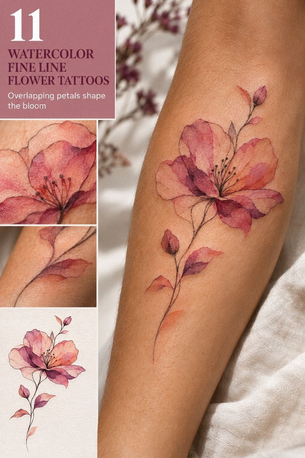
Watercolor style isn’t one fixed look. It can be bold and expressive, or minimal and understated. The strongest pieces use color as support, not as the entire structure.
That’s why I’d choose a crisp black stem over an extra wash every time. The stem gives the design a visual anchor.
Your artist’s healed portfolio matters more than a fresh social-media post. Ask to see work after several months, especially if you want fine lines and pale pigment.
I don’t think fading automatically ruins the experience. My first piece became softer and more romantic than it looked on appointment day. It also became more honest.
A Few Things Worth Answering
How much does a watercolor floral tattoo usually cost?
A watercolor floral tattoo usually costs about $100 to $300 in the US, depending on size, placement, artist, and region. Some studios list minimums around $50 to $100.
Hourly rates may run about $100 to $250. Your quote can change with detail and color.
Are watercolor floral tattoos a good idea for a first tattoo?
Yes, watercolor floral tattoos can be a good first choice because the subject is flexible and personal. A small ankle, forearm, shoulder, or thigh design may feel manageable.
Ribs, feet, and hands can feel more intense. Choose clear lines if you want easier long-term readability.
How do I choose a tattoo artist for watercolor floral tattoos?
Choose an artist with a portfolio showing clean linework and healed tattoos. Look for floral pieces on skin tones similar to yours.
Check hygiene practices and healed color. Ask how the artist balances watercolor washes with stronger structural lines.
How much do watercolor floral tattoos hurt?
Pain varies by placement, but forearms, thighs, and shoulders are often more tolerable than ribs, feet, hands, or the sternum. Session length and stress also matter. Eat beforehand, hydrate, and tell your artist if you need a pause.
How long does a watercolor floral tattoo take to heal?
The surface usually heals in about two to three weeks, while complete healing can take roughly two to three months. Follow your artist’s aftercare. Wash gently, moisturize lightly, and avoid pools and strong sunlight while the skin recovers.
What’s the best placement for watercolor floral tattoos?
The best placement depends on your pain tolerance and visibility preference. The shoulder, thigh, and forearm offer practical options with relatively readable skin. Ankles, ribs, hands, and feet can be more demanding.
Your artist can adjust the design to follow your body’s natural lines.
Where I’d Start First
If I had to pick one, I’d start with the clear wildflower sprig. Its black stems and symbolic shape keep the meaning readable after the soft color settles.
Save your favorite reference. Ask for healed examples.
Protect the placement from strong sun. Let the design stay personal.
That’s the lesson I’d carry into another appointment. A watercolor floral tattoo doesn’t need to remain perfectly bright to remain striking. It needs a strong idea, a thoughtful structure, and care that lasts.