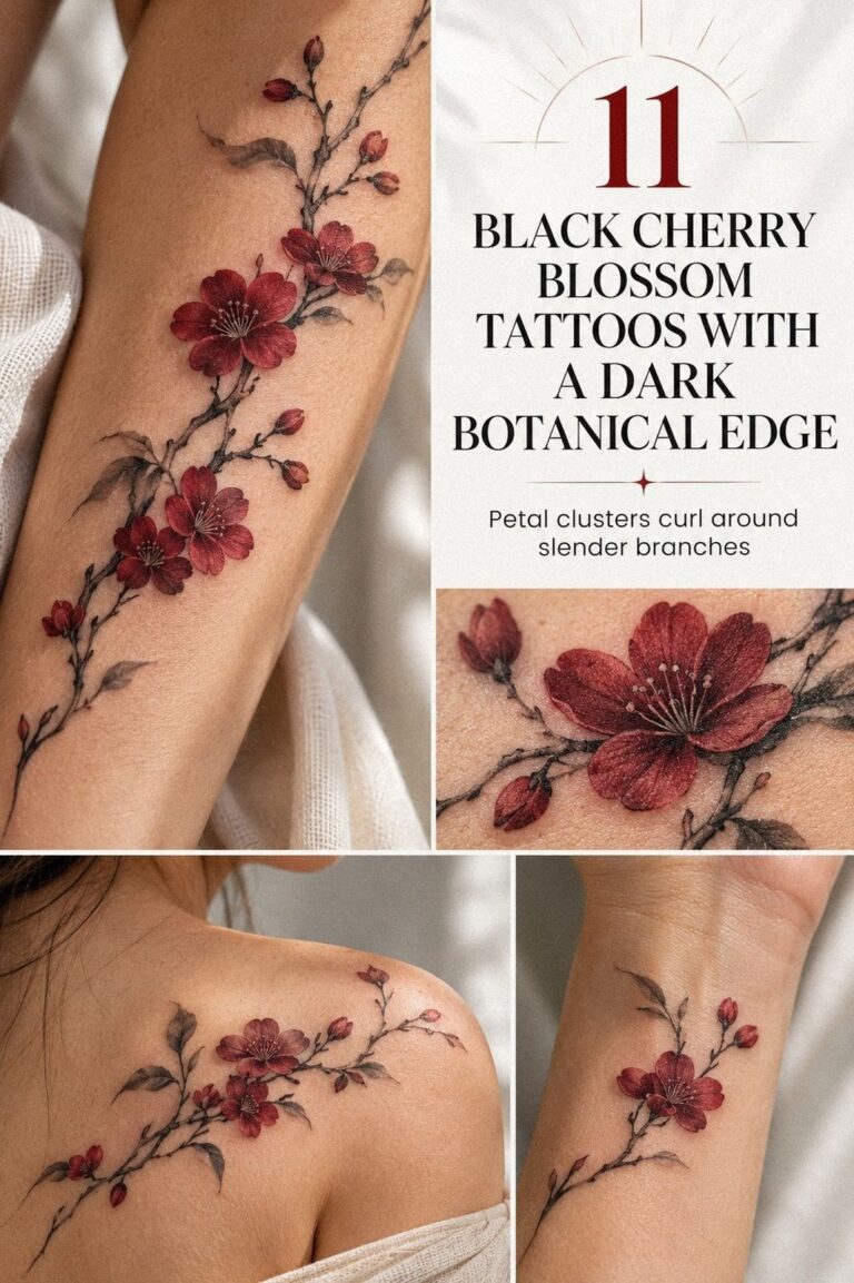
Fine line cherry blossom tattoos can stay delicate without feeling disposable, especially when placement, spacing, and aftercare work together. I learned that after choosing a branch that was too crowded for my skin. You’ll find 11 striking ideas here, plus honest guidance on pain, healing, cost, and value. Start small, but choose thoughtfully!
Small Fine Line Cherry Blossom Wrist Tattoo
A small wrist piece works best when the branch has breathing room around each bloom. I’d choose single-needle linework with two open flowers, one closed bud, and a stem that follows the wrist instead of cutting straight across it. That shape feels personal, especially if you’re planning your first tattoo.
You’ll want the design visible as you look down at your wrist. A forward-facing branch reads more clearly than a tiny cluster turned toward someone else. The fine-point needle can create crisp petals, but your artist still needs enough space to keep every line separate as the tattoo settles.
And don’t confuse minimal with empty. One small leaf, a curved stem, and a few uneven petals can make the image expressive without making your wrist look crowded.
I’d skip five or six flowers here. They may look intricate on paper, but they’ll blur into one dark mark over time.
Protect the negative space.
A 2-inch concept is a useful starting point to discuss with your artist, though your wrist width and skin texture matter more than a fixed measurement. If you’re comparing tiny references, browse these tiny fine line flower tattoo ideas before your consultation. Your wrist width should guide the final scale.
Your wrist moves constantly, catches sunlight, and rubs against clothing. You’ll need gentle washing during the first 2 to 3 weeks and consistent sun protection afterward.
The result can be sleek and understated, but only if you’re willing to let the artist protect the negative space. For such a small piece, that spacing is worth the cost.
Fine Line Cherry Blossom Branch Along Ribcage
A ribcage branch gives you more vertical room, so the design can feel graceful rather than cramped. I’d let the stem travel along the curve of the ribs, with the blossoms opening toward the front of your body. That vertical rhythm creates a flowing silhouette that feels romantic without becoming overly ornate.
The ribs are a more intense placement for many people because the skin sits close to bone. You’ll want to ask for a calm session plan, especially if your tattoo is your first. A clean black tattoo ink line can look powerful here, but the artist shouldn’t keep returning to the same area just to make it darker.
This placement rewards uneven spacing. Put one larger bloom near the center, then let smaller buds trail outward.
The variation makes the branch feel organic and symbolic, while a perfectly repeated pattern can look stiff. I tried arranging blossoms at equal intervals once, and the result felt more like a diagram than a living branch. Let the uneven spacing stay visible.
If you’re concerned about visibility, rib tattoos are easy to cover beneath a fitted shirt. That flexibility is meaningful for work, family events, or days when you want the design to stay yours. You can compare this longer shape with small cherry blossom tattoo references before choosing your final scale.
Your artist may recommend a stencil adjustment after seeing your body in person. That isn’t hesitation; it’s good placement judgment.
And if you’re nervous about the session, remember that the finished tattoo will be delicate, but the process may feel sharp and demanding for a while. That extra space is worth it!
Unique Fine Line Cherry Blossom Spine Tattoo
A spine design needs a strong central rhythm. The most elegant version uses a thin vertical stem with blossoms alternating left and right, rather than a heavy branch that sits directly over every vertebra.
You’ll get a more balanced silhouette, and the design will remain readable when your body bends. Start with a central rhythm.
The spine can feel intense because the area is bony and sensitive. I’d choose smooth black linework with restrained detail instead of soft gray shading everywhere. Too much shading can make a tattoo look muddy, while selective dots inside the petals add depth without stealing the clean structure.
This is where a proprietary concept helps: think of the Spine Balance Rule. One larger flower should anchor the middle, while smaller blooms taper toward the upper and lower ends. That hierarchy keeps your tattoo bold enough to read from a distance and delicate enough to reward a closer look.
Would you rather have a perfectly symmetrical design or one that feels hand-grown? I’d pick the second option. A slightly irregular stem looks timeless and expressive, while mirror-image petals can make the tattoo feel polished but strangely lifeless.
That natural asymmetry matters.
If you’re collecting references, the minimalist fine line flower tattoo gallery has useful examples of spacing and scale. You’ll also want to discuss how your skin tone affects contrast. A confident artist won’t promise identical results on every body.
Keep your aftercare simple. Use fragrance-free soap, pat the area dry, and avoid soaking it while the surface heals. The skin may look settled after about 2 to 3 weeks, but complete healing can take roughly 2 to 3 months.
Fine Line Cherry Blossom Sleeve With Falling Petals
A falling-petal sleeve gives your forearm movement, which is why the design can feel daring without relying on heavy shading. Start with one branch near the lower forearm, then let separate petals travel upward. That falling-petal rhythm creates a visual path and keeps the sleeve from becoming one dense block.
For this idea, I’d use black-and-gray tattoo ink sparingly. A few darker petals near the central branch can create contrast, while the outer petals remain open. You’ll want each falling shape to have enough distance from the next one, especially if the design is meant to age gracefully.
The sleeve should look intentional as your arm turns. Your artist can rotate the stencil slightly so the main bloom faces outward when your arm rests naturally.
That small adjustment makes the tattoo more personal. A stencil centered on one flat view may look charming on paper but lose its energy once wrapped around your forearm. Think about the wrapped placement.
And don’t rush into a full sleeve just because the first reference looks vibrant. I’d begin with the main branch and leave room for a later extension. Your skin will tell you how the first section heals, and you can add petals after seeing whether the line weight still feels right.
A 2-inch floral stencil can help you judge the smallest details before the needle touches your skin. Ask to see healed work, not only fresh reference images. If you’re building a larger collection, these minimalist cherry blossom tattoo ideas can help you decide whether the sleeve should stay minimal or become more ornate.
The strongest sleeve here is delicate, graceful, and quietly bold. You’ll need patience, though. Depending on the artist and the amount of detail, a session may take several hours, and your forearm may need time before another section feels comfortable.
Set a clear budget before booking a multi-session design.
Fine Line Cherry Blossom Tattoo Behind The Ear
Behind the ear is a charming place for a tiny cherry blossom, especially when the design uses one open flower and a short curved stem. The area stays discreet beneath your hair, but you can reveal it whenever you want.
That combination feels personal, playful, and slightly edgy. Keep the short curved stem clear.
Because the available skin is limited, the design should stay crisp. I’d choose fine black ink with open petals and no crowded interior shading.
A tiny tattoo needs contrast more than complexity. Your artist may simplify the reference, and you should welcome that choice rather than insist on every decorative mark.
This placement often appears on a traditional flash sheet, where several hand-drawn options sit together on paper. You’ll notice that the best flash designs usually have clear silhouettes. They’re meant to be understood quickly, so your artist can adapt one into a personal version without losing the original shape.
The behind-ear area can feel sharp and loud because of its closeness to bone. I’d skip a long session there.
A small design may be finished quickly, but the sensation can still surprise you. Take breaks if you need them, and don’t let anyone frame discomfort as a test of commitment.
If you want a similar idea with a little more room, compare it with tiny cherry blossom tattoo designs. You’ll see how a slightly larger scale lets the stem curve naturally. That extra space may help your tattoo remain readable as the lines soften with age.
Keep headphones, hair products, and tight headwear away from the fresh area when possible. Your aftercare routine matters more than the flash sheet. The final result can be delicate and iconic, but only when the small scale is respected.
Fine Line Cherry Blossom And Hummingbird Tattoo
A hummingbird adds a lively counterpoint to the stillness of cherry blossoms. I’d place the bird slightly above the flowers, wings open, with its beak angled toward one bloom. That visual counterpoint creates a meaningful interaction instead of two unrelated images sitting side by side.
On deep ebony skin, contrast and placement deserve a careful conversation. Your artist may use solid black accents in the bird’s eye, wing edges, or beak so the silhouette stays clear. You’ll want to review healed examples on a similar skin tone, because fresh ink can hide how fine lines settle.
The bird should remain smaller than the main branch. If it becomes the largest shape, the cherry blossoms lose their symbolic role.
I prefer a petite hummingbird with one crisp wing curve and only a few internal marks. It feels energetic, but it doesn’t overpower the main branch.
This is a good place for the Two-Motion Rule: the branch should curve in one direction while the bird enters from another. That contrast makes the tattoo feel vibrant and expressive. A bird placed directly above the branch can look static, and I’d avoid that arrangement.
You’ll want to think about clothing friction if you choose the thigh. Loose fabric is easier during healing, while rough seams can irritate the area. For more floral options, see these small fine line flower tattoo examples and notice how much open skin surrounds each motif.
The finished piece can feel empowering without becoming loud. Ask your artist whether the bird needs a small amount of black fill. Used with restraint, that anchor can help the delicate flowers remain legible for years.
Fine Line Cherry Blossom Tattoo With Japanese Waves
Japanese waves bring a fierce, energetic line to a cherry blossom design. On the forearm, I’d place one curling wave beneath the branch, with the flower stem following the wave’s movement rather than crossing it randomly. That curling wave creates a symbolic and bold composition.
A fine-line wave contour needs enough room to remain legible. Too many foam marks can collapse into a dark knot, especially in a small tattoo. You’ll want the artist to choose two or three wave ridges, then leave the rest as negative skin.
That restraint gives the design a sharp, polished character.
I’d keep the cherry blossoms softer than the wave. The flowers can use open petals and thin stems, while the water gets slightly stronger outlines.
That line-weight hierarchy makes the tattoo feel intentional. If every element has the same line weight, your eye won’t know where to land.
And yes, the combination can become busy quickly. I’d skip adding a koi, a moon, and kanji in the same small forearm piece.
One clear idea will age better than a crowded collection of references. You can study Japanese cherry blossom tree tattoo meaning if symbolism matters to you.
Your artist should explain how the design will wrap with your arm’s movement. A wave that looks perfect when your palm faces up may bend awkwardly when your arm relaxes. That practical check is important, especially if you want the tattoo to look crisp as you move.
The result can be edgy, graceful, and timeless at once. If you’re drawn to Japanese influence, make sure you understand the imagery you’re borrowing and choose an artist who handles the style with respect. Clear references add value here because cultural details shouldn’t be improvised at the appointment.
Fine Line Cherry Blossom Moon Phase Tattoo
A crescent moon paired with cherry blossoms can feel ethereal without becoming overly decorative. I’d place the moon above a short branch, then use three small stars or dots to connect the shapes. That three-star rhythm gives the tattoo a dreamy flow while keeping the central image clear.
For the moon, black crescent shading should stay controlled. A solid crescent can create a strong anchor, while the flowers remain delicate.
You’ll want to ask whether the artist prefers stippling or a clean fill. I’d choose a clean fill for a tiny design because scattered dots may soften unevenly.
The upper arm offers more flexibility than the wrist or behind-ear area. Your artist can enlarge the petals slightly, which helps the design remain crisp as it ages. I went back and forth on this placement myself, but the extra skin made the final composition feel polished and less cramped.
The upper-arm placement gives you room.
Try the Three-Point Orbit: moon, main blossom, and one falling petal. Those three points should create a loose triangle, not a straight line.
That small compositional choice gives the tattoo movement. A row of symbols can look flat, while a triangular arrangement feels more graceful.
If you’re drawn to a quieter motif, compare this with minimalist cherry blossom tattoo 2. You’ll find that fewer marks can carry more emotion when each line has a clear purpose. You don’t need every star from the reference to make the moon feel personal.
Protect the tattoo from ultraviolet exposure once it has healed. Fine lines can widen over time, and repeated sun exposure can make black ink appear softer. This design is understated, but thoughtful aftercare will help it stay elegant.
Fine Line Cherry Blossom Tattoo On Collarbone
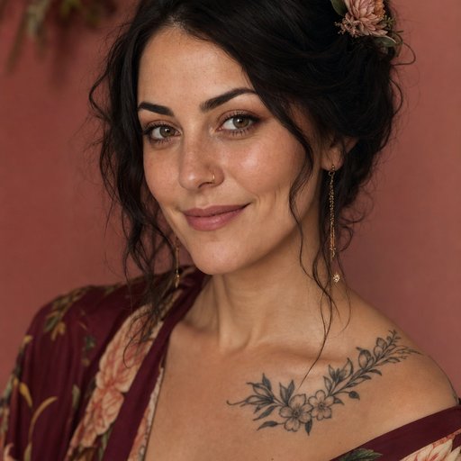
The collarbone naturally creates a long horizontal path, so a cherry blossom branch can follow it with an elegant sweep. I’d keep the stem slightly below the bone rather than placing every mark directly on top of it.
You’ll get a more comfortable composition and a stronger sense of movement. Follow the horizontal path.
A hair-thin tattoo line can look crisp against medium olive skin when the artist chooses clear spacing. You’ll want to review healed work and ask how the line weight may settle. Fine line does not mean invisible, and your artist should explain how contrast will change as the tattoo matures.
This placement can be feminine, masculine, or completely personal depending on the branch shape. I’d avoid assigning the design a gendered meaning before you see the stencil.
A compact branch with angular stems can feel sharp, while round petals and a curved stem can feel romantic. Let the branch shape lead.
The collarbone is also easy to show and easy to cover. That makes it useful if you want visibility without committing to a hand or neck tattoo. Before your appointment, wear a top with a neckline that lets the artist view the entire area comfortably.
If you want to compare proportions, open these minimalist fine line flower tattoo ideas. You’ll notice that the strongest horizontal designs don’t fill every inch. Leave skin around the branch, and the tattoo will look more crisp as you move.
You may feel more tenderness near the bone, especially during longer passes. Ask for a break before you need one.
A confident tattoo can still be delicate, but your comfort deserves attention throughout the session. A short pause protects the quality of the collarbone placement too.
Fine Line Cherry Blossom Bouquet Forearm Tattoo
A bouquet forearm tattoo gives you a compact cluster instead of a long branch. The cleanest version uses three blossoms at different angles, one curved stem, and a small gap between each flower.
I’d keep the bouquet asymmetrical so it feels expressive rather than arranged with a ruler. Preserve the asymmetrical bouquet.
The useful comparison here is fresh work versus healed work. You’ll see why open skin matters.
Fresh lines often look darker and sharper, but healing can soften the edges. Your artist should be comfortable showing you both stages through a healed portfolio.
For the bouquet, I’d choose black floral linework with just a few darker centers. Too much fill can make the flowers lose their open quality. You’ll want the petals to remain distinct, especially if the bouquet is under 3 inches tall.
The forearm is usually more tolerable than ribs, feet, hands, or sternum. That doesn’t mean it feels effortless, but it gives many first-timers a manageable starting point. I’d choose this placement over the hand if you want your fine lines to have a better chance of staying readable.
Compare the bouquet with small cherry blossom tattoo inspiration, then save the references that show healed skin. Images from the day of the appointment can be captivating, but healed examples tell you far more about line quality.
Your artist may recommend a slightly wider bouquet than your first sketch. Listen to that advice. A little extra spacing can protect the design from becoming a soft black cluster later, and the result will still feel dainty and personal.
Fine Line Cherry Blossom Tattoo With Initials
Initials can turn a cherry blossom into a deeply personal piece without adding much visual weight. I’d place two small letters along the stem or beneath one blossom, using a clean serif or restrained handwritten style.
The lettering should support the flowers, not compete with them. Keep the small letters open.
On deep brown skin with a warm undertone, black ink lettering can give the initials a clear anchor. You’ll want the artist to keep the letters open and avoid hairline flourishes that may merge. Tiny script can look stylish in a stencil and become difficult to read after healing.
This design works especially well on the spine because the letters can sit beneath the central bloom. A vertical arrangement feels intimate and symbolic, while initials placed sideways may look disconnected from the branch. I’d ask to see the lettering at actual tattoo scale before approving the stencil.
Use the Initials-in-the-Stem Method if you want the personalization to stay subtle. One letter can follow the curve of the stem, while the second sits near a small leaf. That placement feels meaningful without announcing the reference to everyone who sees it.
You can compare the floral structure with tiny fine line flower tattoo references. You’ll find that the best tiny designs use fewer marks than expected. Don’t add dates, stars, and extra symbols simply because the empty skin feels unfinished.
Initials can carry emotional weight, so choose lettering you’ll still recognize years from now. Your tattoo should feel personal, not trapped in a passing font trend. A crisp, understated design is more likely to remain timeless.
The Spine Balance Rule
The central stem should carry the design before the blossoms do. I’d test the branch as a single flowing shape first, then add flowers only where the curve needs visual weight. This keeps the spine tattoo readable when your posture changes.
Use one larger bloom as the anchor, then taper the remaining flowers toward the neck and lower back. The rule sounds simple, but it prevents a common mistake: placing identical blossoms at identical intervals until the tattoo feels mechanical. Build a tapered flower rhythm.
You don’t need perfect symmetry. A slightly uneven branch can feel more human and more expressive, especially when the petals turn in different directions. Your artist should be able to explain why each flower sits where it does.
Choose the Placement Before the Petals
For a first tattoo, I’d choose the placement before choosing the exact branch. The wrist, forearm, and upper arm usually offer more forgiving space than the ribs, hands, feet, or sternum.
That doesn’t make one zone universally better. It means you should match your tolerance, visibility needs, and daily habits to the design. Make the placement decision first.
Ask your artist to make a consultation stencil at the intended size. Walk around with it for a few minutes if the studio allows that. Look at the branch while your arm hangs naturally, not only while you pose for a mirror.
Think about sun, friction, work clothing, and whether you want the tattoo visible every day. A design can be beautiful and still be inconvenient in the wrong place.
The best value comes from a placement you’ll actually enjoy living with. Consider your daily friction.
If your reference only works when your body is held in one exact position, it needs more editing. A strong tattoo follows movement. That’s why the artist’s placement judgment matters as much as the petal design.
Is a Fine Line Cherry Blossom Tattoo Worth It?
Yes, it can be worth it! The style suits a first tattoo because the subject can be reduced to one flower or expanded into a branch, bouquet, or sleeve. You have room to make the design personal without committing to heavy saturation.
The cost depends on placement, artist experience, region, and detail. A tiny tattoo may still have a shop minimum, while a sleeve or ribcage branch may require several appointments. Ask what’s included before you compare numbers.
I’d rather pay for a thoughtful consultation and strong healed work than chase the lowest budget quote. Fine lines depend on spacing, skin knowledge, and restraint. Those decisions affect the long-term value of the tattoo.
A clear design is also easier to live with. If you’re adding initials, waves, moons, birds, and color only because the reference feels empty, pause first. One meaningful idea often has more impact than five competing ones.
When Should You Add Color?
Black and gray are usually the safest starting point for a fine line cherry blossom, but a restrained color accent can be striking. A muted pink in one bloom or a small red detail can change the mood without covering the entire branch.
Ask about the artist’s experience with color ink on your skin tone. Color can settle differently from black, and the final result may not match a fresh reference image. Your artist should explain the pigment, saturation, and expected maintenance before you decide.
I wouldn’t add color simply to make a small tattoo feel more stylish. The placement and spacing still do most of the work. If the petals are already crowded, extra pigment won’t solve the structure.
Color can also change the cost and the maintenance plan. If you love the black version on its own, start there. You can always discuss a later accent after the original tattoo has healed.
Fresh Lines vs. Healed Lines
Fresh tattoos often look darker, sharper, and more dramatic than they will after the skin settles. That doesn’t mean the healed result is worse.
It means you need to judge line quality with realistic expectations. Trust the healed result.
Ask to see a fresh tattoo beside a healed example from the same artist. Look for consistent spacing, readable petals, and lines that haven’t spread into one another. The comparison tells you more than a carefully edited portfolio page.
Fine line does not mean maintenance-free. Sun protection, sensible aftercare, and patience during healing all affect the final appearance. Don’t pick at peeling skin or soak the area before your artist says it’s safe.
The most useful question is simple: does the tattoo still read after healing? If the answer is yes, the artist has protected the structure instead of relying on the drama of a fresh finish.
The Linework Choice I’d Make Again
I used to think the most important choice was the flower itself. It isn’t.
The real decision is whether the design gives your artist enough room to make the linework clean, readable, and honest to your skin. I’ve seen a tiny reference look exquisite on paper and lose its identity when compressed into a space that was simply too small.
Protect the linework quality.
For a first tattoo, I’d choose the placement before choosing the exact branch. The wrist, forearm, and upper arm usually offer more forgiving space than the ribs, hands, feet, or sternum.
That doesn’t make one zone universally better. It means you should match your tolerance, visibility needs, and daily habits to the design you’re considering.
I’m also firm about healed portfolio evidence. Fresh work can look vibrant and flawless because the ink hasn’t settled and the skin hasn’t finished recovering.
A healed image tells you whether the artist understands spacing, line weight, and black saturation. If you’re paying for delicate work, that evidence matters more than a dramatic fresh reference.
My own mistake was asking for too much detail in a small branch. I wanted every petal vein, several leaves, and a few decorative dots.
The artist removed half of them, and I’m grateful. The finished tattoo feels more polished because the skin has room to speak.
That’s the part I’d repeat: edit until the design still reads from a few feet away.
Cherry blossoms can carry ideas of change, tenderness, memory, and impermanence, but you don’t need to explain the meaning to anyone. Your tattoo can be empowering because it marks a person, a season, or a decision that mattered to you.
Choose the image that still feels personal when the trend has moved on. Do not skip healed work!
The Questions I Get Asked Most
How much does a fine line cherry blossom tattoo usually cost?
A fine line cherry blossom tattoo is often about $100 to $300 in the US, depending on the artist, region, placement, and detail. A shop minimum may be around $50 to $100, while hourly rates often fall near $100 to $250. Artist experience and healed work matter more than chasing the lowest quote.
Are fine line cherry blossom tattoos a good idea for a first tattoo?
Yes, they can be a meaningful first tattoo because the subject works at several sizes and placements. A forearm, upper arm, or thigh may feel more tolerable than ribs or feet. A clear, well-spaced design is a better first choice than a crowded one with too many tiny details.
How do I choose a tattoo artist for fine line cherry blossom tattoos?
Choose an artist with a portfolio showing clean fine line work, healed photographs, consistent petals, and strong placement decisions. Ask about studio hygiene, stencil approval, and aftercare. Healed portfolio evidence should be your priority, especially if you’re considering a wrist, collarbone, or spine tattoo.
How much do fine line cherry blossom tattoos hurt?
Pain varies by person and placement. Ribs, feet, hands, and sternum are often more painful because they have less padding and sit near bone.
Forearms, thighs, and shoulders are usually more tolerable. Your comfort level matters, so ask for breaks instead of treating pain as a competition.
How long does a fine line cherry blossom tattoo take to heal?
The surface usually heals in about 2 to 3 weeks, while complete healing can take roughly 2 to 3 months. Wash gently, moisturize as directed, and avoid swimming and strong sun while the skin recovers. Simple aftercare protects delicate lines better than constant touching or overthinking.
What’s the best placement for a fine line cherry blossom tattoo?
The forearm and upper arm are strong choices for a first tattoo because they offer visibility, workable space, and generally more tolerable sessions. The wrist and collarbone feel more intimate but may experience more friction or sun exposure. Placement should fit your daily life, not only the reference image.
Where I’d Start First
If I had to pick one, I’d start with the small forearm bouquet. It gives your artist enough space to protect the petals, it’s usually more tolerable than ribs or feet, and you can see it while it heals. Pin the small fine line flower tattoo guide for later and bring your favorite healed reference to the consultation.