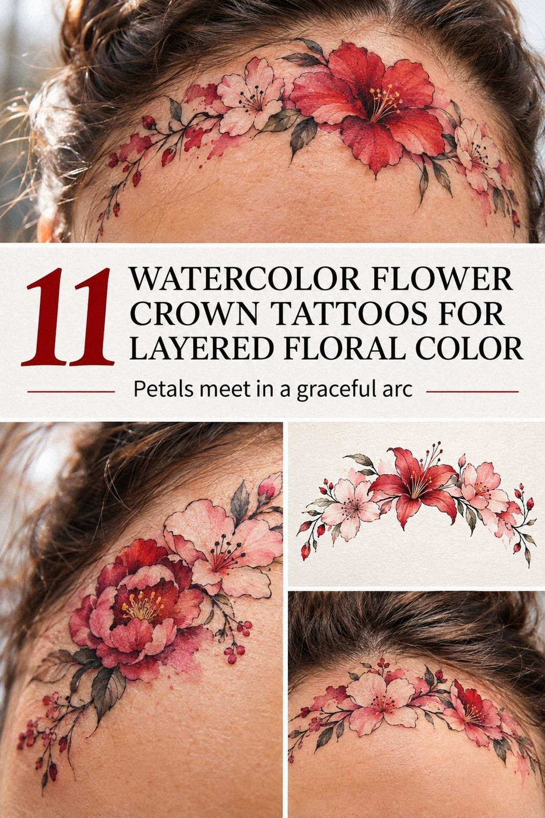
A watercolor flower crown tattoo can stay readable for years when its lines, pigment weight, and placement work together. I learned that after choosing a small wrist design, watching the color settle, and noticing which details stayed crisp. The result is personal, striking, and more durable than I expected.
Design note: If you’re comparing ideas, ask whether the crown still feels meaningful when you imagine the cost, placement, and healed result together. My favorite version wasn’t the loudest one. It was the most thoughtful.
Here’s what it looked like before:
The patch of skin I had been saving was small, pale, and completely undecided. I kept tracing imaginary petals over it with my finger, then wiping them away before anyone could ask what I was planning. The negative space felt intimate, but I didn’t want a random symbol that would lose its meaning.
I wanted a crown that felt delicate without becoming vague. My reference folder held single-stem flowers, thin leaves, and soft color breaks instead of one heavy block of pigment. I also wanted the piece to look graceful from a distance and intricate up close.
The first sketch was too ornate. The second was too minimal.
I kept returning to a short curved arrangement because it looked personal rather than borrowed. If you’re saving a spot for your own design, you’ll want to notice how the skin moves there before you commit.
I nearly bailed! Then I saw the final stencil beside my wrist, and the shape suddenly made sense. That small moment changed the whole appointment.
- I Chose a Small Watercolor Flower Crown Tattoo
- How I Sketched Wildflowers Around My Wrist
- Birth Flowers Gave the Crown Its Meaning
- Test the Crown at Real Size
- Wrist or Collarbone? The Placement I Nearly Chose
- Leaves Keep the Crown From Becoming a Wreath
- Bold Color or Quiet Wash?
- Let Fine Lines Carry the Stems
- The Ankle Version I Left Behind
- What the Color Looked Like While Healing
- My Finished Watercolor Crown on Skin
1I Chose a Small Watercolor Flower Crown Tattoo
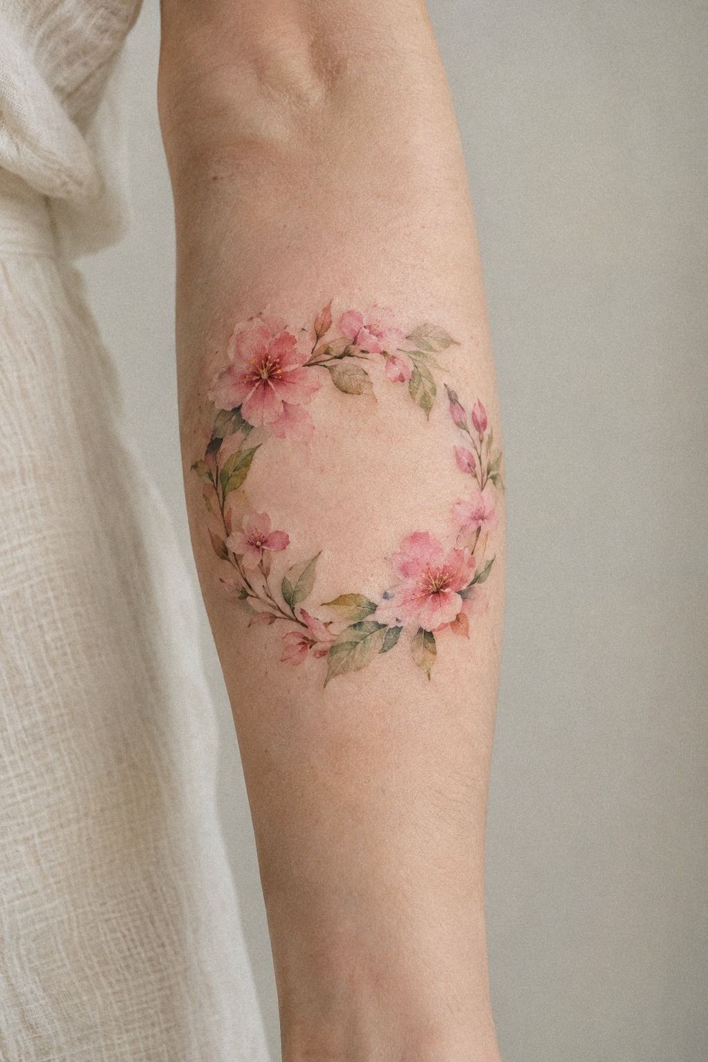
I chose a small watercolor flower crown tattoo because I wanted the design to follow my wrist instead of dominating it. The wrist placement gave the crown a natural curve, with enough open skin around the bloom to keep the composition crisp. It was dainty, but it didn’t look timid.
The terracotta, stone, and olive tones made the color palette feel vibrant without becoming loud. I kept the olive restrained and used the stone shade as a quiet transition between petals. A dense color field would blur the shape faster than a lighter wash.
My artist and I kept the central bloom slightly larger than the side petals. That focal bloom matters because your eye needs one anchor. If every flower is the same size, the crown can look flat, and you won’t get that graceful upward movement.
I also asked for a clean black ink stem rather than a fully painted one. That line gave the color something to hold onto while keeping the overall look soft. I wouldn’t skip that contrast, even if your taste leans painterly.
Before booking, I compared the proportions with this small flower crown tattoo guide. I also asked about the consultation and stencil revisions, since a low starting price isn’t always the best budget choice.
2How I Sketched Wildflowers Around My Wrist
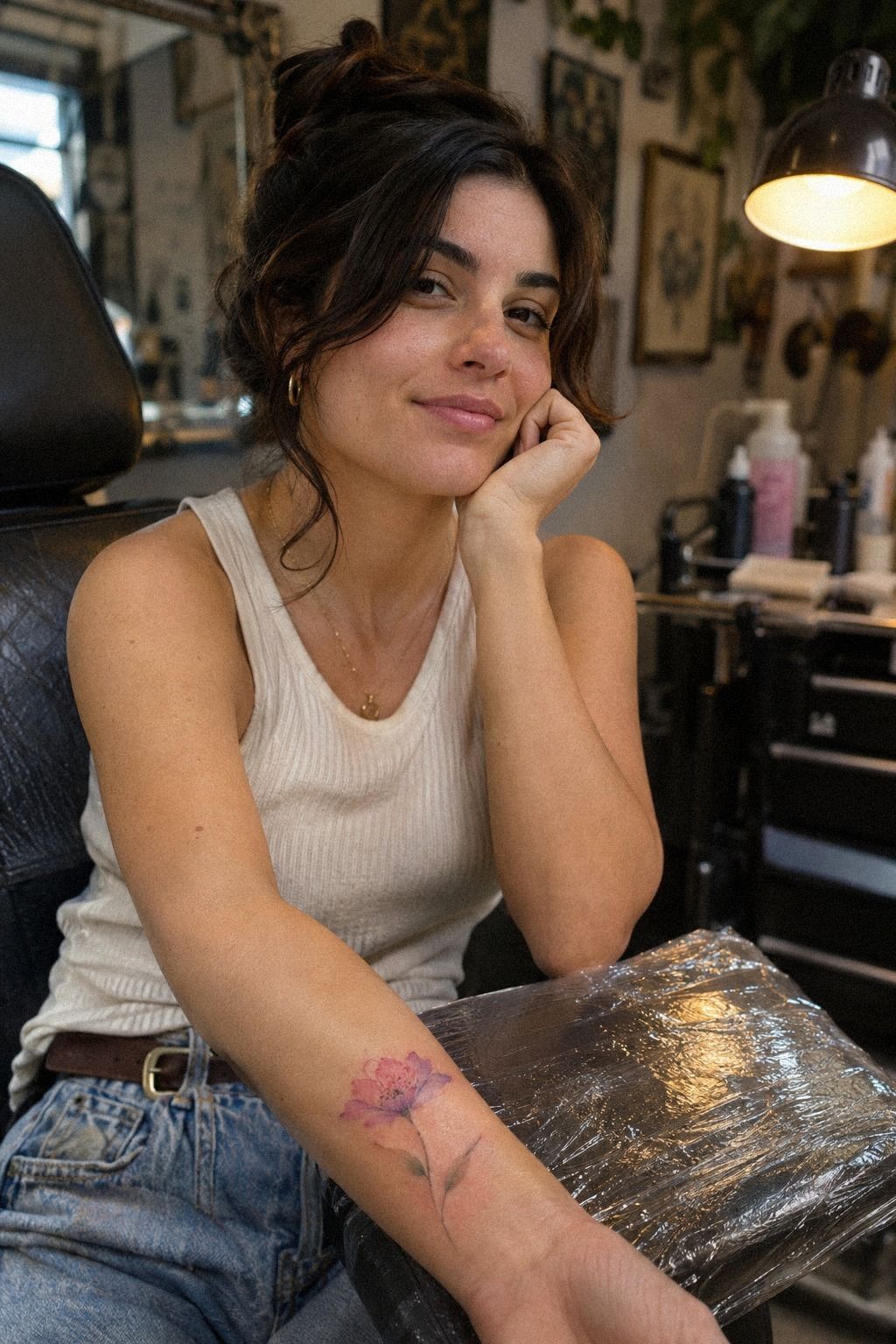
I sketched wildflowers around my wrist instead of copying a formal bouquet. One main bloom with layered petals and loose color around the stem made the wildflower structure feel flowing rather than perfectly arranged. That irregularity made it more expressive, and I preferred it to a symmetrical ring.
The wrist has constant movement, so I kept the leaves narrow and the outer petals open. A pointed leaf can disappear into a wrist crease if it’s too small, while a rounded petal still reads when your hand bends. My first sketch had six leaves.
I cut it to three, and the whole idea became sharper.
The artist used a fine-line needle for the stems and a diluted pigment wash for the petals. I liked the contrast between the crisp structure and the hazy color. You don’t need every edge outlined, but you do need a few dependable lines to preserve the flower’s identity.
I left one small crown gap between the ends. That break keeps the design from looking like a bracelet, which wasn’t what I wanted. If you’re considering a continuous circle, ask yourself whether you want botanical movement or a more graphic band.
For more reference, I kept returning to this watercolor fine line flower tattoo collection. The strongest examples use restraint, and I found that the less crowded sketches felt timeless on skin.
3Birth Flowers Gave the Crown Its Meaning
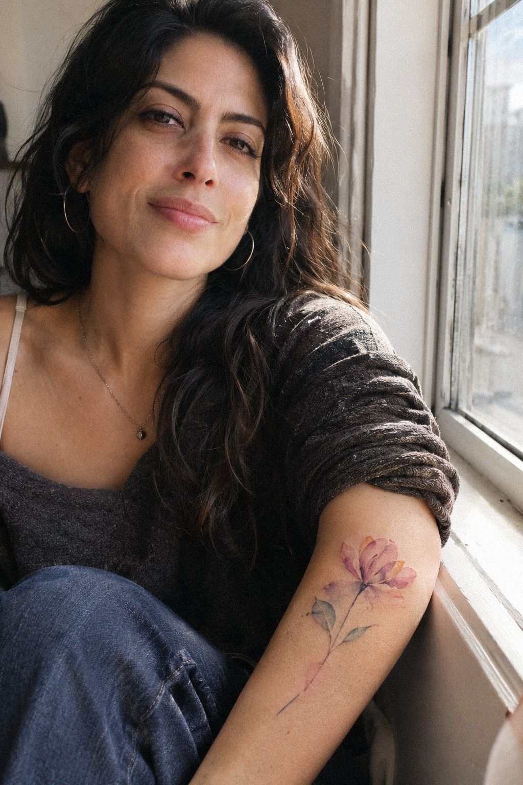
I matched the petals to my birth flowers because the meaning needed to come from somewhere real. I didn’t want a generic floral crown chosen only because the colors looked pretty in a reference image. The final mix felt meaningful, with one flower representing family and another marking a season of change.
The plum, smoky gray, and rose-gold tones looked elegant together. I chose warm pigments carefully so the colors could stay distinct without competing. Each shade had a specific job, rather than simply filling space.
I asked for the birth-flower references to influence the petal shapes, not dictate every detail. One bloom became more rounded, another more pointed, and the leaves stayed simple. You can personalize a design without forcing every symbol into the same tiny space.
My artist also showed me how the red pigment might settle against my undertone. That conversation mattered more than the digital mockup. Screens exaggerate saturation, while skin softens it, so your final palette should leave room for that change.
If you’re still choosing symbolism, this watercolor flower tattoo meaning guide helped me separate meaningful details from decorative clutter. I kept only the flowers I could explain without reaching for a long story. That made the design feel playful, personal, and empowering.
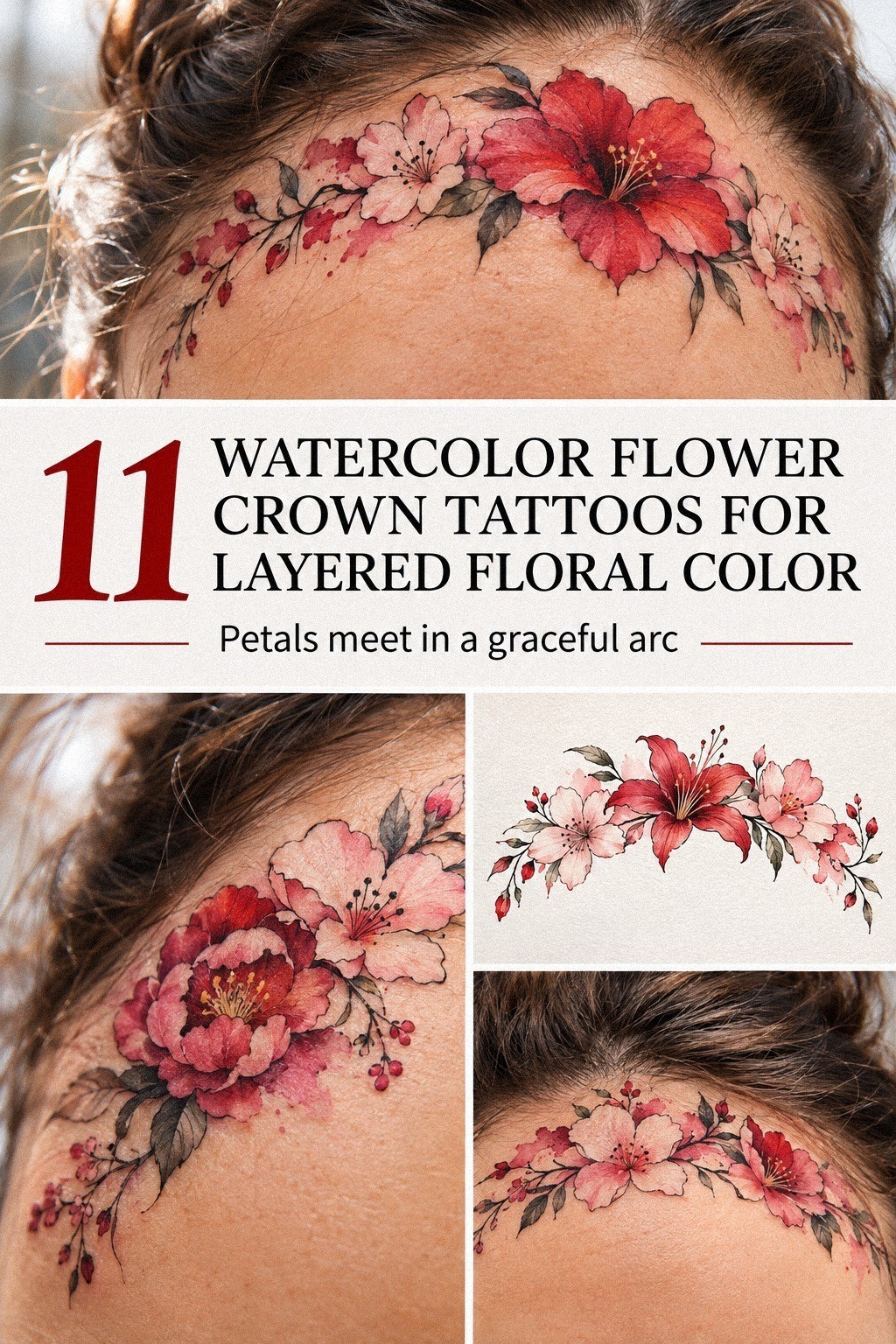
4Test the Crown at Real Size
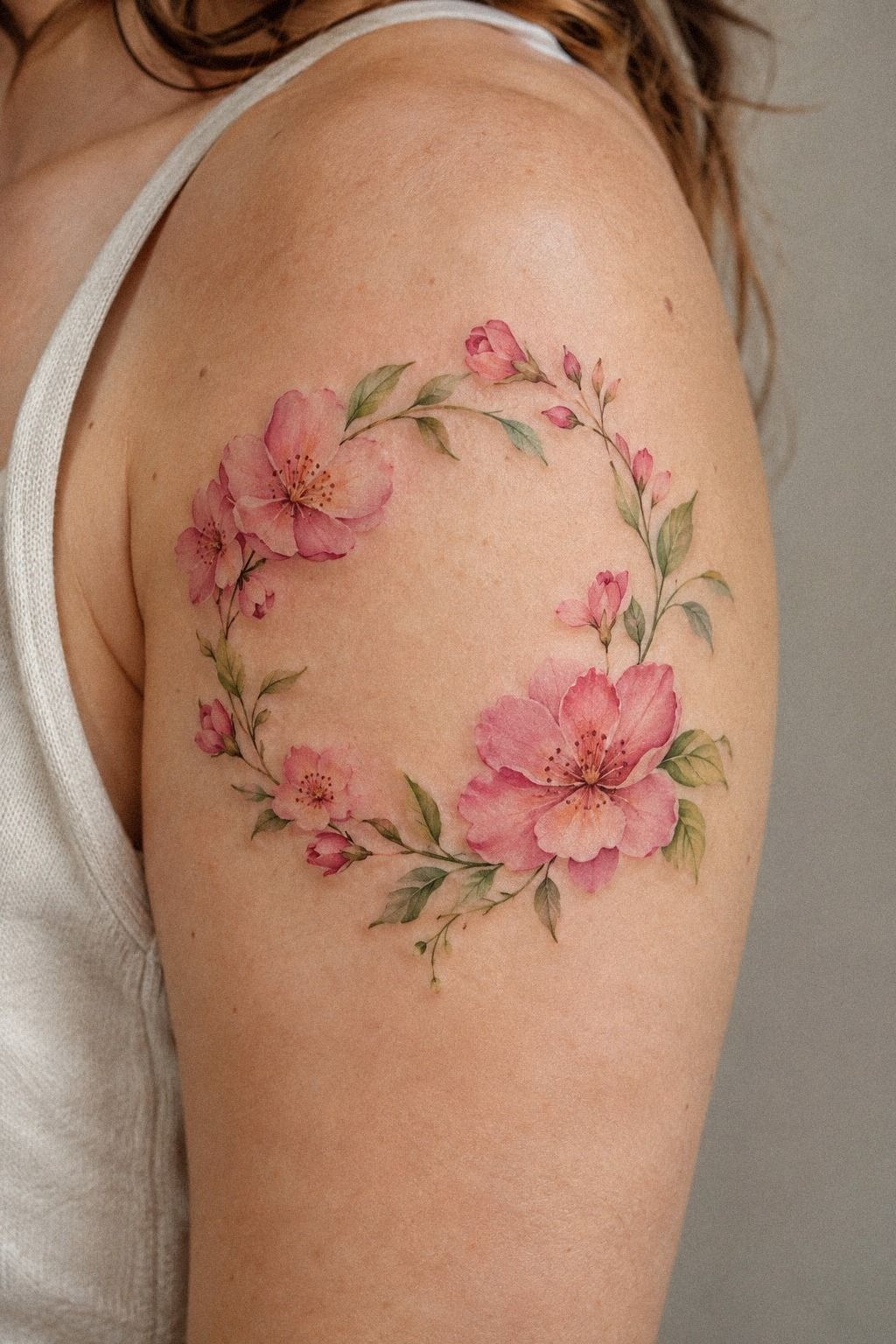
I tested unique watercolor crown tattoo ideas by printing several sketches at the size I might wear. That was when I noticed the most iconic version wasn’t the largest one. A wider crown looked impressive on paper, but it wrapped awkwardly around my wrist and lost its lightness.
The strongest option used a navy wash, soft white highlights, and restrained walnut-brown accents. I also tested one nearly monochrome design. That version was the most understated, but it didn’t carry the emotional spark I wanted.
I compared a sharp geometric outline with a looser botanical shape. The geometric version looked edgy, yet it fought the natural movement of the flower. I chose the looser sketch because the slight unevenness made it feel handmade rather than mechanically repeated.
Your artist should be willing to place the stencil more than once. I moved mine two centimeters toward the inner wrist, then turned my hand several ways before approving it. You won’t know whether the curve works until you see it while relaxed, flexed, and hanging naturally.
The tiny flower crown tattoo examples gave me a useful scale reference. I liked the designs that protected one clear focal bloom instead of shrinking every detail until the crown became visual noise. That extra testing made the final price feel worth it.
5Wrist or Collarbone? The Placement I Nearly Chose
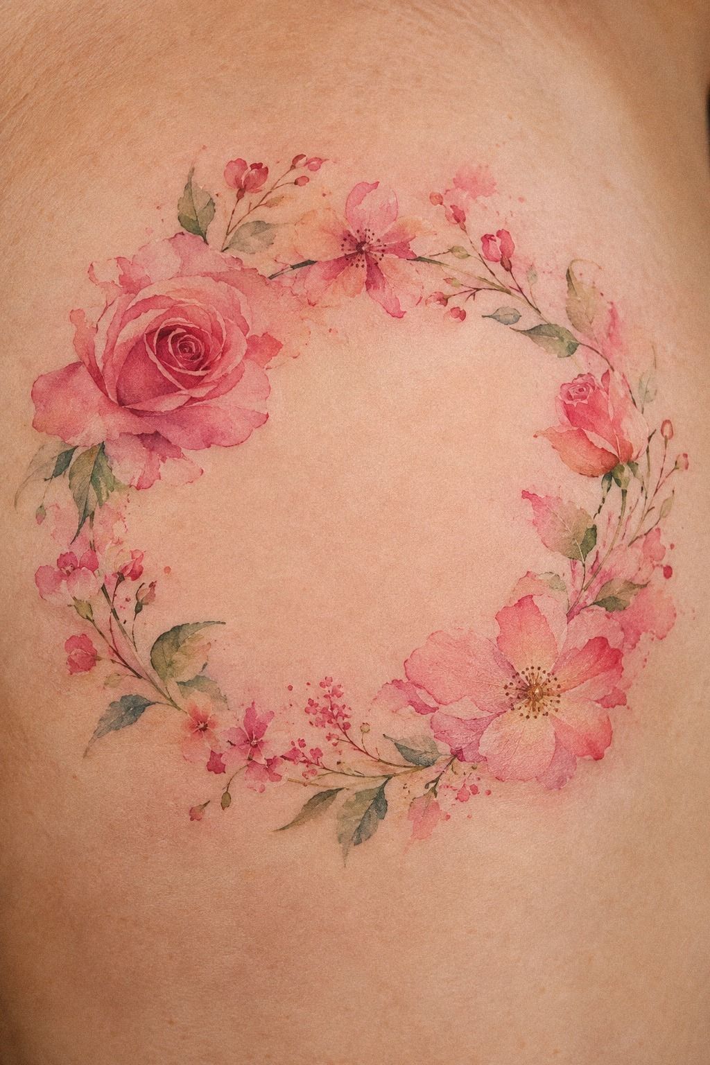
I considered collarbone placement as a second possibility, especially for an emerald, gold, and cream crown with a more visible presence. I eventually chose my wrist because the smaller placement felt more personal and easier to live with.
6Leaves Keep the Crown From Becoming a Wreath
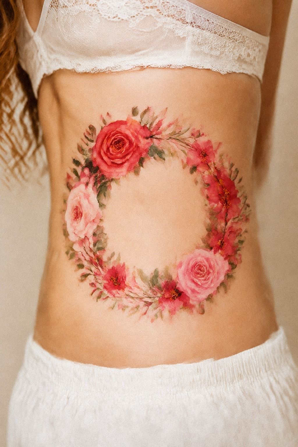
I added delicate leaves between each flower to connect the crown without making it look like a wreath. The forest-green, rust, and warm oak-brown tones made the leaf spacing especially important. The contrast could feel bold, even while the individual details remained fine.
On deeper skin tones, your artist should think carefully about value and contrast rather than simply adding brighter pigment. A solid black outline can help the structure stay readable, while the color wash creates the painterly effect around it.
My first version had too many leaves. They filled every gap and made the flowers compete, so I removed two before the stencil was finalized. That edit made the design more understated, and the remaining leaves began to guide the eye instead of interrupting it.
Ribs can move with every breath, which means rib movement matters during both the stencil check and the session. I took a few slow breaths while looking in the mirror. If you’re holding your body stiffly, you won’t see how the design will sit when you move normally.
The leaves also gave me a reason to connect the crown to these minimalist flower crown tattoo ideas. Minimal doesn’t mean empty. It means every mark has to earn its place.
7Bold Color or Quiet Wash?
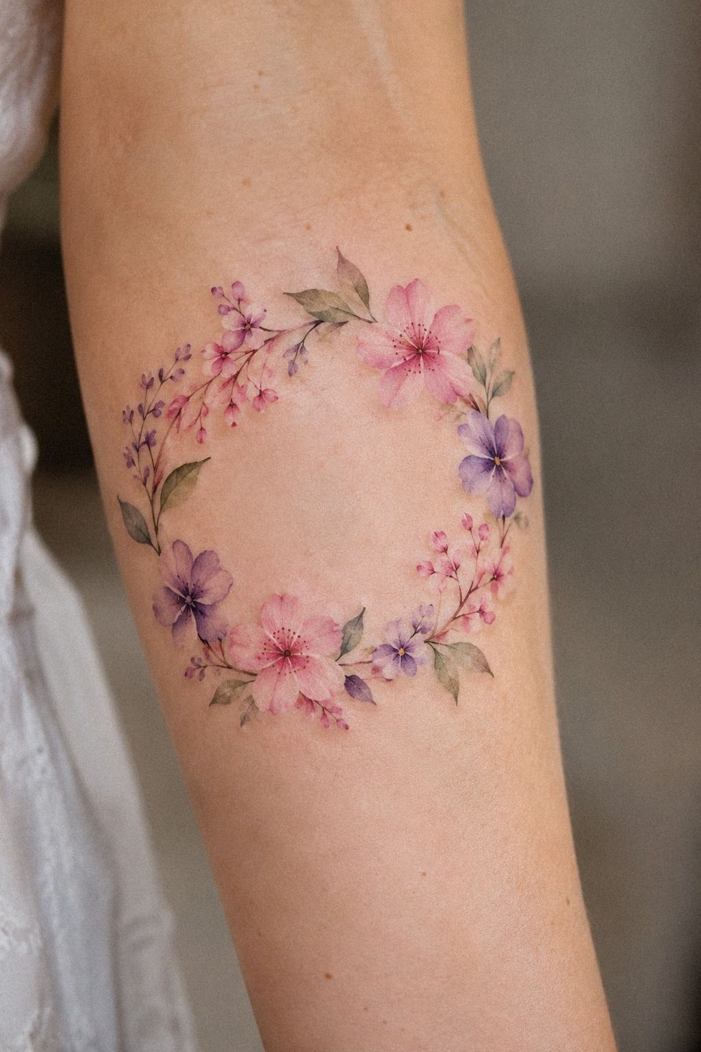
I compared bold and minimal color palettes before choosing the softer middle ground. The restrained wash made the design feel romantic without becoming sugary. I wanted color you could notice immediately, but not a piece that shouted across the room.
The saturated color option used dusty rose, charcoal, and warm brass tones. It looked daring on paper, though some of that intensity disappeared when I viewed the sketch at a natural arm’s length. The quieter version used diluted rose and gray, which aged more quietly but lacked the emotional lift I wanted.
I settled on a dusty rose pigment for the central petals and left the outer blooms lighter. That gives the crown depth without asking every area to carry the same weight. Your strongest color should usually have a clear focal job.
I didn’t choose the palest option just because it seemed safer. Watercolor tattoos need enough contrast to remain legible, and overly delicate color can fade into the skin. The better question is whether your design still reads when the surface shine is gone.
I used this fine line flower crown tattoo reference to compare how open skin changes the overall effect. The minimal examples looked crisp because they weren’t overloaded with pale details. That open-skin balance felt worth the tradeoff.
8Let Fine Lines Carry the Stems
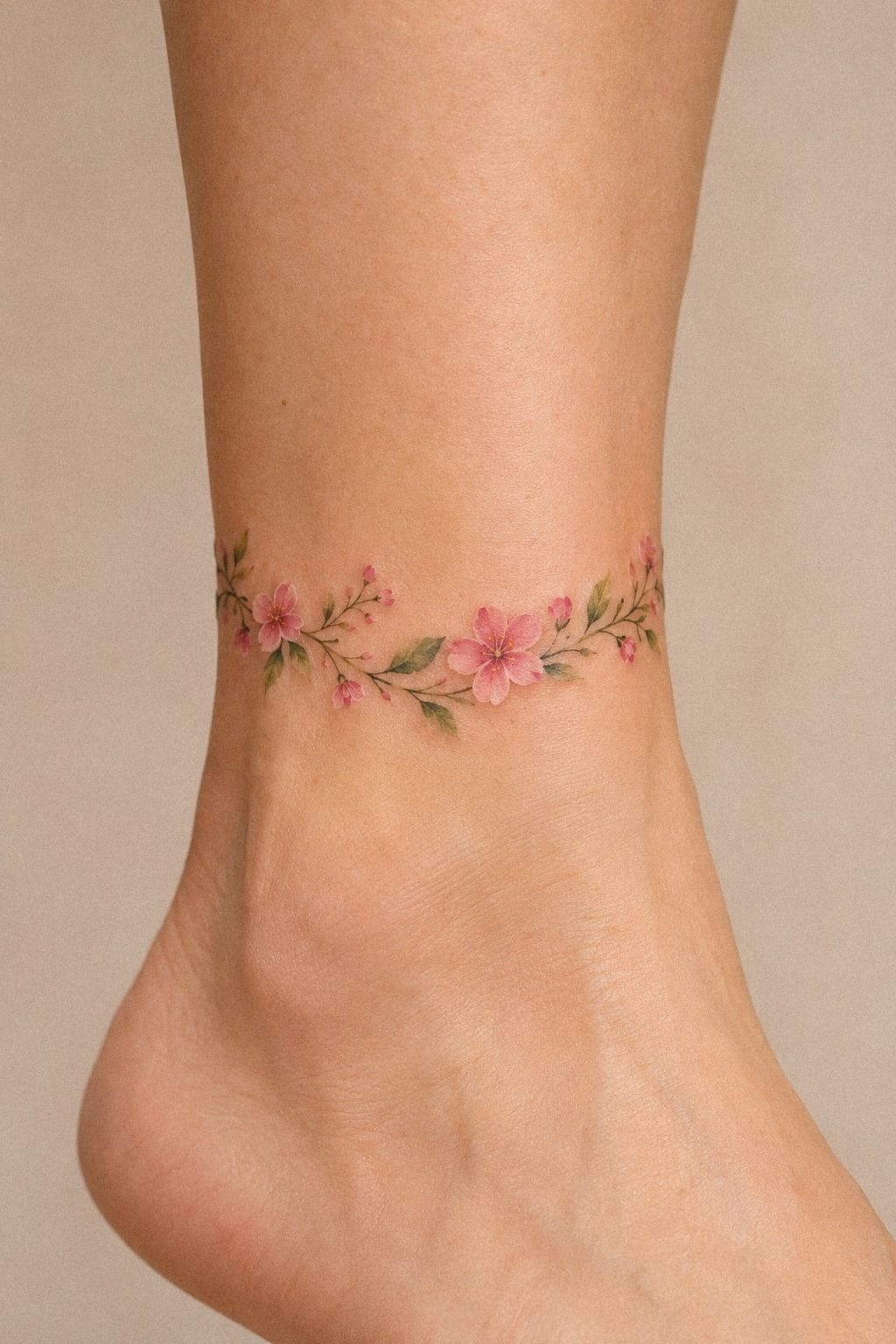
I chose fine linework for every stem because the stems were the quiet architecture of the crown. The central stem kept the design sleek, while the layered petals added softness. Without that structure, the color would have floated into disconnected spots.
Fine lines can soften or widen over time, especially when they’re packed too tightly or placed where friction is constant. That doesn’t mean fine-line work is fragile. It means your artist needs to protect negative space and avoid squeezing too much detail into a small area.
I asked for spacing between the closest stem and leaf lines where the design allowed it. The exact line spacing isn’t a universal rule, but the principle helped us keep the marks from merging. Your artist should explain those choices in a way you can understand.
The ankle is more exposed to socks, shoes, and movement than I first considered. I almost moved the design upward, but the placement still felt right because the linework stayed open. I wouldn’t put a dense miniature crown directly under a shoe seam.
The watercolor fine line flower tattoo guide helped me compare open stems with heavily outlined ones. I preferred the open stems because they gave the faded color a dependable frame.
9The Ankle Version I Left Behind
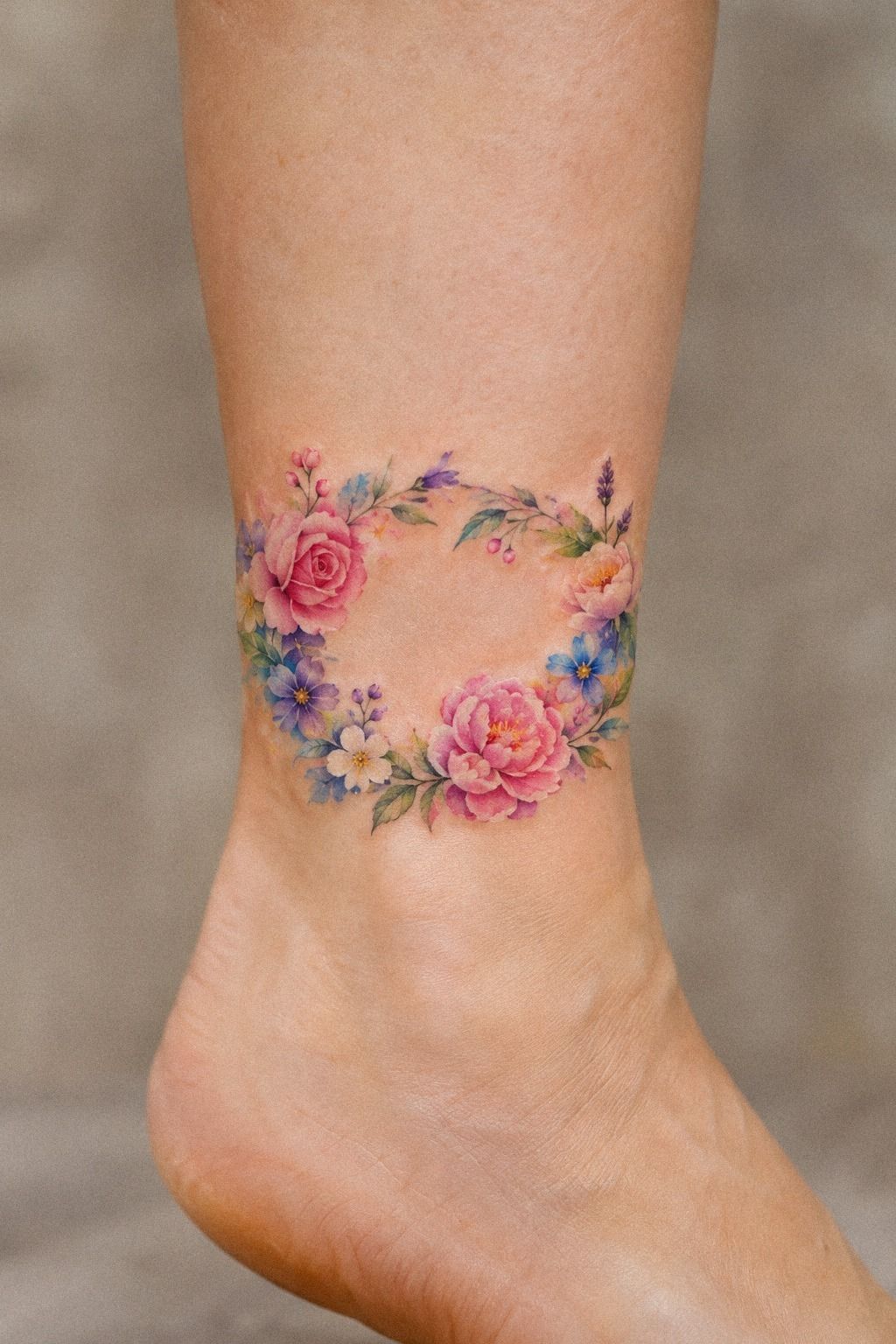
I planned meaningful flowers around my ankle because I wanted the placement to feel like a private marker rather than a constant display. A midnight-blue, copper, and ivory palette made that version feel sacred, but the friction from socks and shoes ultimately changed my mind.
10What the Color Looked Like While Healing
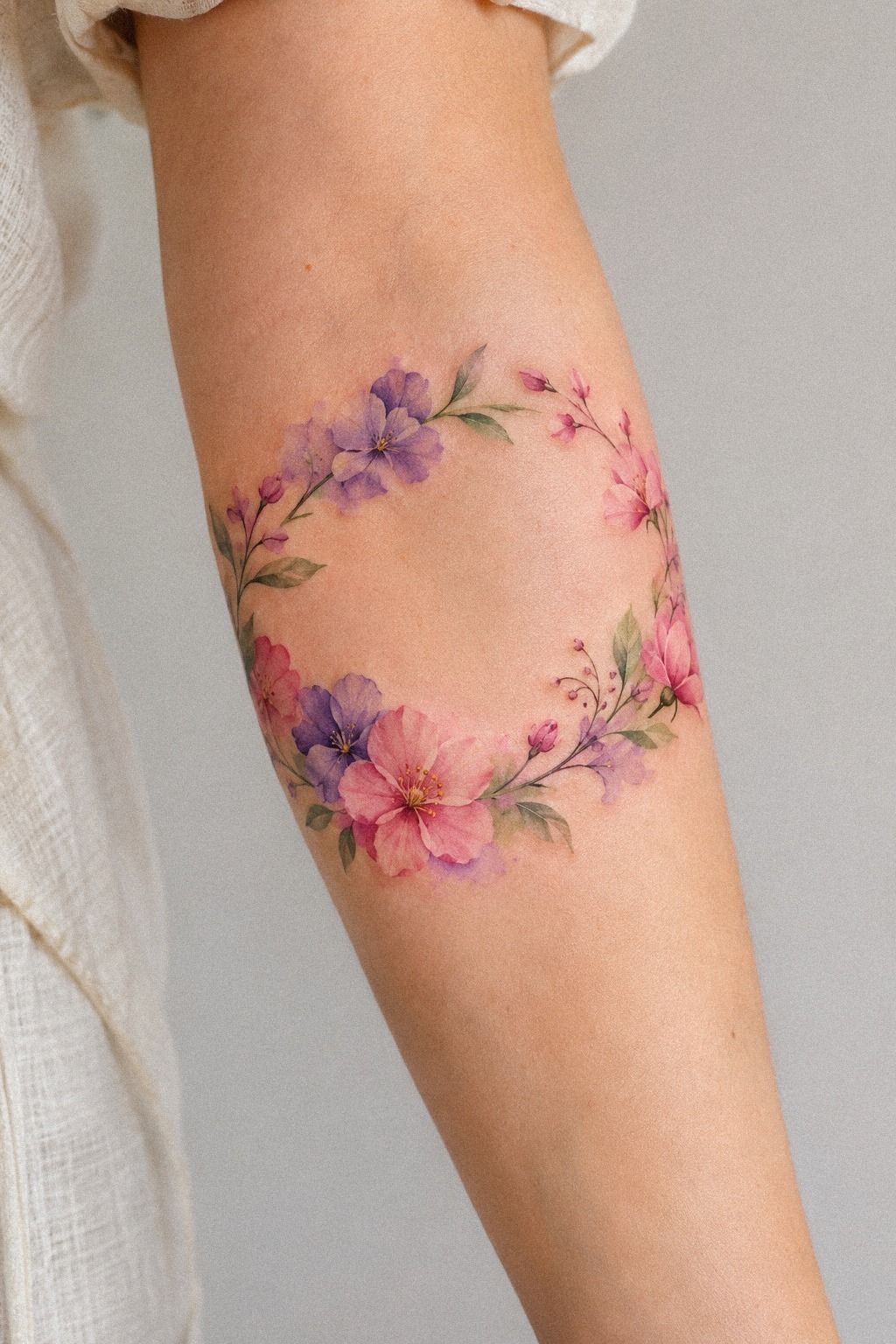
I prepared for colorful tattoo healing by accepting that the fresh version wouldn’t be the finished version. The healed design looked quieter, with softened edges and a sage-green, warm-cream, and natural-brown palette that settled into a more natural relationship with my skin.
The surface commonly settles over about two to three weeks, while complete healing can take roughly two to three months. During that healing window, I followed simple care: gentle washing, light moisturizing, and no swimming or direct sun. You don’t need a complicated routine, but you do need consistency.
I used a fragrance-free lotion in a thin layer and avoided picking at flakes. The first week was less dramatic than I expected, although the color looked cloudy for a while. That temporary haze can make you worry, but the surface needs time to settle.
I kept the tattoo covered from strong ultraviolet exposure once the skin was closed. UV exposure can fade color, and watercolor-style washes often show that loss sooner than heavier blackwork. If you’re outside, use appropriate sun protection only after the area has healed.
The delicate flower crown tattoo ideas helped me compare healed compositions rather than fresh, glossy ones. I wanted to judge the design by its readable shape, not its first-day brightness. That patience made the investment feel more worthwhile.
11My Finished Watercolor Crown on Skin
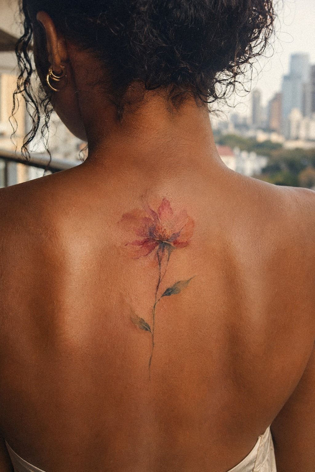
I reviewed my finished watercolor flower crown on the spine as another placement reference because a vertical design can stretch without losing its softness. The terracotta, stone, and olive colors still felt balanced there, although I preferred the smaller wrist version.
The Three-Part Aging Rule
My watercolor flower crown held up because three choices supported one another: readable linework, controlled color, and enough open skin. I call that the three-part aging rule because removing any one part changes the result. A colorful tattoo can be timeless, but only when the structure remains visible after the surface settles.
The first part is contrast. Black or deep pigment gives your eye an anchor.
The second is spacing. Fine lines need room, especially around small petals. The third is placement.
Areas exposed to friction and ultraviolet light need more care, and moving skin can change how a design reads.
I used to think aging well meant choosing the darkest possible tattoo. That wasn’t right for my design. A pigment boundary mattered more than maximum saturation, and the lighter washes worked because the stem and focal flower stayed clear.
If you’re deciding between a more colorful crown and a blackwork version, ask which details must remain after several years. Then let those details receive the strongest contrast. This watercolor fine line flower tattoo guide is useful when you’re comparing open designs with heavier outlines.
Linework Over Saturation
I chose linework over saturation when the two options competed. A bold wash can feel powerful on appointment day, but heavy color may hide the small petal breaks that make a flower crown recognizable. I wanted the design to remain expressive without turning every bloom into one dense shape.
My artist kept the central contour crisp and softened the outer color. That gave the tattoo a polished center with a looser edge. The result still feels painterly, but it has enough definition for someone to understand the flowers at a glance.
Watercolor doesn’t need to imitate a painting in every detail. Skin isn’t paper, and a tattoo has to live through movement, sunlight, and time. You can preserve the mood of watercolor while using a stronger structure underneath.
I wouldn’t remove all outlines to make a design look more delicate. A few well-placed lines can be the reason your tattoo still reads later. That balance is where the expressive color wash earns its place.
For another comparison, I used this fine line flower crown tattoo reference. It made the difference between soft color and disappearing color much easier to judge.
How Much It Cost
The typical US cost for a small watercolor flower crown tattoo varies by artist, region, detail, and minimum charge. A small piece may fall around $100 to $300, while a studio minimum can sit near $50 to $100 and hourly rates often land around $100 to $250.
My appointment stayed within the small-piece estimate because the crown used one main flower, limited color, and a short session. I didn’t treat the lowest quote as the best value. A healed portfolio mattered more to me than saving a small amount upfront.
Ask whether the quote includes the consultation, stencil changes, and touch-up policy. You should also ask how the artist handles watercolor designs on your skin tone. Those answers will tell you more than a polished social post.
The final price isn’t the only cost to consider. You may need time away from swimming, strong sunlight, or tight clothing while the surface heals. Plan for that practical part too, and you’ll know whether the tattoo fits your budget.
If you’re still comparing styles, this watercolor flower tattoo meaning guide can help you decide which details deserve the time and pigment.
The Placement Tradeoff
I went back and forth on placement because every location changes the tattoo’s visibility, pain, and aging pattern. The forearm, thigh, and shoulder are often more tolerable, while ribs, feet, hands, and sternum can feel sharper because of bone, movement, or thin coverage.
My wrist won because I could see the crown without making it the first thing everyone noticed. The tradeoff was friction from sleeves and regular hand movement. A smooth healed surface depends partly on how well you protect it during the early weeks, but daily movement still influences wear.
If you want privacy, the ankle or inner forearm may suit you better. If you want the flowers to stretch and breathe, the collarbone or shoulder can give you more surface. Your best placement isn’t the one that looks most dramatic.
It’s the one you can live with in ordinary motion.
And yes, I still notice mine when I wash my hands. That small flash of color has become reassuring rather than distracting.
A tattoo can be sacred without being solemn, and mine feels quietly connected to the person I was when I chose it. Worth it!
The delicate flower crown tattoo ideas were helpful when I compared private placements with more visible ones.
The Questions I Get Asked Most
How much does a watercolor flower crown tattoo usually cost?
A small watercolor flower crown tattoo usually costs about $100 to $300 in the US, though studio minimums may be $50 to $100 and hourly rates often range from $100 to $250. Artist quality and healed work matter more than choosing the lowest quote.
– Size and placement – Color density – Artist experience – Regional studio rates
Are watercolor flower crown tattoos a good idea for a first tattoo?
Yes, watercolor flower crown tattoos can work well as a first tattoo when the design has clear lines and a manageable placement. A forearm, thigh, or shoulder is often more tolerable than ribs or feet. Personal symbolism also makes the choice easier to live with.
– Clean linework – Moderate size – Meaningful flowers – Comfortable placement
How do I choose a tattoo artist for a watercolor flower crown tattoo?
Choose an artist with healed portfolio work, clear linework, and examples of color work on varied skin tones. Ask about studio hygiene and how they protect small details. Healed results tell you more than a fresh tattoo viewed under bright lights.
For more comparison, I liked this watercolor fine line flower tattoo collection. Good references make it easier to judge whether an artist’s style is worth the cost.
How much do watercolor flower crown tattoos hurt?
Pain depends on placement, personal tolerance, and session length. Ribs, feet, hands, and sternum are often more painful, while the forearm, thigh, and shoulder tend to be more tolerable. Placement comfort can help you stay relaxed during detailed linework.
– Bone-heavy areas – Skin movement – Session duration – Individual sensitivity
How long does a watercolor flower crown tattoo take to heal?
The surface usually heals in about two to three weeks, while complete healing can take roughly two to three months. Wash gently, moisturize lightly, avoid swimming, and protect the healed tattoo from strong sun. Consistent aftercare supports a cleaner result.
– Gentle washing – Thin moisturizer – No picking – UV protection after healing
The delicate flower crown tattoo ideas also helped me think about how open details behave after healing.
What’s the best placement for a watercolor flower crown tattoo?
The inner forearm is a strong choice for visibility and readable linework, while the shoulder gives a larger crown more surface. An ankle can feel more private but faces more friction. Open skin and manageable movement should guide your decision.
I also compared these minimalist flower crown tattoo ideas before choosing. Good placement is often the difference between a design that feels merely stylish and one that feels truly personal.
Where I’d Start First
If I had to pick one, I’d start with the inner forearm. You can see the design, protect the healing skin, and give fine lines enough space to breathe. Pin the idea for later, then choose the flowers that still mean something when the color softens.
That was the moment!