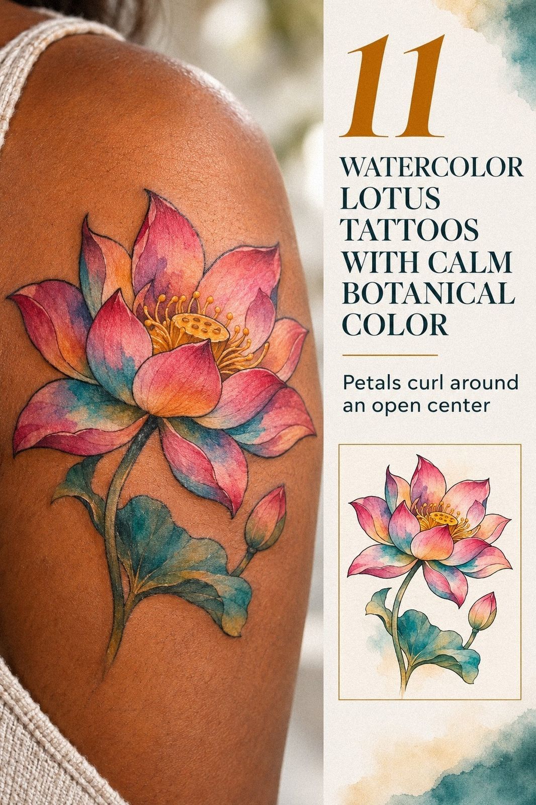
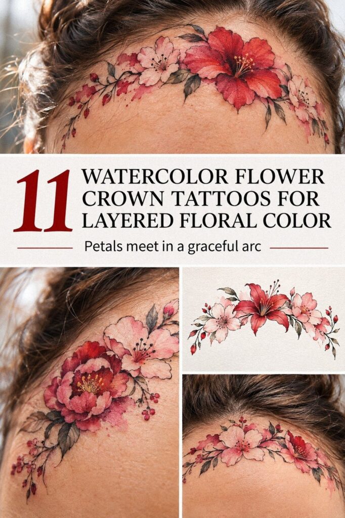
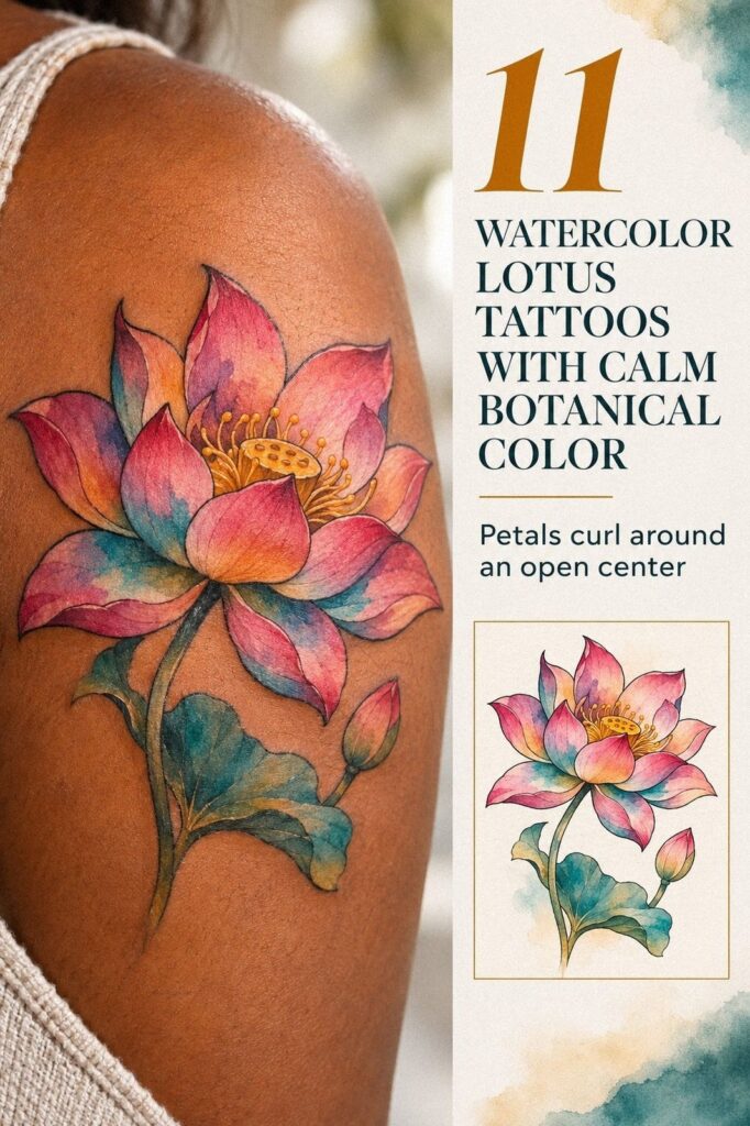
Watercolor rose tattoos can look striking without taking over your whole identity. I chose one at 30, after comparing healed work, skin tones, and a few delicate sketches that felt too loud. The finished rose stayed personal, visible only when I wanted it to. That choice mattered.
Editor’s note: Start with the silhouette, not the trend. A watercolor rose tattoo is worth the cost only when the shape, color, placement, and meaning still feel right after the first excitement fades.
- I Chose My First Watercolor Rose Tattoo: The Single Rose Rule
- Which Small Watercolor Rose Tattoo Sketch Still Feels Like Me?
- I Matched Rose Colors to My Skin: Coral or Berry?
- The Three-Layer Meaning Test Made the Rose Personal
- Fine Line or Heavy Shading? I Chose Fine Line
- I Placed the Rose Along My Forearm: The Quiet Visibility Test
- I Added Three Leaves Around the Watercolor Rose
- Which Unique Watercolor Rose Tattoo Idea Survived the Contrast Check?
- I Prepared for the Tattoo Session with a Simple Routine
- I Followed My Rose Tattoo Aftercare: Fresh to Healed
- How Will My Watercolor Rose Tattoo Age?
1I Chose My First Watercolor Rose Tattoo: The Single Rose Rule
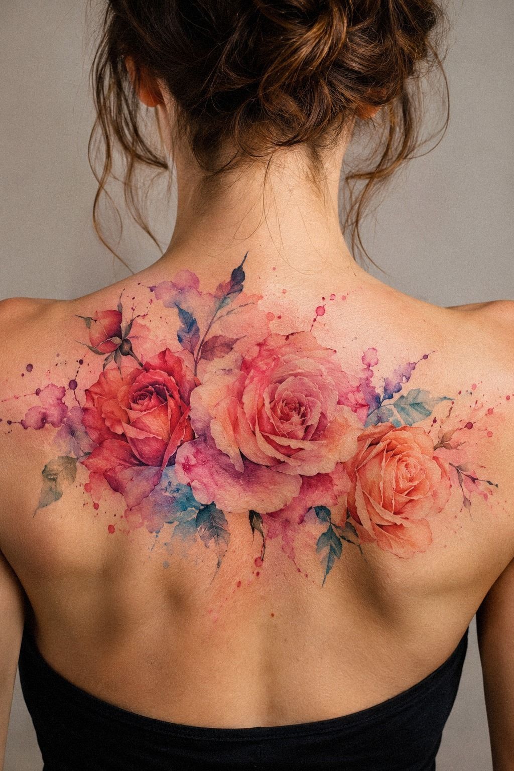
Before booking, I had a patch of blank skin on my forearm that I’d been saving for the right idea. It wasn’t damaged or marked. It was simply untouched, and that made the decision feel bigger than choosing a picture from a flash book.
I wanted something meaningful, but I didn’t want a giant symbol that would explain my life before I had spoken.
I kept returning to rose shapes because they could be timeless without feeling predictable. The profile view had a clear silhouette, layered petals, and enough open skin around it to keep the design readable. I didn’t want a crowded bouquet.
I wanted one rose, a few short leaves, and color that could stay understated when my sleeve covered it.
My first decision was restraint. I chose one rose in profile, with layered petals opening toward my wrist and a short stem following the natural direction of my forearm.
The design felt symbolic without looking like a logo. I asked for a clean outer contour, loose color around the petals, and no extra flowers competing with the center.
The artist showed me a single-rose stencil before the color began, and I studied it while moving my wrist. That small test changed the placement. At one angle, the bloom looked graceful.
At another, the stem seemed to point toward my elbow. I didn’t want the rose sliding sideways, so we rotated it slightly.
I kept the design close to three inches because a smaller version would have lost the petal spaces. If you’re comparing first sketches, save examples from our watercolor floral tattoos collection, but pay attention to healed photos, not only fresh color. Fresh ink can look vibrant while hiding weak structure.
2Which Small Watercolor Rose Tattoo Sketch Still Feels Like Me?
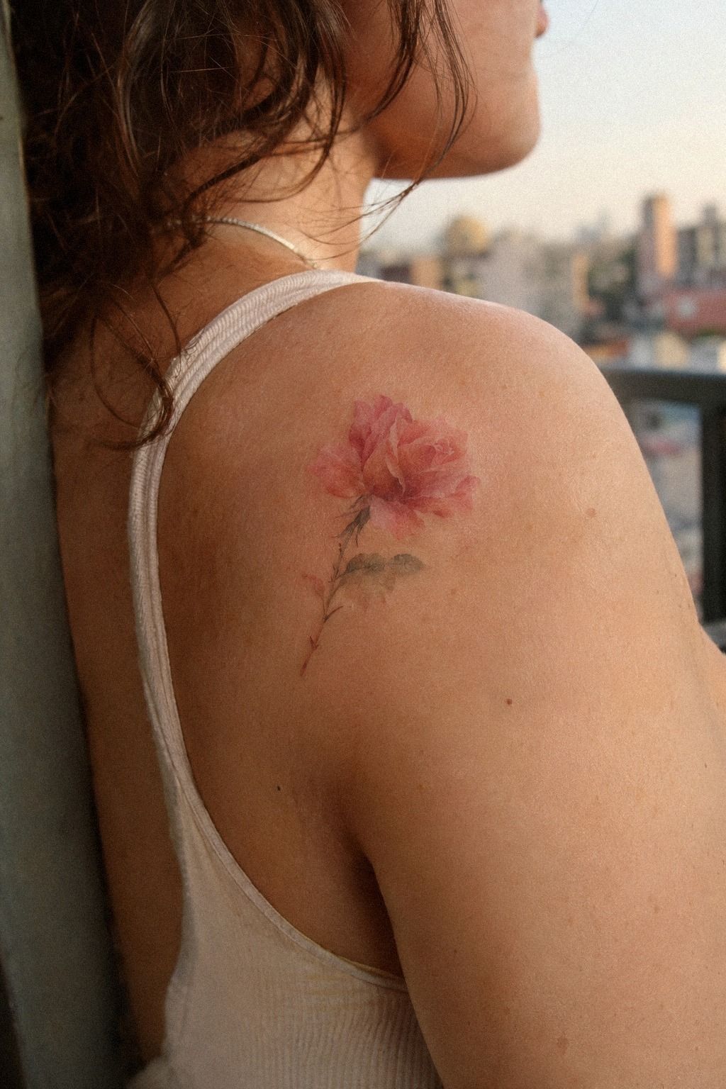
I compared small watercolor rose tattoos on paper before choosing the final outline.
3I Matched Rose Colors to My Skin: Coral or Berry?
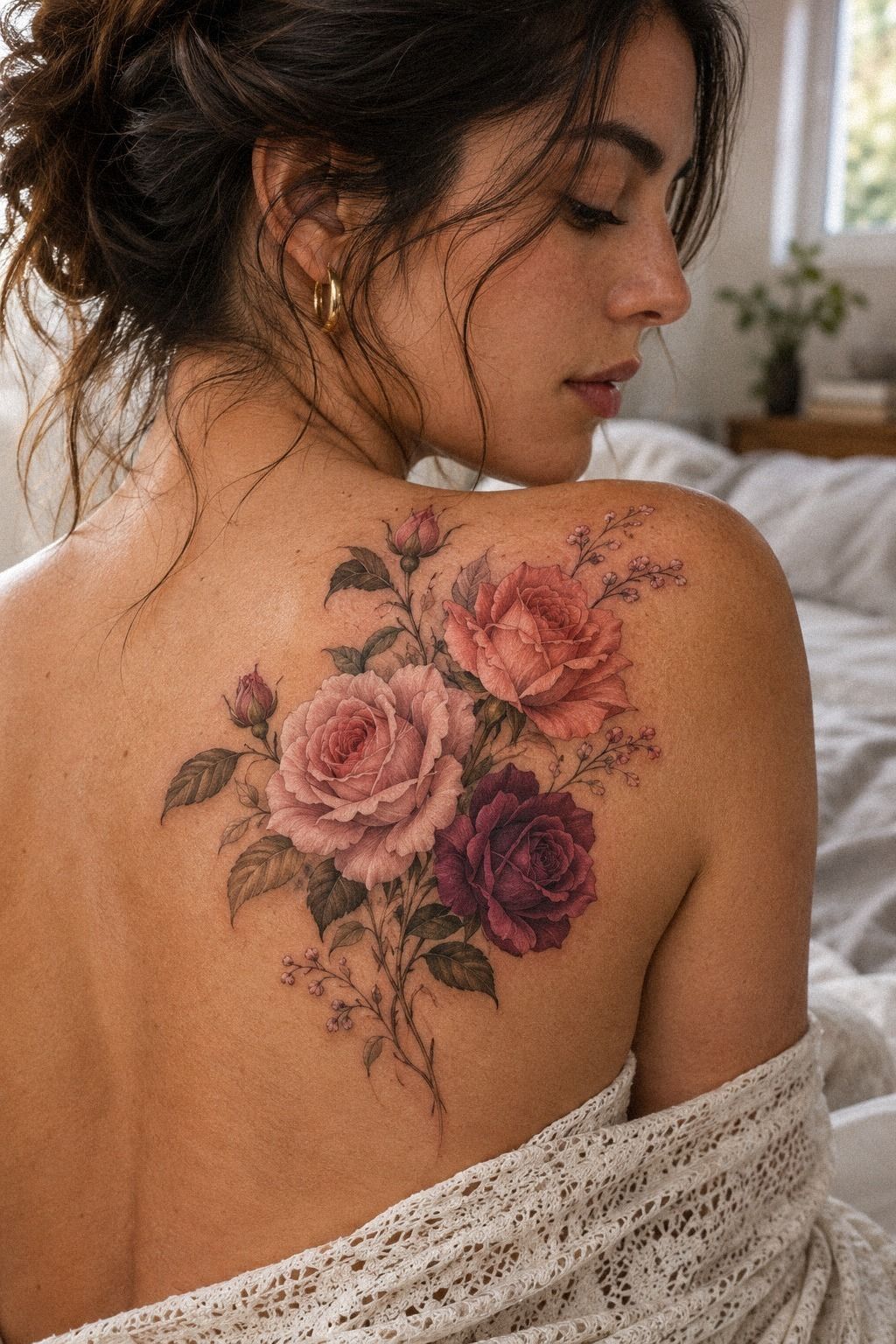
My upper arm has medium olive skin, so I didn’t copy the bright red-and-pink palette I’d first saved. I tested plum beside cool gray and a restrained rose-gold accent, then looked at all three under daylight. The plum became romantic against my undertone, while the gray looked more edgy and graphic.
I chose a rose wash moving from deep plum to soft gray, with a small amount of rose gold near the outer petals. That blend gave the profile more depth without making it heavy. I skipped pale yellow because it nearly disappeared on my skin during the color test.
Your color needs contrast, but it also needs to look like it belongs to you. Why settle for a shade that only works in an artist’s portfolio? I asked to see healed examples on several complexions before booking.
The minimalist rose tattoos gallery helped me compare restrained color and open skin.
I kept the leaves in a deep gray rather than a soft gray. That stronger edge gave the rose a powerful anchor beside the cooler petals.
The result wasn’t loud. It was elegant, and that was exactly the point.
4The Three-Layer Meaning Test Made the Rose Personal
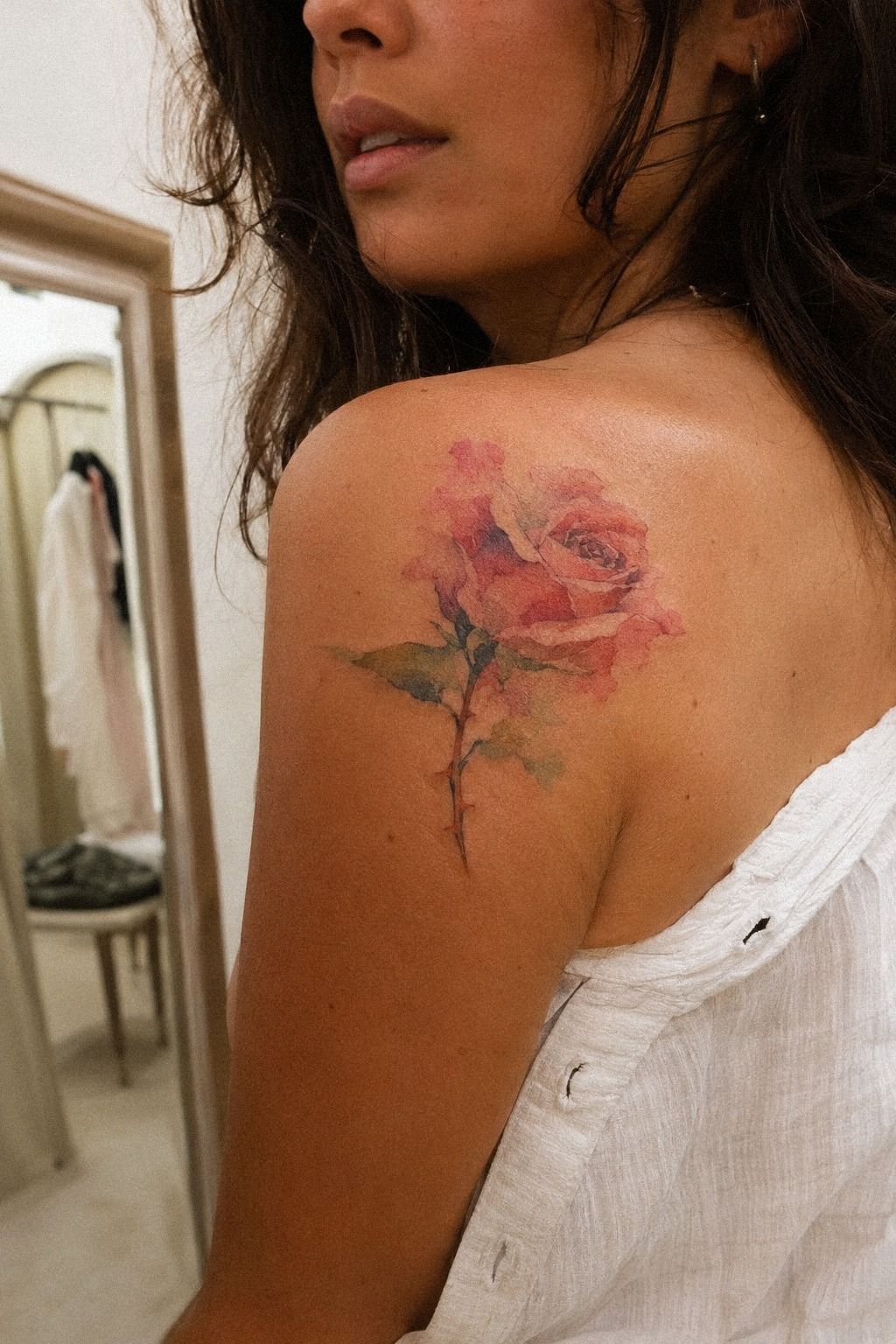
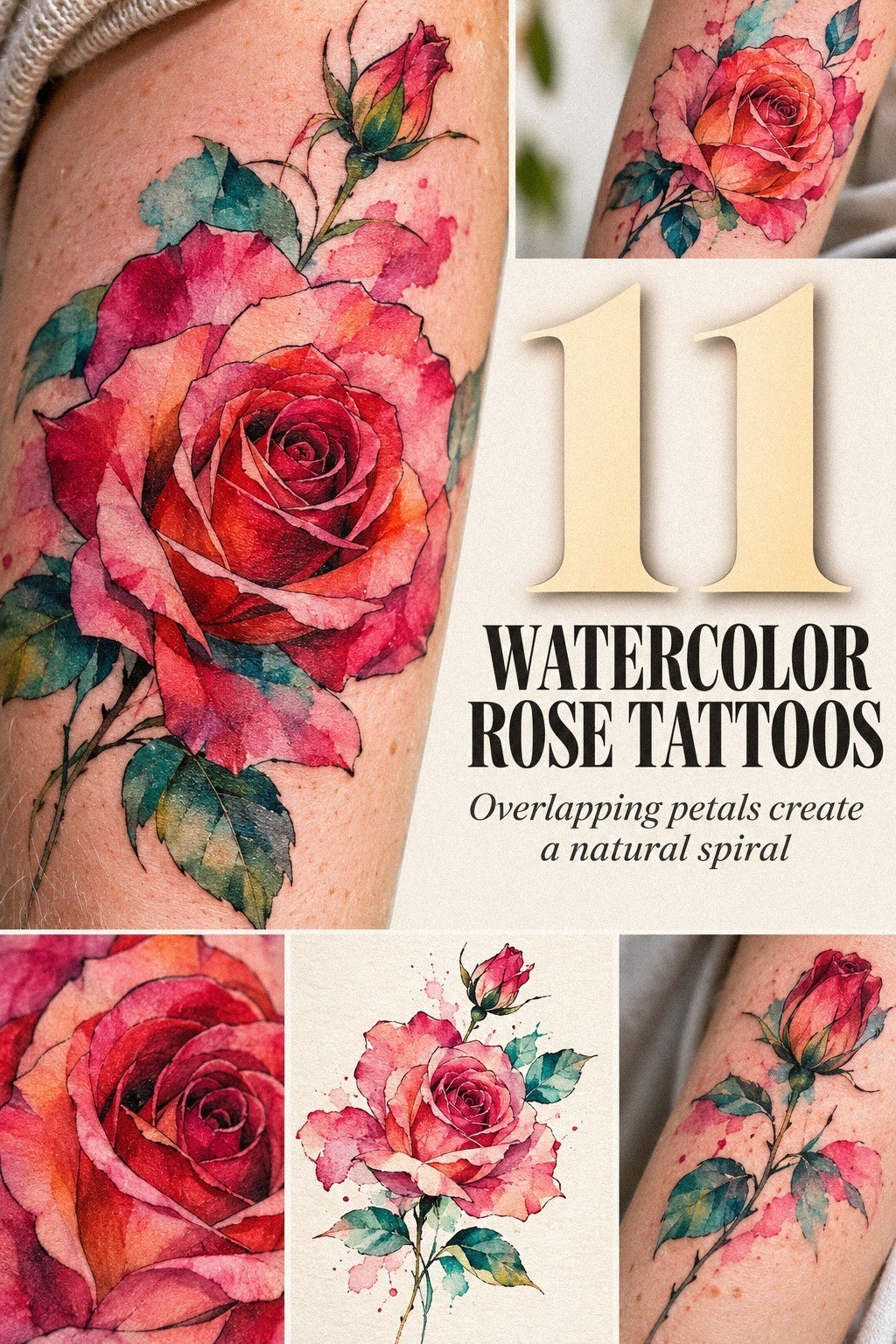
I didn’t want to attach a dramatic story to a rose just because roses already carry familiar meanings. I wrote down three things the tattoo needed to hold: a person I wanted to remember, a season of change, and my decision to stop waiting for a perfect occasion. That made the design personal instead of decorative.
The bloom became a reminder of tenderness with boundaries. The closed side of the profile felt sacred to me, while the open petals suggested a choice to be seen.
I rejected a dagger, a date, and a long quote. Those additions would have made the tattoo more literal, and literal wasn’t what I wanted.
My artist helped me test a tiny initial beneath the stem, but I removed it the next day. The rose already carried the story.
If you’re choosing among rose sleeve tattoos for women, ask whether each extra mark adds meaning or merely fills skin. I wanted the final piece to stay personal, even when nobody knew the backstory.
The best symbol was the one I could explain in one sentence and still feel something afterward. Mine wasn’t an announcement. It was a quiet promise, and that made it empowering.
5Fine Line or Heavy Shading? I Chose Fine Line
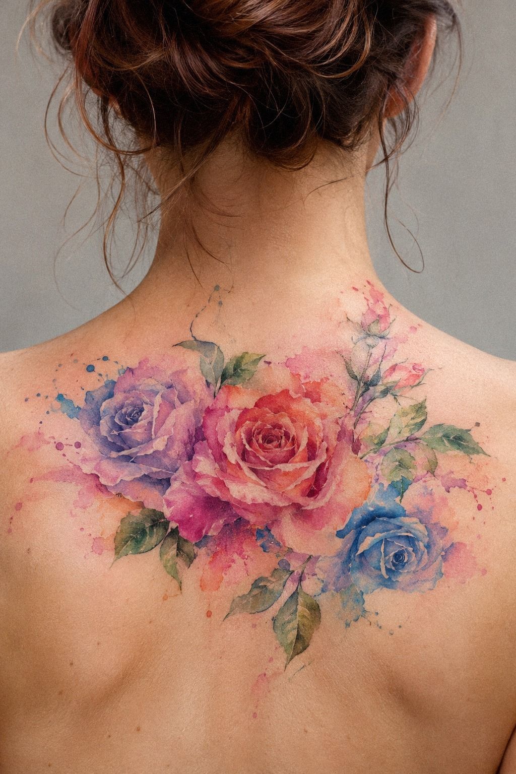
The fifth planning decision was how much structure the rose needed. I chose fine-line structure with open petal spaces instead of heavy shading.
6I Placed the Rose Along My Forearm: The Quiet Visibility Test
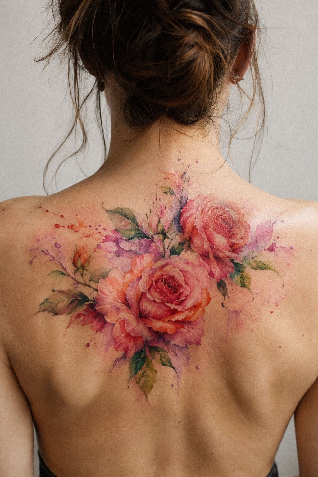
I tested the forearm placement with a washable marker, then wore a long sleeve for an afternoon. With my arm down, the tattoo disappeared.
When I rolled the sleeve back, the bloom appeared in one clean movement. That balance was sleek, and it matched the way I wanted to control its visibility.
My forearm was also a practical choice. The area generally feels more tolerable than ribs, feet, hands, or sternum, while the shoulder and thigh are often easier zones for many people.
Pain varies, so I didn’t treat a chart as a promise. I asked the artist about the exact spot, skin tension, and session pace.
The direction mattered as much as the location. I wanted the rose following my arm rather than pointing across it. That kept the design sharp from the side and made the stem feel intentional.
I avoided placing the bloom directly over the wrist because constant movement could have made the narrow stem look unsettled. I measured the stencil from several angles before agreeing. If you’re still weighing visibility, compare the rose sleeve tattoo meaning examples for ways a rose can stay bold without becoming the whole composition.
My placement feels understated until I turn my arm. That small reveal is one reason the design still feels like mine.
7I Added Three Leaves Around the Watercolor Rose
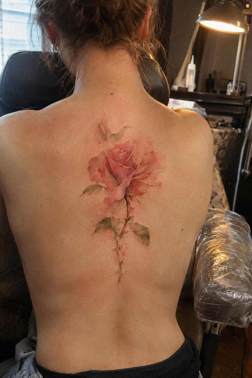
I added three leaves around the rose, but I kept them unequal. One leaf bends away from the bloom, one points down, and the smallest tucks behind the stem. That irregular rhythm looked more organic than a mirrored arrangement, and it kept the tattoo from resembling a sticker.
The leaves also gave the color a resting place. Without them, the rose looked feminine and soft in a way that didn’t quite feel like me. With charcoal leaves and a dusty-rose accent, the whole design became more balanced.
I still skipped thorns because the sharp shapes made the piece feel defensive rather than honest. Your leaves need visible skin between them, especially along the spine or any area that bends during movement. The artist kept mine short and clean.
I wouldn’t add extra foliage just because the surrounding skin looks empty. Empty skin is part of the composition. The black rose tattoos collection showed me how a darker accent can create an iconic outline without turning every leaf into a solid block.
8Which Unique Watercolor Rose Tattoo Idea Survived the Contrast Check?
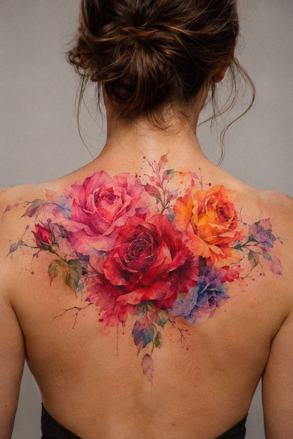
I reviewed unique watercolor rose tattoos with different levels of color, line weight, and symbolism. One design used warm-white petals and almost no outline. Another used a black contour with a camel wash.
A third paired the rose with a tiny moon. I kept returning to the second because it looked bold without losing the flower’s softness.
I compared the mockups with my actual skin instead of trusting a screen. That exposed a problem I hadn’t noticed in saved examples: a very pale rose looked ethereal online, but it nearly vanished against my undertone. The stronger black contour gave me the contrast I needed, so I kept the outline and softened the saturation.
What makes a tattoo feel unique isn’t always an unusual subject. Sometimes it’s the decision to stop at the right point.
I removed the moon, the script, and a cluster of dots. Your design can still be whimsical without collecting every idea you like.
I looked through small floral tattoos again and paid attention to negative space. The final rose felt stylish because it had a clear edge, not because it had the most elements.
9I Prepared for the Tattoo Session with a Simple Routine
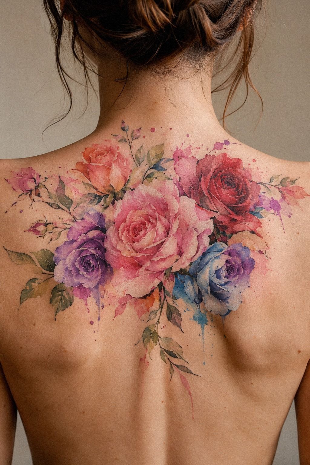
I prepared by choosing comfortable clothes, eating beforehand, and bringing water. That simple session routine helped me arrive focused.
10I Followed My Rose Tattoo Aftercare: Fresh to Healed
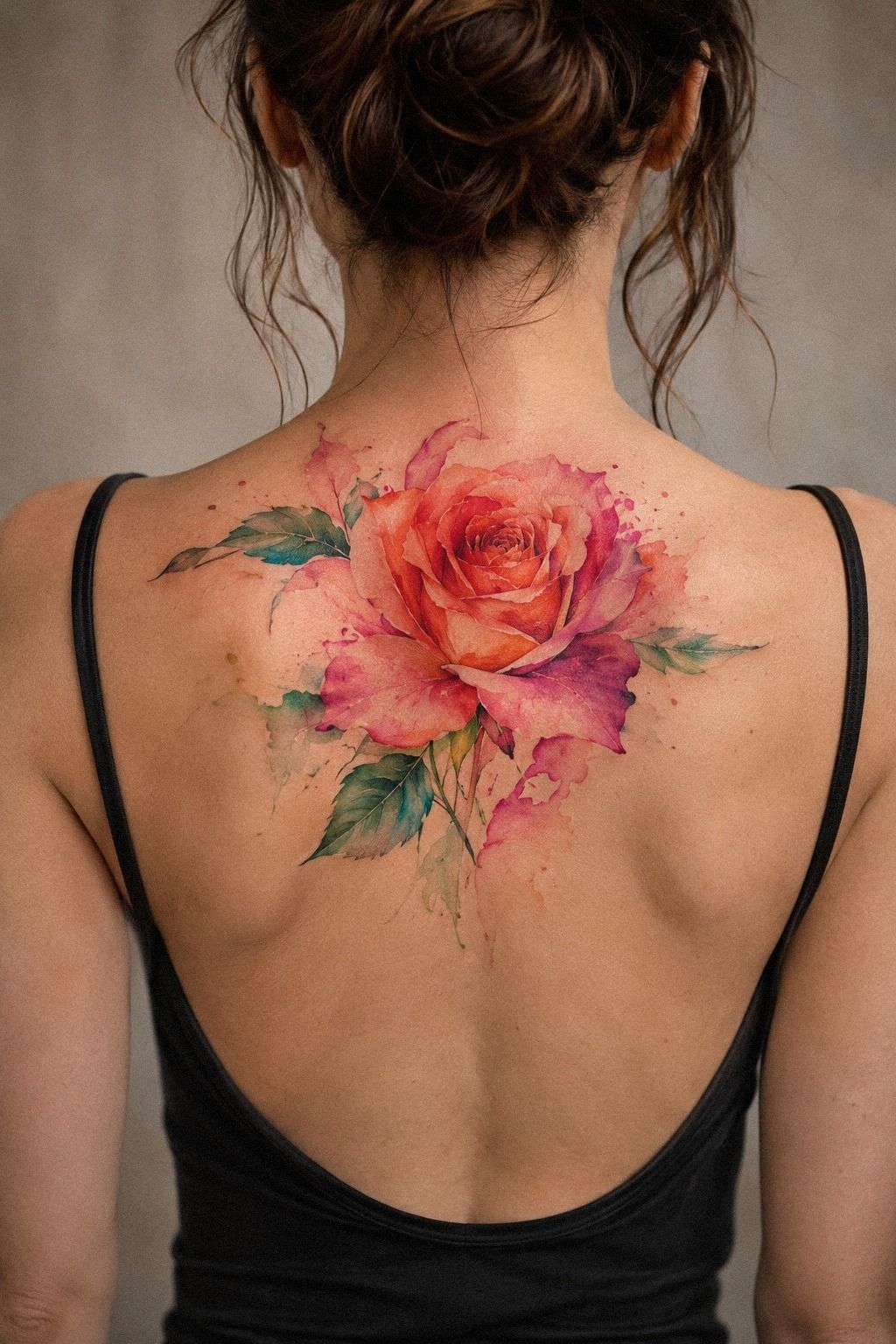
I followed the studio’s instructions instead of building my own complicated routine. I washed gently, dried the area without rubbing, used a light layer of the recommended moisturizer, and avoided soaking it.
I also kept direct sun away from the healing skin. Your aftercare should be boring.
Boring is good here.
The surface usually settles in about two to three weeks, while complete healing can take roughly two to three months. I didn’t judge the color during the flaky stage because the skin looked dull and uneven. My healed watercolor tattoo needed time before I decided whether anything had changed.
I didn’t pick at the peeling skin, even when one petal looked rough. That was harder than expected!
The delicate rose tattoos references reminded me to focus on structure, not the temporary surface. The aftercare period felt gentle only after I stopped staring at it every hour.
The color changed gradually. The plum wash looked quieter, the contour became less startling, and the petals settled into my skin.
That shift wasn’t a flaw. It was part of the process.
11How Will My Watercolor Rose Tattoo Age?
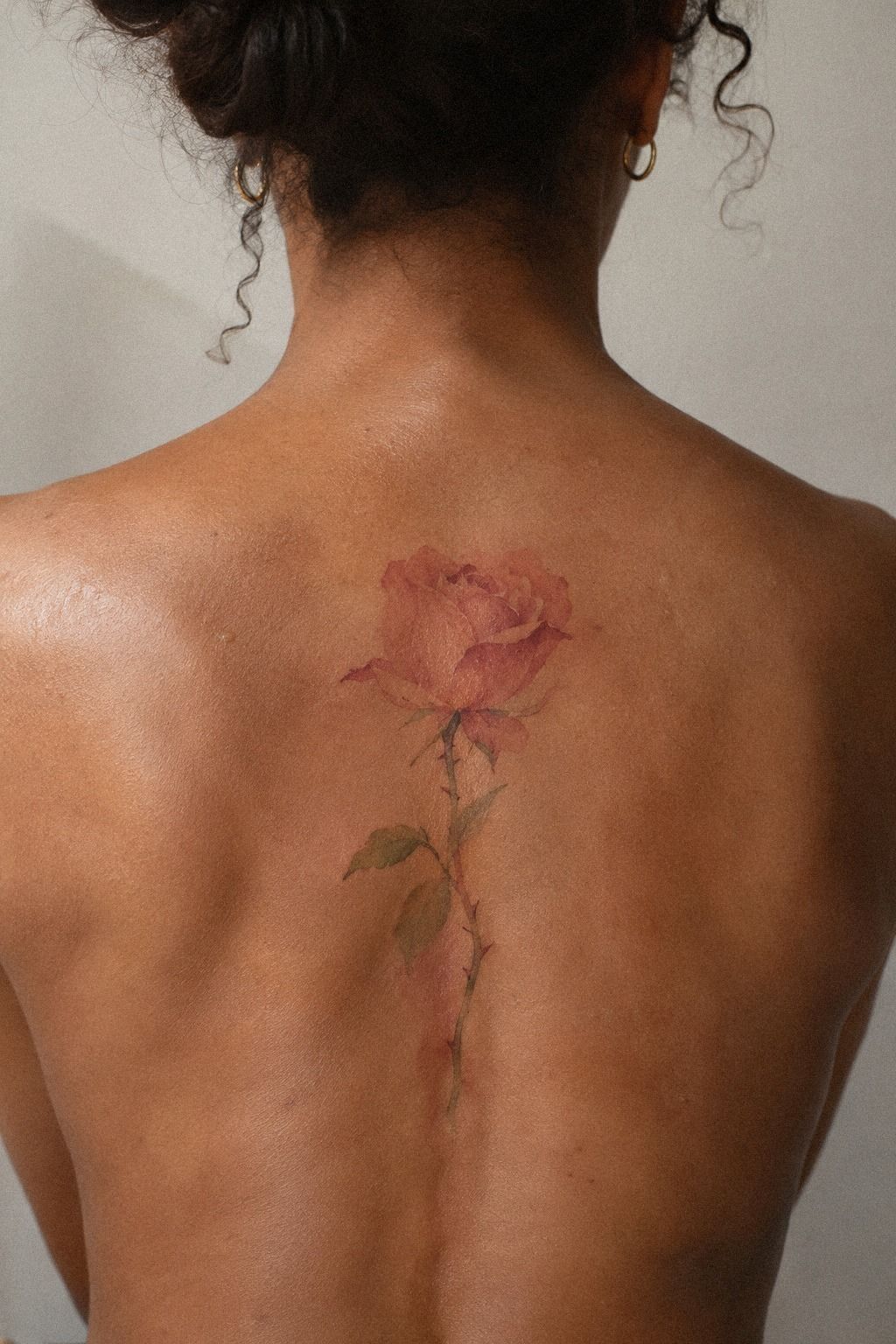
I watched my tattoo settle as the terracotta wash softened, the stone-gray dilution became subtler, and the olive notes continued to support the shape. That contrast made the rose look gritty in a good way, less like a fresh illustration and more like something that belonged to me.
Fine lines can widen as tattoos age, especially when they sit too close together or receive heavy sun exposure. I knew that before booking, but seeing the process made the information more real. Black structure generally ages more reliably than pale, isolated color.
I don’t expect the tattoo to look frozen at twenty years old. Skin changes, color softens, and the design becomes part of me. Still, sunscreen after healing, sensible placement, and an artist who understands spacing can help.
Your rose should be classic in its construction, not dependent on perfect freshness.
The final result is visible when I choose to roll up my sleeve, but it remains private most days. That control is why I kept the piece fierce and small enough to live with.
The Small Details That Changed the Final Result
The rose improved when I stopped treating every detail as equally important. The outer contour, petal spacing, and color contrast mattered more than extra dots or a second flower. That was the most understated lesson in the process.
I also learned that a small tattoo can still have presence. The strongest details were the ones I could understand instantly: one profile, three leaves, a dark edge, and a restrained wash. The watercolor floral tattoos examples helped me see how much clarity comes from leaving marks out.
When a More Minimal Design Has More Value
I nearly added a moon, lettering, and another leaf because the bare skin made the design seem unfinished. Then I looked at the price of each extra decision in visual weight. A minimal tattoo isn’t automatically cheaper, but it can offer better value when every mark has a reason.
The cleaner option also gave the artist more space to work carefully. That made the investment feel worthwhile. If you’re comparing minimalist rose tattoos, ask whether the design will still read clearly after the fresh saturation fades.
What I Learned About Color and Contrast
The palest version was pretty, but pretty wasn’t enough. I needed the rose to remain visible on my skin without becoming loud. The muted color shift gave the design a haunting quality in certain light, while the darker contour protected its shape.
That is why I asked about healed color instead of judging a new tattoo. A healed portfolio tells you more about saturation, spacing, and the artist’s judgment than a freshly completed tattoo.
A Private Tattoo Can Still Be Daring
Keeping the rose covered most days did not make the decision timid. It made the reveal intentional. I can show it at dinner, cover it for work, or leave it unseen when I don’t want questions.
That control feels romantic to me because the tattoo remains connected to my own choice.
A design does not need to be public to be powerful. The rose tattoo meaning ideas helped me separate symbolism from performance. I wanted the rose to speak when I invited it to.
How Much My Watercolor Rose Tattoo Cost
Tattoo pricing varies by artist, region, size, placement, and session length. I asked for a written quote before booking because watercolor rose tattoos can involve both fine-line precision and layered color. A studio minimum may apply even when the design is small, and an hourly rate may matter more for a detailed rose.
I didn’t pretend a small tattoo would automatically be cheap. The artist’s time, drawing preparation, hygiene, and color decisions still matter.
My budget question was simple: what can I afford without choosing a less experienced artist? That answer led me toward a smaller, polished design with enough space to heal clearly.
If you’re comparing quotes, ask what the cost includes, whether a consultation is separate, and whether a touch-up policy exists. Don’t bargain over careful work. A lower number isn’t a win if the artist rushes the contour or compresses the petals.
For me, the final price was worth it because the design solved several problems at once. It was visible when I wanted, easy to cover, and personal without being overly literal.
Worth it? For me, yes!
Why This Tattoo Still Feels Like Mine
I kept the rose hidden for a while because I didn’t want outside opinions shaping my relationship with it. Everyone has a reaction to tattoos, and even a kind reaction can make a personal choice feel public.
I wanted to see the design on my skin before I explained it to anyone. That waiting period made the decision more meaningful.
The first time I showed it, I wore a short sleeve and let the rose appear naturally. I didn’t announce it. A friend noticed the profile, asked about the color, and then moved on to another subject.
That ordinary reaction helped. The tattoo didn’t need a speech to matter.
I also learned that privacy isn’t shame. It can be a form of control.
I can cover it for work, show it at dinner, or keep it beneath fabric when I don’t want a conversation. Why should every personal mark be available for public interpretation?
The choice to reveal it makes the piece feel empowering.
I went back and forth on whether the color should be louder. In the end, the softer wash won because it changes with the light instead of shouting from across the street.
I skipped the brightest red, the extra script, and the crowded leaves. Those decisions left the rose polished and unmistakably mine.
What I’d recommend is simple: choose the meaning first, then test the silhouette, color, placement, and healed expectation one at a time. The order matters.
If you begin with a trend, you’ll keep adjusting yourself around someone else’s taste. If you begin with your own reason, the design can stay personal even after the trend moves on.
The Questions Worth Answering First
How much does a watercolor rose tattoo usually cost?
In the US, a small piece may fall around $100 to $300, but a studio minimum of about $50 to $100 or an hourly rate near $100 to $250 can affect the quote. A written estimate should explain the artist, region, size, color, and placement. You don’t need the lowest price; you need a clear reliable plan from someone whose healed work deserves the investment.
Are watercolor rose tattoos a good idea for a first tattoo?
Yes, watercolor rose tattoos can suit a first tattoo when the design has clear lines, open spacing, and a tolerable placement. The forearm, shoulder, and thigh often feel easier for many people than ribs, feet, hands, or sternum. Readable structure helps the piece age well.
A minimal rose with thoughtful color can feel more personal than a larger composition chosen under pressure.
How do I choose a tattoo artist for watercolor rose tattoos?
Review a portfolio for clean linework, healed photos, consistent color, and examples on different skin tones. Ask about studio hygiene and how the artist handles watercolor-style blending.
Healed portfolio work matters more than one dramatic fresh example. You can also compare delicate rose tattoo designs and ask what the artist would simplify.
How much do watercolor rose tattoos hurt?
Pain depends on your body and the placement. The ribs, feet, hands, and sternum often feel more intense, while the forearm, thigh, and shoulder are commonly more tolerable.
Placement choice can make the appointment easier. Tell your artist if you need a pause. You don’t earn extra credit for staying silent, and a calm session usually produces better decisions!
How long does a watercolor rose tattoo take to heal?
The surface often heals in about two to three weeks, while complete healing can take roughly two to three months. Wash gently, moisturize as directed, avoid soaking, and keep healing skin away from direct sun.
Simple aftercare is easier to follow. Don’t judge the color during peeling or dryness.
Give the skin time before asking about changes.
What’s the best placement for watercolor rose tattoos?
The forearm offers visibility, a relatively tolerable surface for many people, and enough length for a profile rose. The shoulder and thigh offer more privacy and may feel easier, while ribs, feet, hands, and sternum can be more painful.
Placement should match your daily life. My forearm works because I can cover it immediately when I want privacy.
Good call!
Where I’d Start First
If I had to pick one, I’d start with the forearm placement. It gives a profile rose enough length to stay readable, while a sleeve can hide it in seconds. Pin the idea for later, then compare healed work before you book.
I’d also save examples from fine line rose tattoos, black rose tattoos, and watercolor floral tattoos before requesting a quote. Choose the silhouette first. The color, meaning, and reveal should follow.