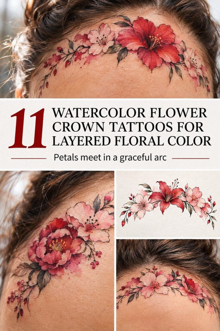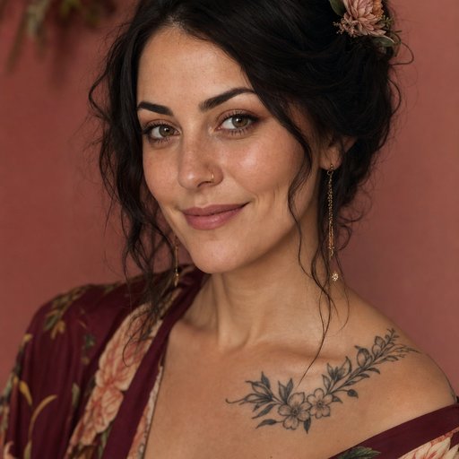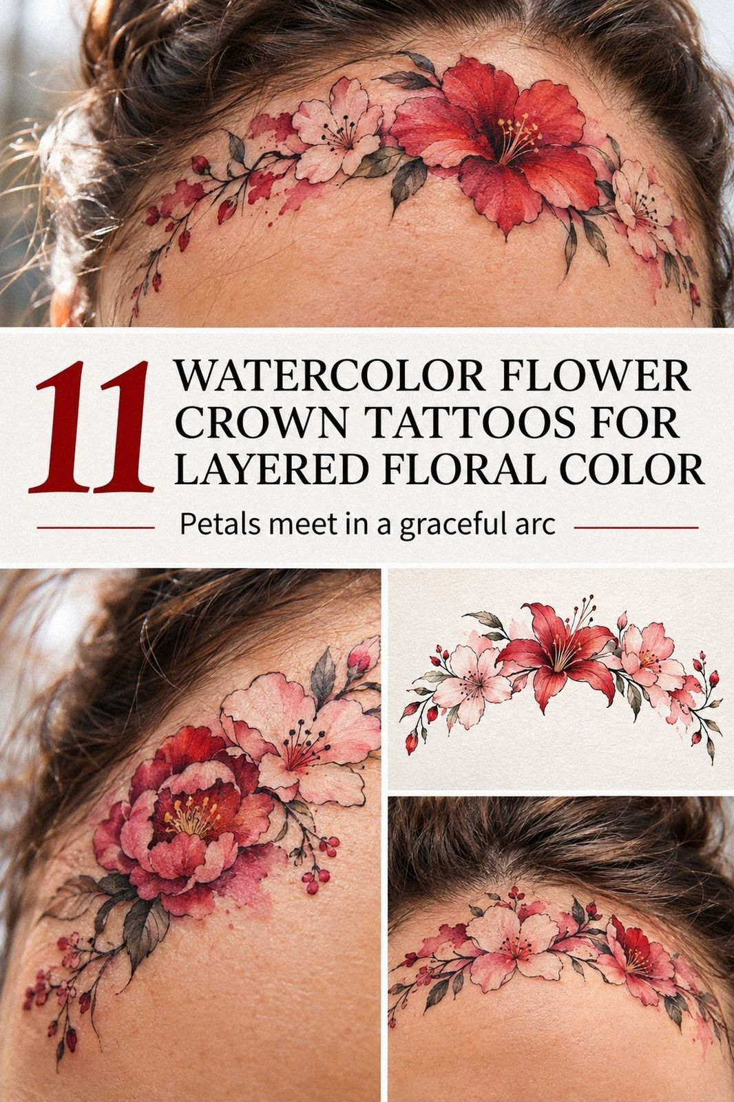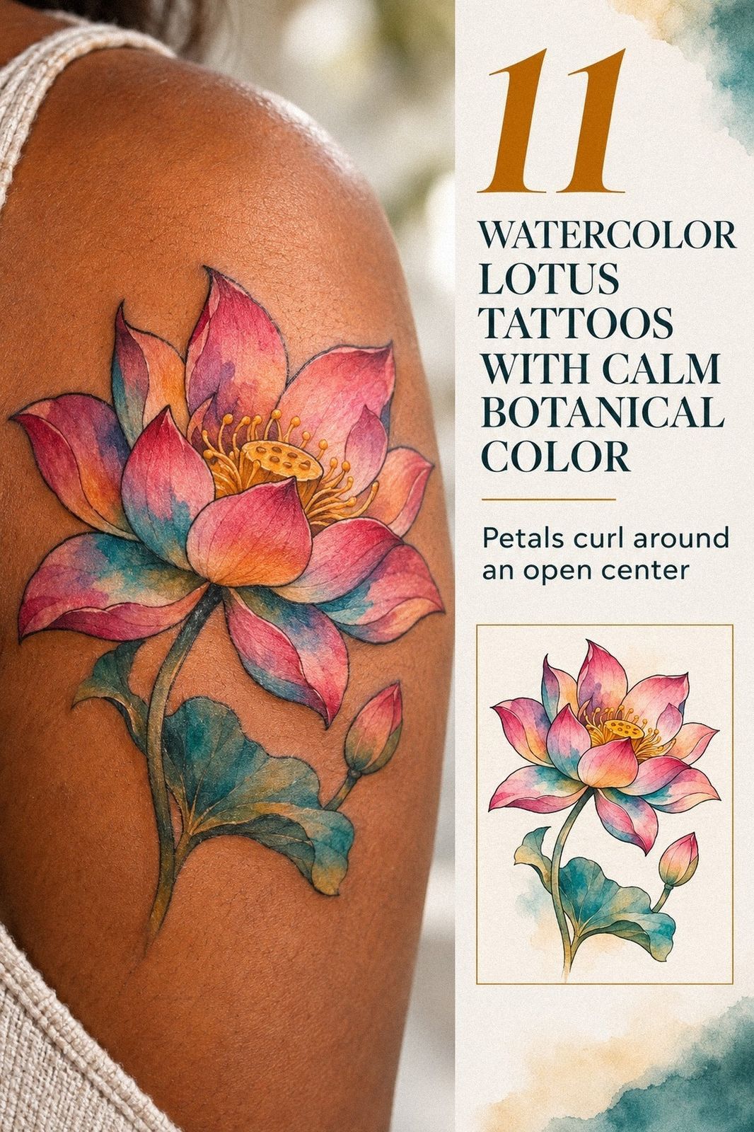
A small watercolor lotus tattoo usually costs about $100 to $300 in the US, depending on the artist, region, size, and placement. I got mine as my first ink while I was still nervous about needles, permanence, and pain. The design looked delicate on paper. My skin taught me what the sketch couldn’t.
- Why I Chose a Minimal Watercolor Lotus
- I Tested Color Before the Appointment
- Small or Too Small?
- Inner Forearm: The Placement I Kept
- I Preferred Fine, Delicate Contours
- Forest-Green Splashes Changed the Mood
- The Meaning I Wanted the Lotus to Carry
- What My Skin Changed
Editor’s note: I’d judge a watercolor lotus by three things: a readable silhouette, a personal meaning, and a healed result that still feels expressive. Everything else is negotiable.
Before I Chose Anything
I had a clear patch of skin I’d been saving for the right idea, but I didn’t have a clear idea yet. Every reference looked either too ornate or too plain, and I wasn’t sure whether a lotus could feel personal without becoming predictable.
My screenshots were everywhere. My confidence wasn’t. The blank space sat on my upper arm, where I could see it without needing a mirror.
Blank skin can feel strangely loud when you’re waiting for your first tattoo. I wanted something symbolic, delicate, and unmistakably mine.
- Why I Chose a Minimal Watercolor Lotus
- I Tested Color Before the Appointment
- Small or Too Small?
- Inner Forearm: The Placement I Kept
- I Preferred Fine, Delicate Contours
- Forest-Green Splashes Changed the Mood
- The Meaning I Wanted the Lotus to Carry
- What My Skin Changed
- After Healing, the Watercolor Settled
- Custom Petals Made It Mine
- My Final Lotus: Clear, Personal, and Blue
1Why I Chose a Minimal Watercolor Lotus
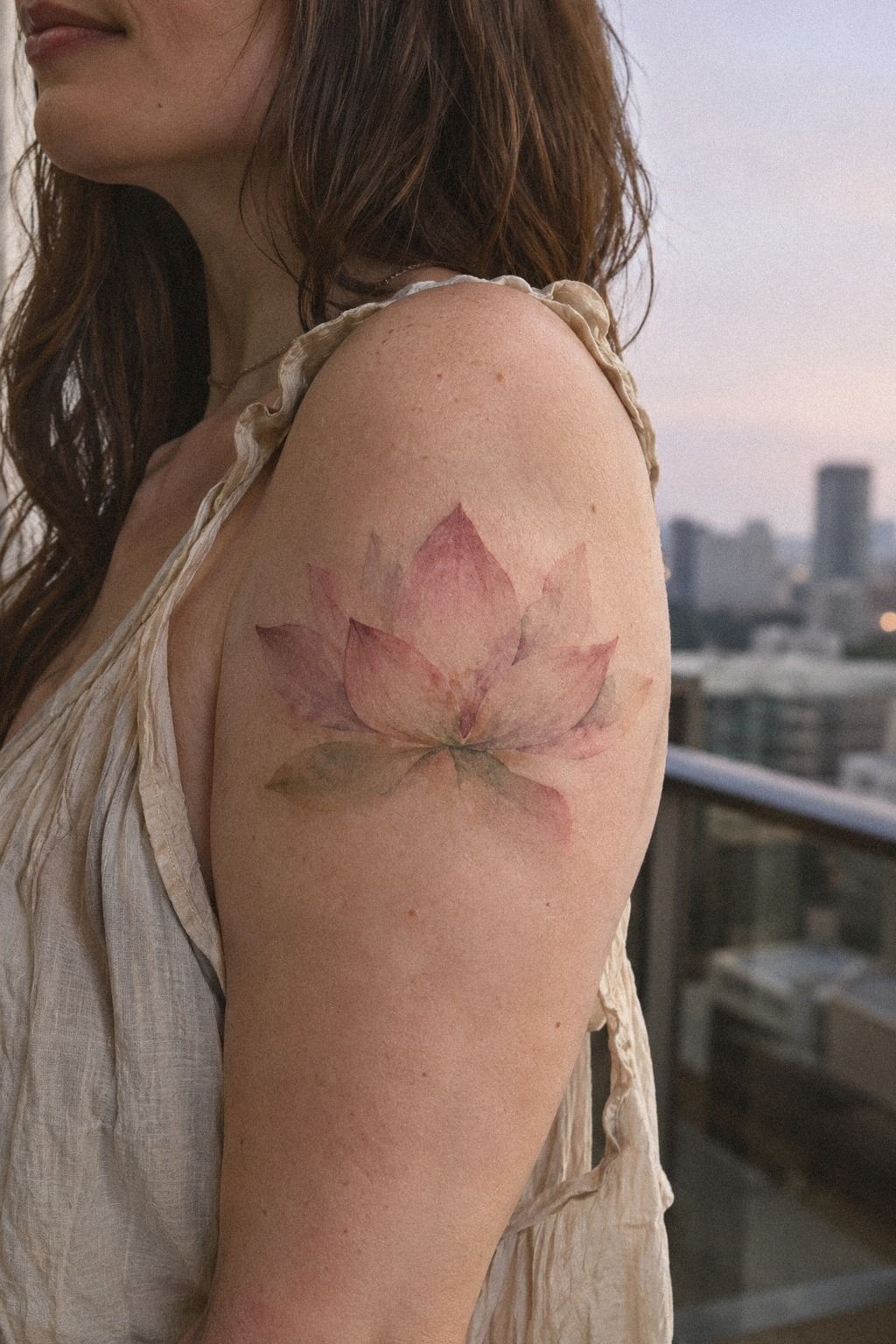
I started with a front-facing lotus in bloom because the shape felt balanced without looking stiff. The petals opened in clean layers, and I asked for a minimal lotus outline instead of a heavy black frame.
You can still make a floral tattoo meaningful without filling every gap. I knew I’d prefer visible skin between the petals, especially because the negative space made the flower feel more graceful.
The first sketch had too many leaves and a tiny moon tucked underneath. I liked the idea, but it made the design feel more ornate than personal.
My tattoo artist removed the extra symbols, softened the lower petals, and left the center open. That decision made the flower look crisp from a distance and intricate up close.
I didn’t want a design that would disappear whenever I wore short sleeves. The upper arm gave me enough space for a readable shape while keeping the tattoo easy to cover.
If you’re considering a similar direction, compare it with these minimalist lotus tattoos before choosing your final outline.
My strongest opinion is simple: skip unnecessary detail on your first tattoo. A single lotus bloom with deliberate spacing can look more powerful than a crowded composition.
You won’t miss the extra leaves once you see how the clean petals catch the light. That restraint was the first choice that made me feel calm.
2I Tested Color Before the Appointment
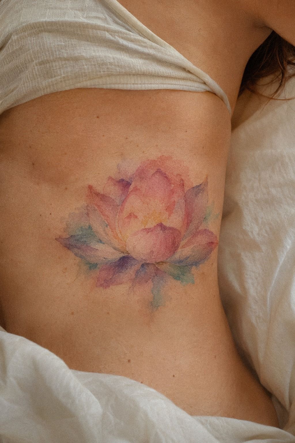
I tested color on paper before I let anyone touch my skin.
The Palette Test Changed My Mind
My artist placed several color swatches beside my skin instead of relying only on a screen. The clay tone looked warmer against me than it had in the reference images.
The linen shade was more understated, while the aged-brass tone added a muted gleam. The combination felt elegant without becoming precious, which was exactly the balance I wanted.
I’d recommend testing the actual colors near the intended placement. A shade that looks fierce in a digital mock-up can feel completely different on living skin.
The final palette stayed narrow: clay, linen, and aged brass. Keeping it focused made the flower look more iconic.
3Small or Too Small?
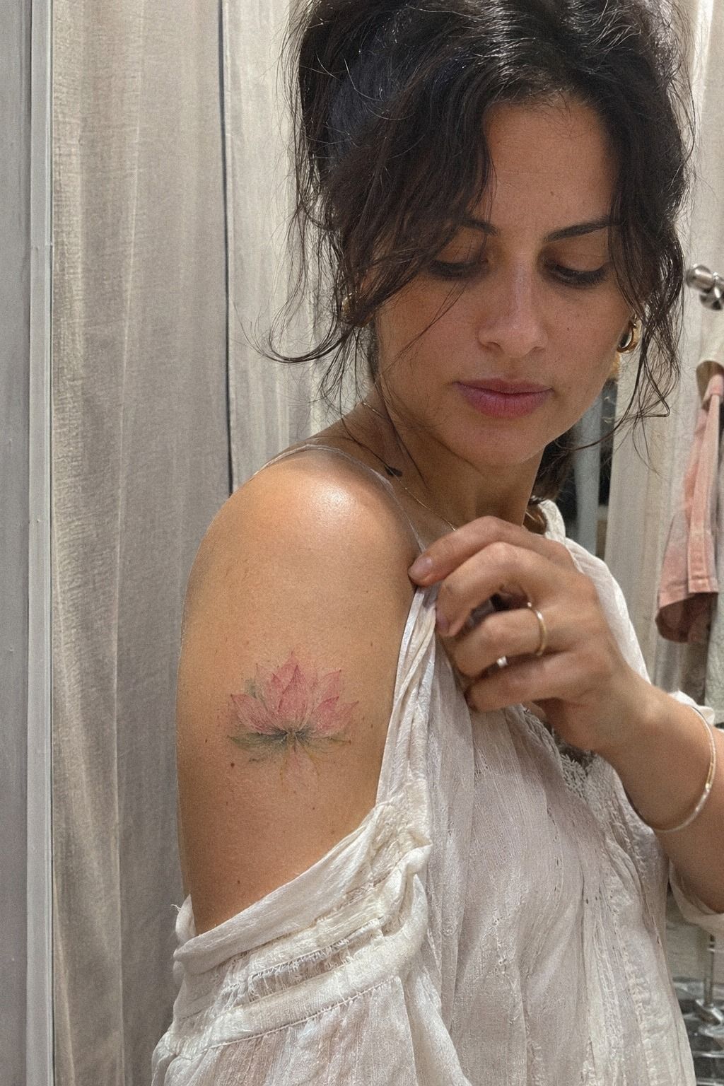
I compared small designs because I wasn’t ready for a large first tattoo. My artist showed me three versions, each with a different petal count and center shape.
The smallest had a dainty silhouette, but the narrow lines began to merge in the preview. The middle version looked sharper and gave the color enough space to remain visible.
The middle-size lotus became the obvious choice. It was compact without being timid.
The final sketch had enough open skin around each petal, which matters when you’re choosing watercolor tattoos with fine details. You don’t need the largest possible design to make a symbolic flower readable.
You do need enough separation between lines. That practical limit mattered more than the size I’d originally imagined.
I saved examples of small lotus tattoos before my consultation. Those references helped me explain what I meant by “small,” because that word can mean anything from a discreet mark to a fully detailed flower.
My artist also pointed out which examples were fresh instead of healed. That distinction was surprisingly important.
The smallest option wasn’t the winner. I’d skip a design that only looks clear when viewed closely, even if it seems stylish on the day.
Your tattoo should still read as a lotus when someone sees it from a few feet away. That test changed my mind!
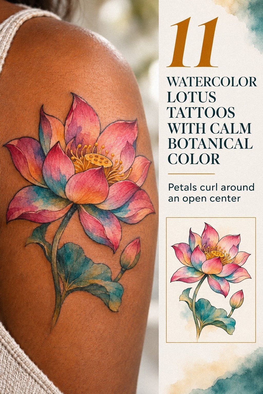
4Inner Forearm: The Placement I Kept
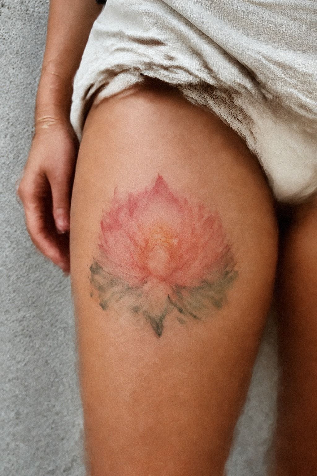
I planned the placement carefully, even though the reference showed a lotus on the thigh. My own design moved to the inner forearm because I wanted to see it while I worked, drove, and reached for a cup.
The position gave the flower a long vertical path and kept the center aligned with my arm. Inner forearm placement also made the tattoo easy to check during healing.
The forearm was more tolerable than I expected. I could feel each pass, but it wasn’t the sharp, concentrated sensation I’d feared.
If you’re choosing a first placement, the forearm, upper arm, shoulder, and thigh are generally more tolerable than ribs, feet, hands, or sternum.
I used a soft measuring tape to check how the design would sit when my wrist bent. A lotus that looks centered with your arm straight can tilt when your hand turns.
Ask your artist to test both positions. I checked the placement with my arm relaxed, bent, and turned outward before we started.
You can see more placement ideas in this watercolor lotus flower tattoo guide. I wouldn’t choose ribs for a first piece simply because the reference looks striking there.
The pose, the pain level, and the way skin moves matter more than a dramatic reference. That was my most practical decision.
The Placement Test I’d Repeat
I held my arm in three positions: relaxed, bent, and turned outward. The lotus looked different every time.
A vertical centerline kept it readable in all three positions. Without that check, the flower would have leaned toward my wrist.
I also considered visibility at work and during ordinary errands. I wanted the tattoo to feel personal, but I didn’t want to spend every day hiding it.
5I Preferred Fine, Delicate Contours
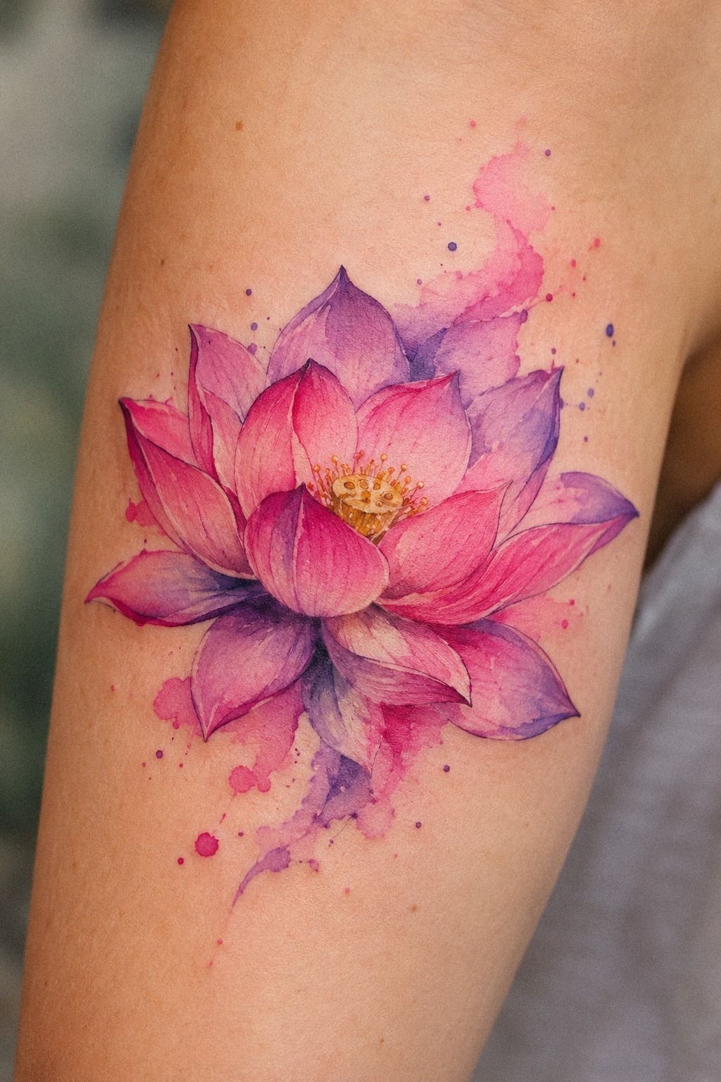
The flash sheet in my artist’s studio showed several floral designs in deep emerald linework, including lotus petals, wildflower stems, and small leaves. I liked the crisp versions best.
Fine-line emerald ink became the anchor for my watercolor layers. It gave the color something stable to sit inside.
I asked for delicate contours around the outer petals and slightly stronger lines near the center. That gave the flower a visual hierarchy instead of making every edge compete.
You can keep a tattoo soft without making every line identical. That small difference made the bloom feel more expressive.
A line that looks impossibly thin in a fresh stencil can spread slightly as it ages. My artist explained that darker solid areas and sensible placement tend to hold their shape better.
Very fine details may soften over time. I didn’t want to chase a fragile trend, so we kept the smallest marks limited.
If you’re collecting references, watercolor sunflower tattoos show how stronger centers can support delicate petals.
I chose the lotus over a fully ornate design because the structure stayed legible. The result was understated, but it still had an edgy little bite around the center.
6Forest-Green Splashes Changed the Mood
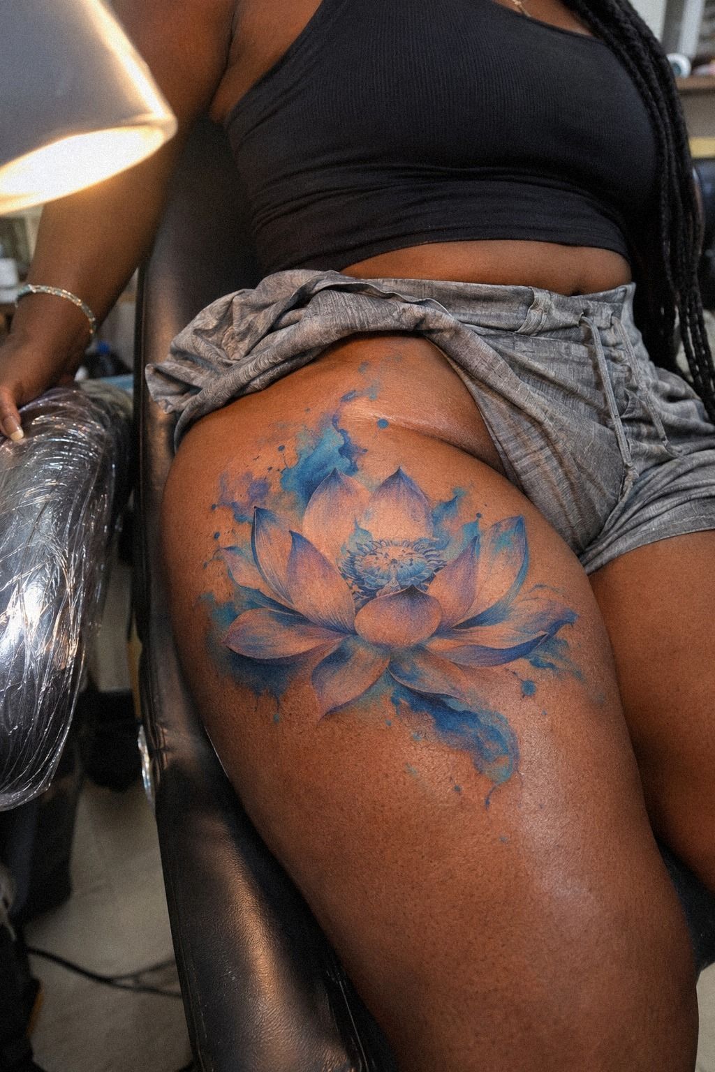
The forest-green splashes were the part I nearly removed. On the stencil, they looked bold and a little wild, while the lotus itself looked refined.
My artist brushed a few irregular marks beyond the petals, then stepped back so I could see whether they supported the flower or distracted from it.
The final splashes were uneven by design. Some were pale and watery, while two rust-colored marks sat near the lower petal.
That contrast gave the piece a raw quality that a perfectly controlled wash wouldn’t have created. You can ask for watercolor movement without asking for random decoration.
I compared the idea with watercolor rose tattoos and noticed that many strong examples used color outside the main outline.
Still, I didn’t want the forest green to become the whole subject. My artist kept the color close enough that the lotus remained the first thing you’d notice.
And yes, I worried that the darker green would look strange against my skin. It didn’t.
The healed color settled into a quieter, more polished version of the fresh pigment, and the darker center kept it readable. The splashes gave the tattoo personality without turning it into a chaotic patch of color.
Worth it!
What the Forest Green Had to Do
The forest green wasn’t there just to make the tattoo look vibrant. It needed to suggest movement without overpowering the petals.
Controlled watercolor splashes gave the design a daring edge while keeping the lotus recognizable. That distinction helped me avoid a random-looking result.
I also asked my artist to leave some skin untouched between the marks. The untouched areas kept the composition crisp as the color softened.
7The Meaning I Wanted the Lotus to Carry
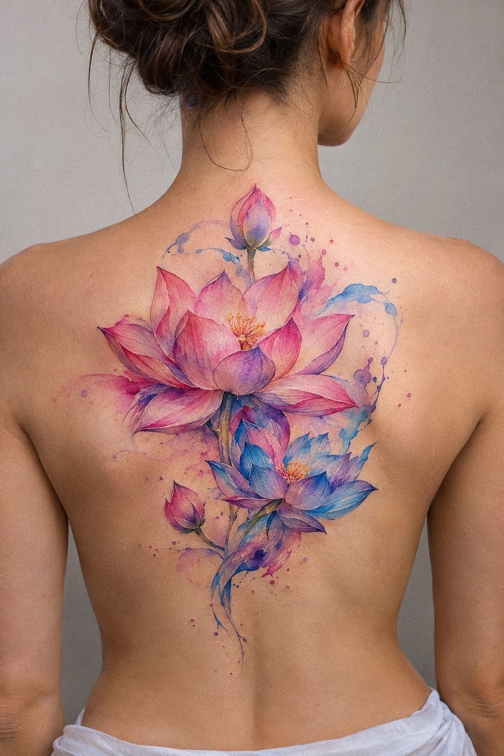
The lotus already carried meaning for me, so I didn’t add a quote or a long line of text. I considered a small wildflower sprig beside it, but the extra stem made the composition feel busy.
In the end, the bloom stood alone, with a few watercolor marks suggesting movement without spelling out the story.
I wanted the symbolism to stay personal rather than obvious. The flower represented returning to yourself after a difficult season.
Lotus symbolism can be sacred, romantic, empowering, or quietly private depending on what you bring to it. You don’t have to explain every part of your tattoo to anyone.
The spine reference in the brief inspired me to think about vertical flow, even though I chose my forearm. I looked through watercolor floral tattoos for examples of stems and spacing, then removed nearly all of them.
That edit made the flower feel more iconic and less like copied flash. My opinion is that a symbolic tattoo needs one clear emotional center.
If you add a moon, quote, bird, and constellation to the lotus, the meaning can become muddy. Choose the image that carries the most weight for you, then let the negative space do some of the talking.
The Meaning I Kept
My final explanation was one sentence: the lotus marked the part of my life when I began returning to myself.
That sentence felt meaningful without being overly literal. I didn’t need initials or a date underneath it.
The design became more personal when I removed things. Sometimes the boldest edit is the one that leaves the symbol alone.
8What My Skin Changed
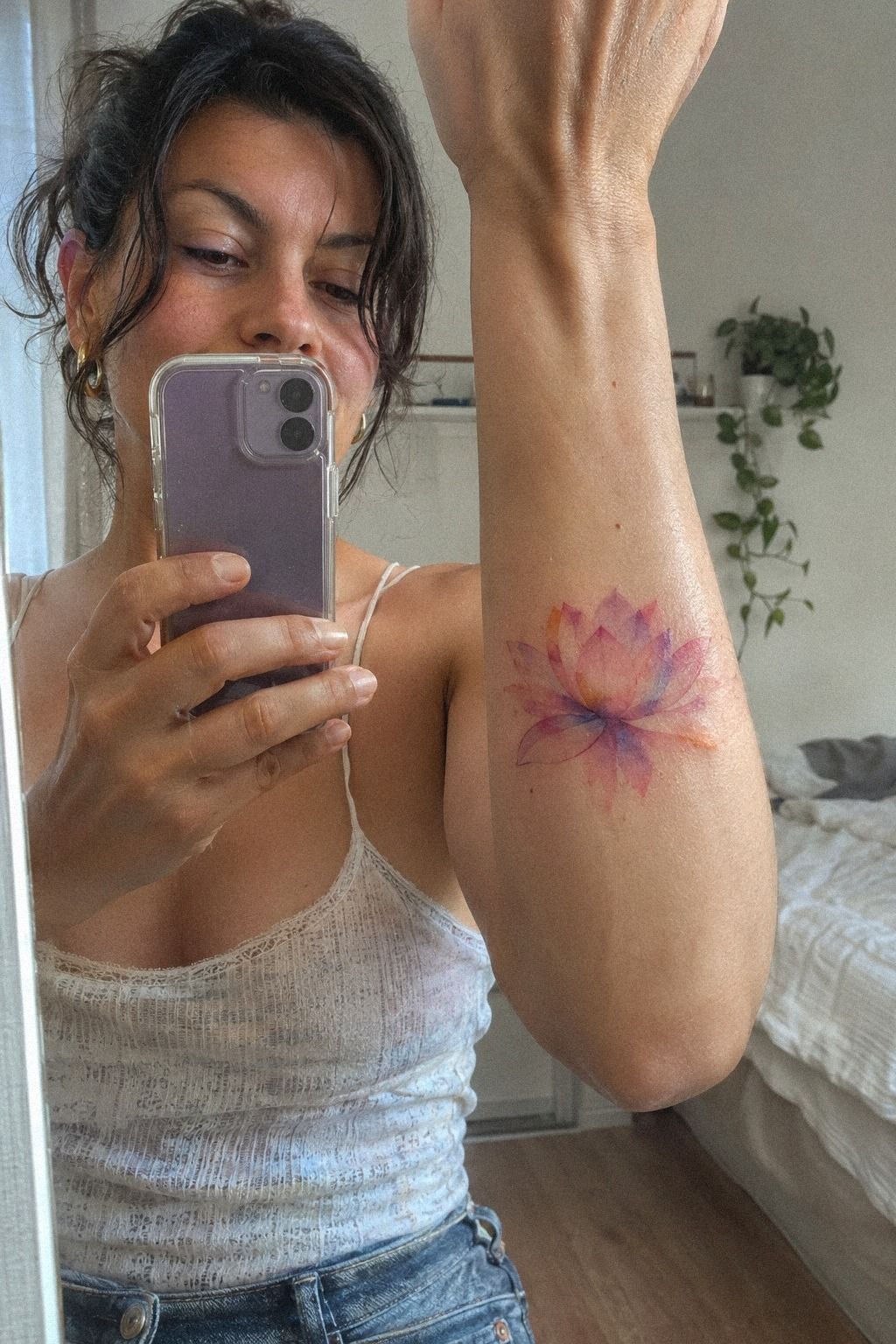
The reference used warm-white and camel tones with black accents, but my own skin had a different undertone and reacted differently to the stencil.
A Small Skin-Tone Check
My artist tested the outline and color placement in stages. That gave me time to notice which petals needed stronger edges.
The palest wash disappeared more than I expected. We kept it in only two petals, where it created an ethereal transition instead of weakening the whole bloom.
That small adjustment made the lotus look personal rather than generic. I’m glad we treated the reference as a starting point.
9After Healing, the Watercolor Settled
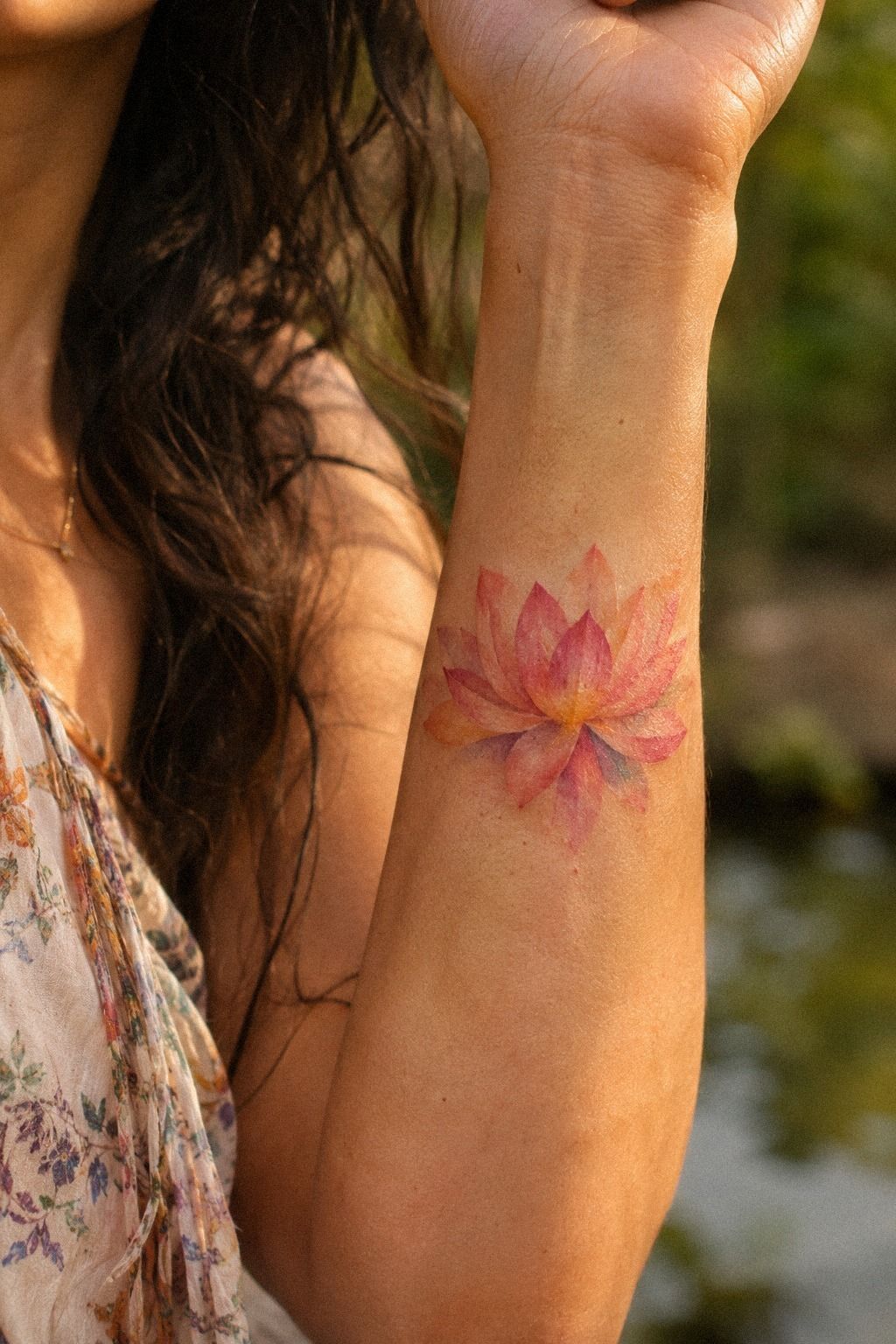
The fresh tattoo was brighter, sharper, and slightly swollen around the lines. That first look wasn’t the final result, even though it was the version everyone wanted to see.
I washed it gently as instructed, used a thin layer of moisturizer, and avoided soaking it in a pool while the surface healed.
Fresh watercolor pigment can look almost too intense at first. I knew I’d need patience before judging it.
The surface took about 2 to 3 weeks to settle, while complete healing took roughly 2 to 3 months. During that time, the color looked dull and flaky before returning with a softer finish.
Healed watercolor pigment can be quieter than fresh ink, so don’t panic during the peeling stage. My tattoo looked less polished for a short stretch, then steadied.
I checked the lotus again after the full healing window rather than judging it after a few days. The fine center lines were still readable, and the midnight-blue and copper accents had softened into a more understated wash.
You should check your tattoo in consistent lighting if you want a useful comparison. That makes changes easier to judge.
I also stopped exposing it to strong sunlight without protection. UV can affect tattoo color over time, and fine lines may broaden as skin changes.
The lotus watercolor tattoo guide helped me compare healed examples instead of trusting only fresh results. That patience saved me from making a needless early judgment.
The Healing Timeline I’d Follow
During the first few days, I focused on gentle washing and following my artist’s instructions. I didn’t add products just because someone online called them essential.
Simple aftercare was easier to follow than an elaborate routine. I kept the area clean, avoided soaking it, and watched for unusual irritation.
By the second week, the surface looked calmer. The tattoo was less vibrant, but the outline remained sharp.
By the second month, the midnight blue and copper had settled into a softer, more cohesive result. The healed version was less dramatic and more timeless.
10Custom Petals Made It Mine
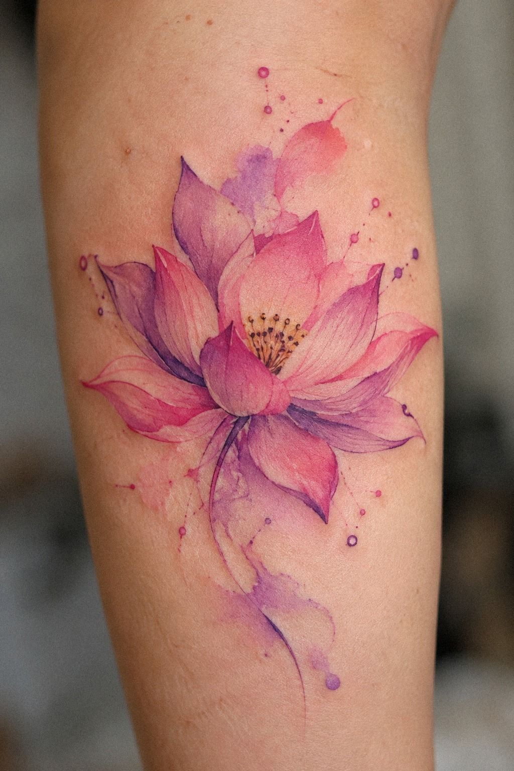
The stencil showed the basic silhouette, but the finished watercolor version had more personality. I asked for one petal to lean slightly outward, a darker crease in the center, and a small sage-green mark that didn’t repeat anywhere else.
Those choices were subtle, but they stopped the design from feeling like a stock image. Custom petal detailing gave the lotus an irregular edge, which made it more expressive and personal.
You can keep the overall silhouette classic while changing the details that make the tattoo yours. That’s where the personal feeling often lives.
I nearly added a tiny initial beneath the flower, then decided against it. Text would have made the design more literal, and I wanted the symbol to stay open-ended.
My artist also suggested leaving one petal mostly uncolored so the eye had a resting point. That pale petal became one of my favorite details.
If you’re collecting rose sleeve tattoo references, look at how petal direction changes the feeling of the bloom. I borrowed that idea without copying the shape.
The lotus stayed feminine and graceful, but the uneven accent made it feel less precious. That was the detail I kept touching after the appointment.
11My Final Lotus: Clear, Personal, and Blue
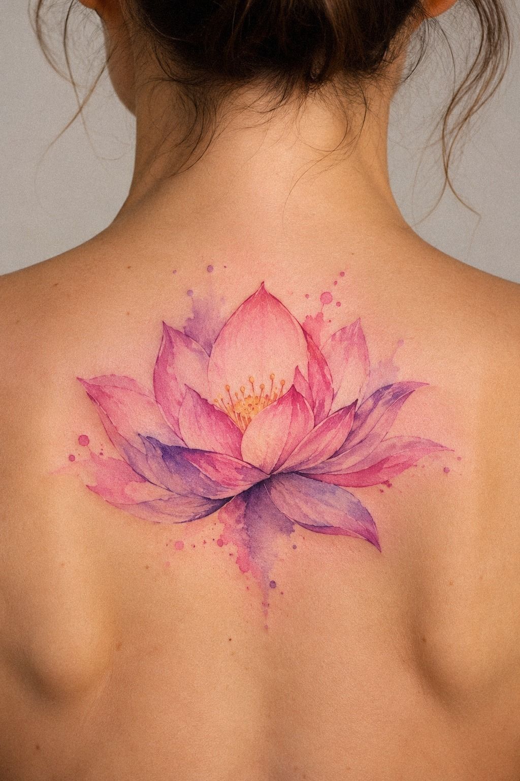
The final design sat vertically along my inner forearm, with a symmetrical lotus, fine dark-green contours, terracotta and olive watercolor accents, and a restrained stone-toned wash.
How Much It Cost
My watercolor lotus tattoo fell within the typical US range for a small floral piece, but the exact quote depends on your artist, region, size, color work, and placement.
Shops may use a minimum of about $50 to $100, while hourly rates often sit around $100 to $250. Ask for the quote in writing before your appointment.
I didn’t choose the cheapest appointment because the design relied on clean line control and restrained color. Professional tattoo consultation mattered more than saving a small amount upfront.
You can ask whether the quoted price includes the drawing time, the session, and a possible touch-up conversation. That question gave me a clearer budget.
My budget also included time, not just money. I set aside the appointment day and kept the following weeks clear of swimming and unnecessary sun exposure.
If you’re planning your first piece, watercolor lotus tattoo ideas can help you compare design complexity before requesting a quote.
I also revisited minimalist lotus tattoos before booking. Seeing simpler designs helped me avoid paying for details I didn’t actually want.
The Three-Check Watercolor Rule
I now use three checks before approving any tattoo design: does the silhouette read clearly, does the color suit the skin, and will the details still make sense after healing?
That sounds basic, but I ignored the first check when I fell for a tiny sketch with too many petals. It was intricate on a screen and muddy in the stencil.
The second check is emotional. I need to know why I want the image before deciding how it should look.
My lotus became more meaningful when I removed the moon, quote, and extra leaves. Personal tattoo symbolism doesn’t need a crowded explanation.
If you can describe the feeling in one honest sentence, your artist has something useful to build from. That clarity made the consultation faster.
The third check is practical. I look at healed work, ask about line spread, and think about sun exposure, movement, and visibility.
I don’t want a tattoo that only works in one fleeting version. A bold outline in the right place may age better than barely-there linework, even if the latter looks more delicate on day one.
And I still believe watercolor tattoos can be timeless when the structure is strong. The color may soften, but the design shouldn’t lose its identity.
If you’re choosing between an ornate sketch and a cleaner one, I’d pick the cleaner version every time. It gives your future self more room to love the tattoo.
The Questions I Get Asked Most
How much does a watercolor lotus tattoo usually cost?
A small watercolor lotus tattoo usually costs about $100 to $300 in the US. Typical tattoo pricing varies by artist, region, size, color, and placement. A shop minimum may be about $50 to $100, while an hourly rate may run about $100 to $250.
Are watercolor lotus tattoos a good idea for a first tattoo?
Yes, watercolor lotus tattoos can be a strong first choice if you want a meaningful floral design with clear structure. The forearm, upper arm, shoulder, and thigh are generally more tolerable placements, and clean central lines can remain readable as the color softens.
How do I choose a tattoo artist for watercolor lotus tattoos?
Choose an artist whose portfolio shows crisp linework, controlled washes, and healed examples, not only fresh tattoos. A healed-work portfolio tells you more than a polished studio image. Check hygiene practices, ask about watercolor experience, and request a consultation.
How much do watercolor lotus tattoos hurt?
Pain depends on placement and your own tolerance. Ribs, feet, hands, and sternum are often more painful because they have less padding or more sensitivity, while the forearm, thigh, shoulder, and upper arm are usually more tolerable. Placement comfort mattered more to me than the tattoo’s size.
How long does a watercolor lotus tattoo take to heal?
The surface usually heals in about 2 to 3 weeks, while complete healing takes roughly 2 to 3 months. Gentle aftercare means washing softly, moisturizing as directed, avoiding pools during early healing, and protecting the tattoo from strong sunlight once the surface has closed.
What’s the best placement for watercolor lotus tattoos?
The best placement depends on visibility, comfort, and how you want the tattoo to age. Inner forearm placement offers easy viewing and is generally more tolerable, while the upper arm or thigh gives you more privacy. Avoid choosing a painful spot only because a reference looks dramatic.
Where I’d Start First
If I had to pick one, I’d start with a clean inner-forearm lotus. You can see the structure, protect it from early sun, and judge the healed color without guessing.
Save your references, ask for healed examples, and give the design one quiet night before you book. If the idea still feels personal in the morning, you’re probably close.
My honest verdict: keep the silhouette clear, keep the palette controlled, and let one meaningful detail carry the story. That’s what made my first tattoo feel like mine!