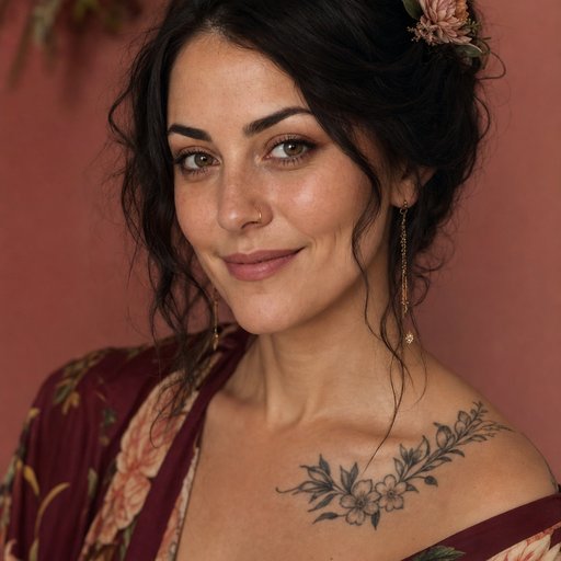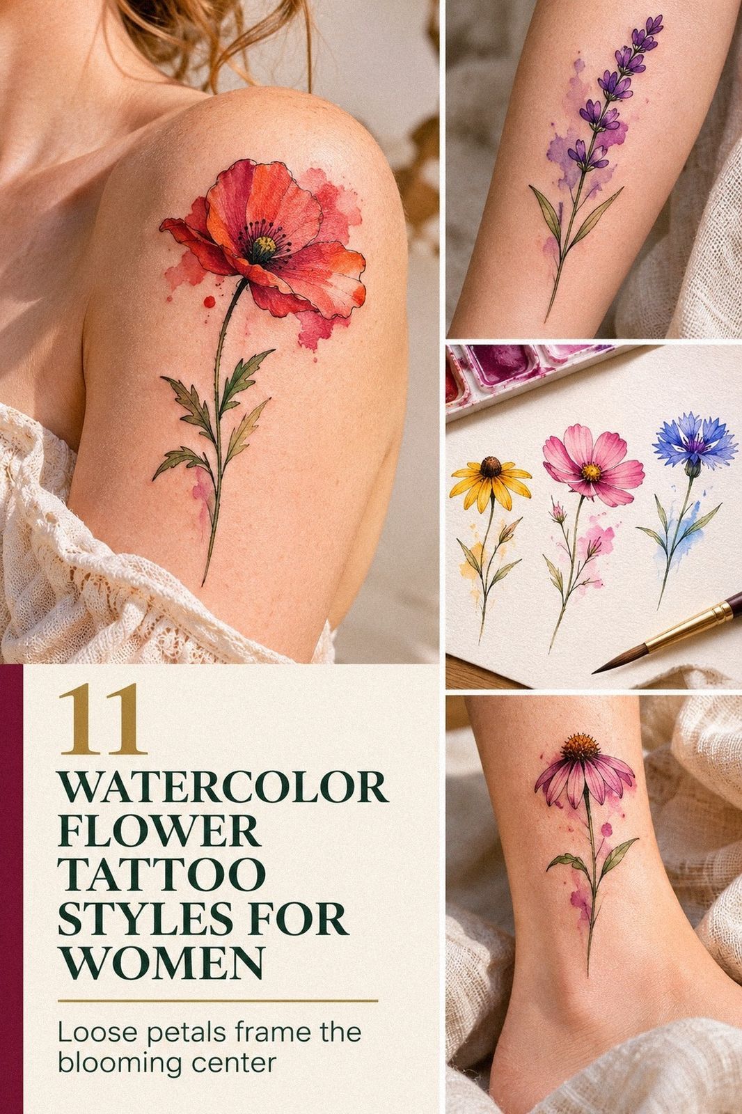
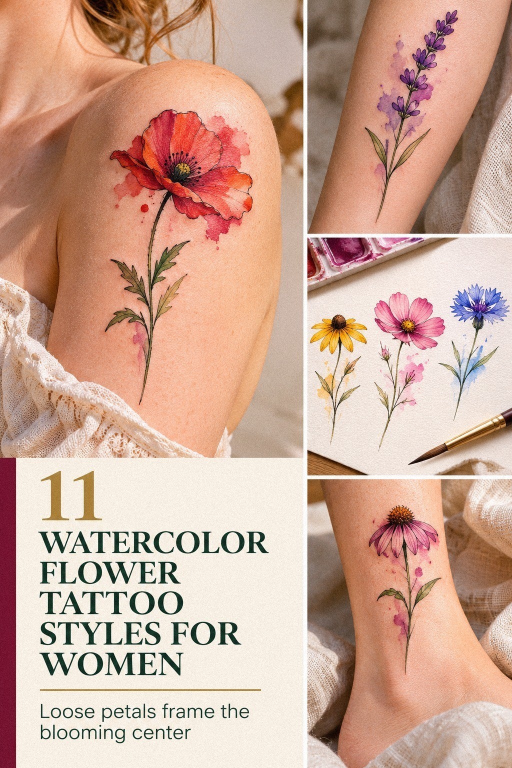
A watercolor flower tattoo for women can cost about $100 to $300 in the US, depending on size, placement, artist, and region. I wanted a delicate single-stem design, but I didn’t want a vague quote or a rushed booking. So I planned the meaning, placement, healing time, and budget before choosing the final flower.
I also wanted the result to feel personal, expressive, and financially sensible. That combination took more thought than I expected.
Here’s what it looked like before:
Before booking, I had a clean patch of blank skin I’d been saving for the right idea. No old ink covered it.
No half-finished concept sat in my notes. Just several references and a growing suspicion that I’d regret choosing a flower only because it looked good in someone else’s design.
My first sketches were too busy. One had three blooms, leaves, dots, and a long curling stem.
Another looked like a sticker. I kept coming back to a single flower with layered petals, a thin stem, and watercolor edges that could move naturally with my body.
It felt personal instead of ornamental. That was the first win!
- Choose a Delicate Watercolor Wildflower: The Single-Stem Rule
- Test Two Scales Before Booking: The Two-Scale Rule
- Match Petal Colors to Your Skin Tone: The Undertone Test
- Rose, Poppy, Lotus, or Wild Daisy?
- Sketch Unique Watercolor Flower Details: The Three-Edge Rule
- Fine Line or Soft Color? Linework Over Saturation
- Pick a Feminine Wrist Placement: The Visibility Test
- Considering Pain Around the Ankle: Is This Placement Worth It?
- Balance Bold Blooms with Delicate Linework: Color Over Crowding
- Plan Watercolor Ink for Graceful Aging: Black Over Blur
- Follow Aftercare for Vibrant Flower Colors: The Gentle Wash Rule
1Choose a Delicate Watercolor Wildflower: The Single-Stem Rule

I started with a single-stem wildflower because the shape gave me a clear line from top to bottom. You can follow it in one glance, and your eye doesn’t get trapped among too many petals. I wanted something delicate but not timid, with a crisp center and loose color around the outer edges.
The artist showed me several references, including a botanical sketch and a washed floral study. I chose the more minimal version because negative skin would keep the design readable as it aged. A crowded bouquet might look striking on a screen, but I’d skip it for a first watercolor piece.
You’ll want breathing space between every major shape.
I also read through this guide to watercolor flower tattoo meaning before committing to a species. The symbolic choice mattered to me, but I didn’t want a flower whose meaning felt borrowed from a list. Botanical reference sheets helped me compare petal shapes, stem directions, and the way each bloom naturally opens.
And I asked myself one slightly uncomfortable question: would I still like this flower if nobody knew what it meant? The answer was yes.
I’d picked a personal silhouette, not a label. My artist kept the outer wash soft, but the center stayed sharp enough to anchor the design.
2Test Two Scales Before Booking: The Two-Scale Rule
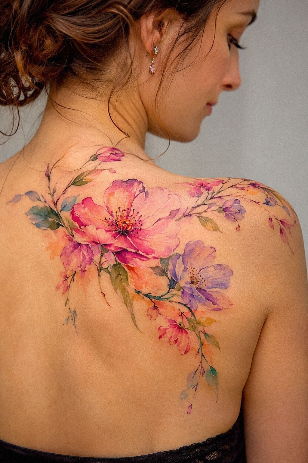
I tested two sizes before booking. The smaller version was about 2 inches tall, while the larger sketch gave the petals more space to separate.
Your choice here affects more than visibility. A small design can look dainty and understated, but tiny color transitions may merge without enough skin between them.
The artist printed both options at full size and placed them against my shoulder area. That simple full-size stencil test changed my mind.
The smallest version looked charming on paper, yet it lost the stem when I viewed it from a few feet away. The slightly larger version felt more balanced and less fragile.
I wanted a playful hint of color, not a blur.
I compared those proportions with examples from these small flower tattoo for women ideas. You’ll notice that the strongest small designs usually have one obvious single focal point. Mine became the top petal, with a tapered stem leading the eye down.
But I didn’t chase size for drama. A larger piece would have added more hours and more cost, and it wasn’t needed for the story I wanted.
Fine-tip transfer paper let me test the outline on skin before the appointment. I kept the version that looked graceful when my arm was relaxed, not only when it was posed.
3Match Petal Colors to Your Skin Tone: The Undertone Test

Color was the part I worried about most. My skin has an olive undertone, so the first rosy pink sample looked muted against me. Your skin may shift the same pigment in a completely different direction, which is why a digital mockup can’t make the final decision for you.
The artist tested diluted magenta, dusty coral, and a small amount of violet on a printed reference rather than promising that one shade would suit everyone. I chose a vibrant coral center with a cooler pink wash around the outer petals. The contrast looked elegant without becoming harsh.
I saved the watercolor lotus flower tattoo guide because it showed how artists can use a deeper center to keep a pale wash readable. That principle helped me more than any trend board. A diluted burgundy pigment gave my flower enough visual weight without turning the whole piece heavy.
And I left room for the color to settle. Fresh watercolor work often looks louder than healed ink, so you shouldn’t judge the final balance from the first day.
My artist used less pigment than I expected, and I’m glad she did. The result felt soft, but the petal edges still had a sharp, expressive rhythm.
4Rose, Poppy, Lotus, or Wild Daisy?

I considered a rose, poppy, lotus, and wild daisy.
The rose felt romantic and timeless. The poppy seemed bold and meaningful.
The lotus carried a sacred quality, while the wild daisy felt playful and personal. I kept returning to the wild daisy because its slightly uneven petals made the design feel more expressive.
5Sketch Unique Watercolor Flower Details: The Three-Edge Rule
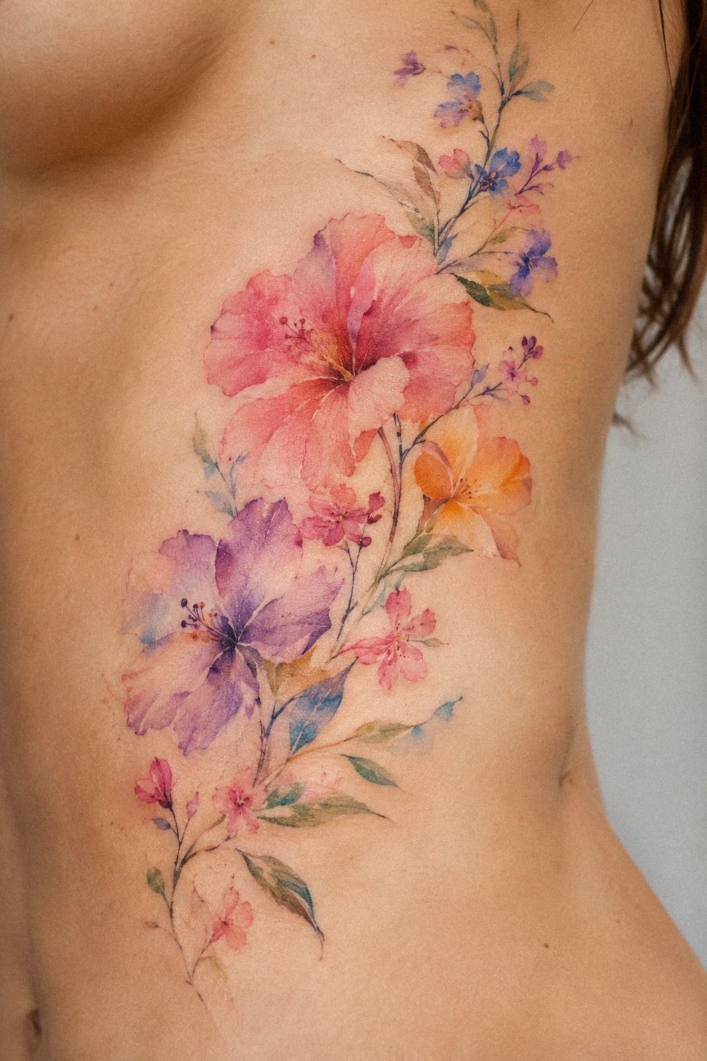
My artist and I divided the flower into three visual edges: a crisp inner line, a soft color boundary, and a few loose brush-like extensions. That combination made the piece feel intricate without stuffing every inch with detail. You’ll want each edge to have a job, or the watercolor effect can become visual noise.
The first sketch had too many scattered droplets. They looked whimsical on the page, but they didn’t connect to the flower’s movement. We removed most of them and kept only two small color marks near the lower petal.
The cleaner version was more polished and easier to read.
I used this watercolor fine line flower tattoo collection to compare line weights. My favorite examples weren’t the most ornate ones. They used 0.5 millimeter stencil lines in the planning stage, then allowed the colored wash to soften the perimeter.
But I kept one imperfect detail. The bottom petal leans slightly left, which gives the stem a flowing direction.
If you’re designing your own reference, don’t correct every unusual angle. A perfectly centered flower can look manufactured, while one daring tilt can make the whole piece feel more personal.
6Fine Line or Soft Color? Linework Over Saturation
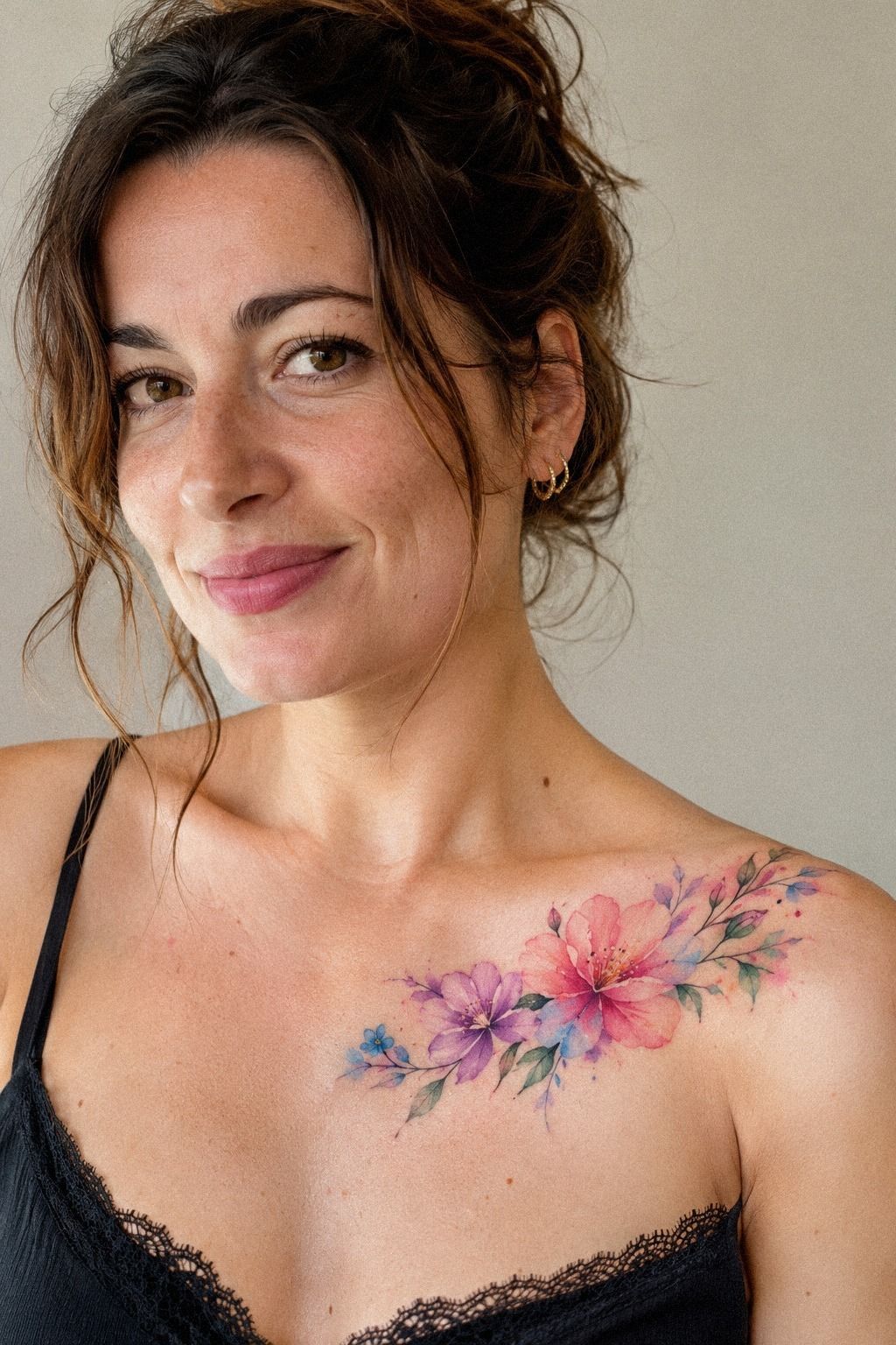
I went back and forth between a mostly colored design and a finer line version with only a few washed petals. The first looked vibrant and playful, while the second felt sleeker and more understated.
I eventually chose a middle path. The artist kept the flower’s outer color light but gave the center and stem enough structure to remain readable. That made the piece feel polished without losing its raw watercolor character.
The strongest part became the contrast between black linework and transparent color. It was delicate, but it didn’t disappear into the skin.
7Pick a Feminine Wrist Placement: The Visibility Test

I tested the wrist, inner forearm, and upper shoulder.
The wrist won because it gave me easy visibility without making the flower feel too exposed. The inner forearm looked graceful and offered more space, while the shoulder felt discreet and feminine.
I chose the wrist because the placement matched the personal, understated quality I wanted. That felt right!
8Considering Pain Around the Ankle: Is This Placement Worth It?

I considered the ankle because the narrow bone could have made the flower look sleek and vertical. The problem was pain. Bony zones such as the ankle, ribs, feet, hands, and sternum are commonly more uncomfortable, while the forearm, thigh, and shoulder are usually more tolerable.
The artist explained that discomfort depends on your skin, the session length, and how close the needle works to bone. I didn’t want to choose an ankle placement only because it looked graceful in a reference. Your body gets a vote, especially if this is your first tattoo.
A watercolor flower tattoo guide helped me compare vertical design options without pretending every placement feels the same. I kept the ankle as a future option, but I chose the wrist for this piece. Ankle stencil placement looked striking, yet the wrist gave me more control over visibility and healing.
And honestly, I’m glad I didn’t force the more painful choice. A bold location isn’t automatically a better location. If you’re sensitive around shoulder or forearm areas, either can still look feminine, expressive, and intentional without turning the appointment into a test of endurance.
9Balance Bold Blooms with Delicate Linework: Color Over Crowding
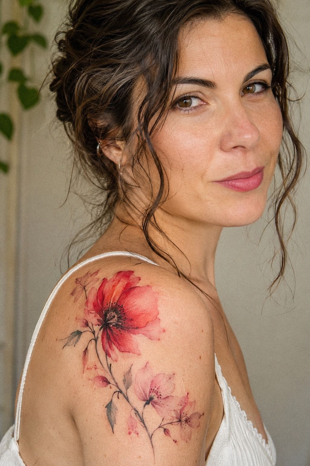
The final flower needed one stronger moment, so we made the saturated center more intense instead of enlarging the whole bloom.
That small change gave the design a fierce point of focus while keeping the petals dainty. I didn’t need a larger flower or heavier outline. The center carried the energy, and the surrounding wash stayed graceful.
10Plan Watercolor Ink for Graceful Aging: Black Over Blur
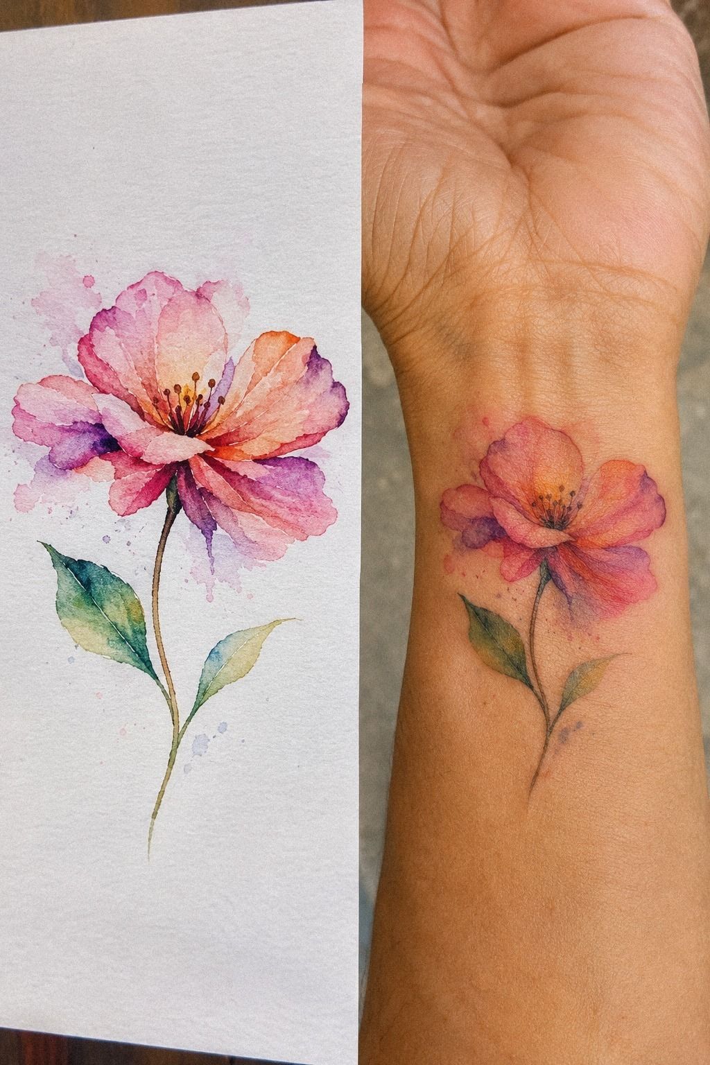
The fresh-versus-healed comparison changed my expectations. Fresh color can look bright, crisp, and almost exaggerated, while healed pigment usually settles into a calmer version of the design. Your tattoo won’t stay frozen in its appointment-day state, so you should plan for that softer stage.
Fine lines may widen over time, and pale color can lose intensity faster with repeated UV exposure. Stronger black structure and sensible placement generally age better than a design made only of faint washes. I didn’t want heavy blackwork, but I did want the stem and center to remain readable.
I studied this watercolor fine line flower tattoo page for examples of restrained outlines. Black pigment anchor lines gave my flower a stable framework, while the color stayed expressive around it. That balance felt timeless rather than tied to one short-lived trend.
The artist also reminded me that aftercare instructions and sun habits matter. I won’t claim the tattoo will look identical for decades, because skin changes.
But I can protect it from unnecessary UV and avoid judging the healed piece too early. The long view made the design feel more honest.
11Follow Aftercare for Vibrant Flower Colors: The Gentle Wash Rule

Aftercare was less dramatic than I expected, but it required attention. I followed the artist’s instructions, washed the area gently, kept it moisturized as directed, and avoided swimming and strong sun while the surface healed. You’ll want to follow your artist’s specific guidance because products and skin reactions vary.
The surface healing period is commonly about 2 to 3 weeks, while complete healing can take roughly 2 to 3 months beneath the surface. My tattoo looked darker and slightly duller during the middle stage, then settled into a softer, more natural color. That shift is normal enough that you shouldn’t panic over one early update.
I kept a small fragrance-free moisturizer nearby so I wouldn’t improvise with a scented product. The watercolor flower tattoo meaning article also reminded me why I’d chosen the design, which helped me stay patient while the skin looked less polished than the final result.
And I treated broad-spectrum sunscreen as part of the tattoo’s future, not an optional extra. Once healed, protecting the ink from UV can help preserve the color. The finished flower looks vibrant without being loud, and that balance was worth every minute!
How Much It Cost
I set a personal ceiling of $300 before contacting an artist. That wasn’t a universal quote, and I wouldn’t present it as one. In the US, a small watercolor flower tattoo commonly falls around $100 to $300, depending on the artist, region, size, and placement.
My planning table looked like this:
I asked for a written quote before booking and sent the final reference, placement, approximate size, and color notes together. That helped the artist respond clearly. Your price may land outside this range, especially if you choose a specialist, a larger piece, or a high-demand city.
I also compared the budget with small flower tattoo for women examples before deciding whether more detail was worth more time. It wasn’t. The single flower gave me the meaningful result I wanted without adding unnecessary elements.
The number that mattered most was not the lowest possible price. It was the amount I could pay without rushing the choice or ignoring the artist’s portfolio. A cheap quote wouldn’t have felt like a saving if the linework failed to match the reference.
The Questions I Asked Before Booking
Before sending my booking message, I asked how the artist approached watercolor color, whether the design would be adjusted to my skin, and how long the appointment would likely take. Those questions helped me separate a thoughtful process from a generic estimate.
I also requested watercolor fine line flower tattoo examples with healed results. Healed examples mattered more to me than a dramatic fresh reference because I wanted to understand the softer, settled version.
Finally, I asked about the deposit, rescheduling terms, and aftercare products. The deposit policy was straightforward, which made the booking feel much less stressful.
That check saved me money! I knew what I was approving before the appointment began.
The Three-Choice Rule I Would Use Again
I’d make three decisions before contacting an artist: the flower’s personal meaning, the placement you can live with daily, and the amount you’re willing to spend. Everything else can stay flexible. I changed the color, scale, and petal shape several times, but those three choices kept the design from drifting.
My first mistake was collecting too many references without knowing what I liked in them. One had an intricate outline. Another had a vibrant wash.
A third had a graceful vertical shape. I treated them as one idea, and the result was confused.
Once I separated the choices, the design became much more personal.
I’d also ask to see healed work, not only fresh examples. That request is reasonable, and it tells you whether the artist understands how fine lines and watercolor pigment settle. If you’re choosing between a larger vivid piece and a smaller understated one, ask which details will still read after the surface has fully healed.
I kept a reference folder with the flower, placement, color, and budget notes. That made the final conversation shorter and more precise. The watercolor flower tattoo meaning guide helped me explain the symbolism without letting it control the design.
The best part of my appointment wasn’t seeing the fresh color. It was recognizing the design after the intensity faded.
The flower still had a sharp center, a flowing stem, and enough blank skin around it to breathe. I’d choose that restraint again, even if a louder version might have earned more immediate compliments.
What Changed After Healing
The healed flower looked quieter than it had on appointment day, but it didn’t look weaker. The coral softened, the center stayed readable, and the stem kept its graceful direction.
I noticed that the less dramatic choices mattered most. The open spacing, slightly tilted petal, and controlled color gave the design an understated confidence. A lotus watercolor tattoo guide had helped me understand why a darker center could preserve that visual structure.
The petal wash became more integrated with my skin instead of sitting on top of it visually. I liked that evolution. It made the piece feel personal rather than frozen.
I’ve kept up with sun protection, especially because of the wrist placement. The tattoo isn’t identical to its first-day version, but that was never the goal. I wanted something expressive that could settle into my life.
What People Always Want to Know
How much does a watercolor flower tattoo for women usually cost?
I’d budget about $100 to $300 for a small US watercolor flower tattoo. Boutique minimums may start around $50 to $100, while hourly rates may run about $100 to $250. A written quote still depends on the artist, region, size, placement, and requested detail.
Are watercolor flower tattoo for women a good idea for a first tattoo?
I think they can be, especially with a tolerable placement and clear structure. A readable outline may help the flower age more gracefully than an extremely pale wash. I’d choose a meaningful design that feels manageable rather than selecting one only because it’s trending.
How do I choose a tattoo artist for watercolor flower tattoo for women?
I’d review the artist’s portfolio for clean linework, healed examples, consistent color, and strong hygiene practices. Healed portfolio images matter because fresh ink can hide how fine lines and soft pigment will settle. I’d ask direct questions before booking and pay attention to unclear answers.
How much do watercolor flower tattoo for women hurt?
I’d expect pain to vary by person and placement. Ribs, feet, hands, sternum, and ankle areas may feel more uncomfortable because they sit close to bone, while the forearm, shoulder, and thigh are often more tolerable. Placement comfort matters if you’re planning several color passes.
How long does a watercolor flower tattoo for women take to heal?
I’d expect the surface to heal in about 2 to 3 weeks, with complete healing taking roughly 2 to 3 months. Gentle aftercare means washing as directed, moisturizing appropriately, and avoiding strong sun and swimming during the early healing period.
What’s the best placement for watercolor flower tattoo for women?
I’d start with the forearm or shoulder because both usually offer tolerable placement and enough skin for the flower to remain readable. The wrist offers easy visibility, but it gets more sun and movement. A stable placement should match your pain tolerance, lifestyle, and long-term care habits.
Where I’d Start First
If I had to pick one, I’d start with the single-stem wildflower. Its clear center and open spacing give watercolor color room to soften without losing the flower’s identity. I’d save the idea, compare it with small flower tattoo for women references, then choose an artist whose healed work makes me want the same design twice.