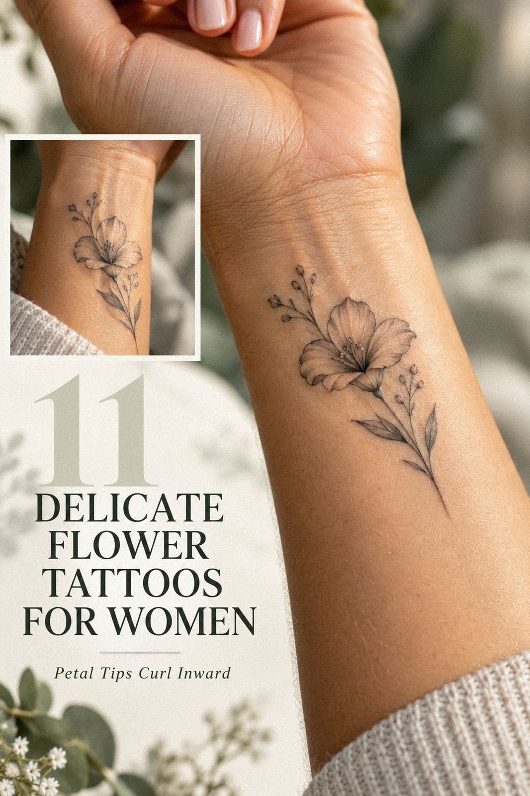
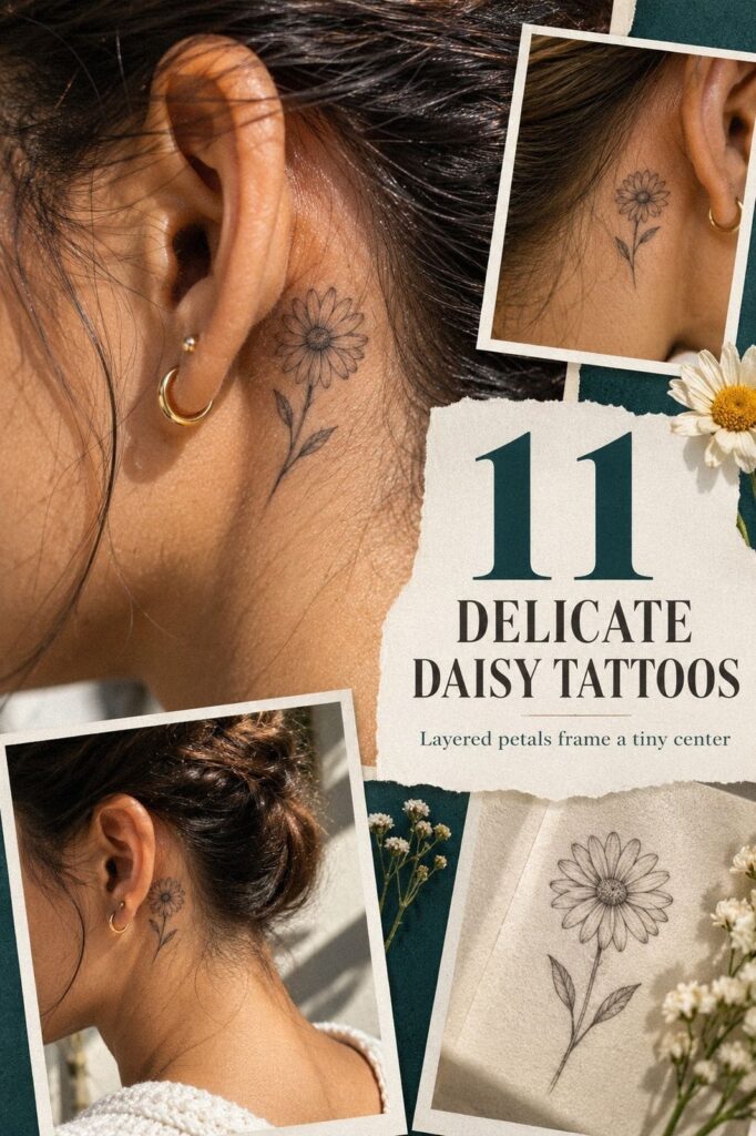
Delicate floral sleeve tattoos work best when the linework has space to breathe. I once packed too many stems into a small design, and the result lost its crisp, personal feeling. Now I plan the negative space first, then choose flowers that still feel meaningful from several angles. That shift matters!
- Start Small: Fine-Line Floral Sleeves With Space to Breathe
- How Does a Wrist-to-Shoulder Vine Stay Balanced?
- A Three-Bloom Story for Wildflower Symbolism
Editor’s note: Your sleeve doesn’t need to explain your entire story. A personal flower, a sharp stem, or one hidden bloom can carry more emotional weight than a crowded collection of symbols.
- Start Small: Fine-Line Floral Sleeves With Space to Breathe
- How Does a Wrist-to-Shoulder Vine Stay Balanced?
- A Three-Bloom Story for Wildflower Symbolism
- Blackwork Versus Soft Contrast: Where Should the Dark Ink Land?
- When Watercolor Color Meets Delicate Floral Linework
- Birth-Flower Thread: A Meaningful Sleeve With Personal Roots
- Strip It Back: Minimal Florals and Negative Space
- Let the Vine Move: A Romantic Sleeve That Wraps Naturally
- What Makes Fine Floral Details Feel Feminine, Not Fragile?
- From Vintage Botanical Plates to Skin
- Lunar Intervals: Floral Sleeves With Moon Phases
1Start Small: Fine-Line Floral Sleeves With Space to Breathe

A small delicate floral sleeve can feel striking floral artwork without covering every inch of skin. Terracotta, stone, and olive accents give the fine-line design a grounded, expressive rhythm. You’ll want each bloom to remain readable, so ask your artist to vary the angle rather than repeating one identical flower.
I’d call this the Single-Stem Rule: one main stem, a few branching leaves, and enough open skin to keep the design crisp. Black linework gives the piece a polished look, but it shouldn’t be packed with microscopic detail. If you’re choosing your first floral design, this is a graceful place to begin.
And don’t confuse small with plain. A three-petal wildflower beside a narrow leaf can feel more expressive than a large, crowded bouquet. I’ve seen tiny designs become more personal when the flower relates to a birthday, a memory, or a place you love.
For your forearm, keep the most intricate bloom away from the wrist crease. That area moves constantly, and your artist will need to account for it. Soft grey shading can add depth without taking over the clean linework, especially if you want an understated result.
If you’re comparing scale, browse these tiny floral sleeve tattoo ideas before you commit. You’ll notice that the strongest examples aren’t the busiest ones.
They’re delicate, personal, and easy for your eye to follow. That restraint may be worth it.
Choosing the First Flower Without Chasing a Trend
Start with a flower you’d still recognize if the trend disappeared tomorrow. A first floral sleeve can reference a birth month, a favorite landscape, or someone you carry with you. I’d rather see one personal bloom used thoughtfully than five fashionable flowers with no emotional connection.
You don’t need a dramatic explanation. A meaningful flower may stay private, and that’s part of its power. If you’re unsure where to begin, collect three references, remove the details you don’t love, and ask your artist to build one clear direction.
2How Does a Wrist-to-Shoulder Vine Stay Balanced?

A botanical fine-line sleeve that travels from wrist to shoulder needs a clear visual path. Clay, linen, and aged-brass tones can give a wildflower vine a graceful, distinctive flow without looking stiff. Start with smaller leaves near the wrist, then let the blossoms grow slightly larger as they climb.
I call this the Wrist-to-Shoulder Rhythm. Your lower arm should feel quieter, while the upper section carries the most ornate focal flower. If every bloom has the same weight, the sleeve can look flat.
You’ll want one graceful pause between each cluster.
But a full vertical flow doesn’t mean every inch needs ink. Open negative space keeps the composition readable and lets the skin remain part of the artwork. I’d skip a solid background here because it would compete with the botanical structure and make the sleeve less sleek.
For a masculine version, ask for sharper leaves, longer stems, and restrained blossoms. For a feminine interpretation, rounded petals and dainty buds can soften the same framework. Neither direction is more correct.
Your own references should decide the mood.
You can compare this layout with small floral sleeve tattoo placement ideas. Save examples where the wrist entry looks natural, then show your artist what you like. They’ll help you adjust the design for your arm, because no two placements curve exactly alike.
That consultation can protect your budget from changes later.
Check the Wrap From Every Angle
An arm is always moving. A forearm placement that looks perfect when your wrist is straight may feel disconnected when your elbow bends. Ask your artist to rotate the stencil and check the flow from the front, side, and back before the session begins.
I’d also bring references that show healed placement, not only fresh work. Your artist can explain how the stems will wrap, where the flowers may stretch, and whether the design will stay readable during ordinary movement.
3A Three-Bloom Story for Wildflower Symbolism

A unique delicate floral sleeve doesn’t need an unusual flower to feel original. Plum, grey, and rose-gold accents can give poppy stems a romantic, memorable character, especially when tiny grasses and one open bloom face different directions. That asymmetry makes the design feel raw and personal.
My favorite approach is the Three-Bloom Story. Choose one flower for where you’ve been, one for what you’re carrying now, and one for what you’re becoming.
You don’t need to explain that symbolism to anyone else. The meaning can stay quiet, which makes it more powerful.
Keep the linework crisp around the main petals, then let the leaves become slightly softer. Single-needle detailing can create fine veins, but too many interior marks may blur as the tattoo ages. I’d rather see three readable leaves than ten crowded ones.
And if you’re drawn to a gritty look, ask for uneven stems and subtle black variation. Perfect symmetry can make wildflowers look manufactured. Deep black botanical ink gives the sleeve an iconic anchor, while the smaller buds keep it playful and light.
For more symbolism, read this guide to floral tattoo meaning and symbolism. You’ll find ideas for remembrance, resilience, affection, and change. Choose a meaning that still feels personal after the trend has moved on, because your sleeve will stay with you.
That’s the point!

4Blackwork Versus Soft Contrast: Where Should the Dark Ink Land?

Blackwork can be delicate when the contrast is carefully controlled. Navy, white, and walnut-brown accents can make the design feel bold while preserving its intricate structure.
Where Black Ink Earns Its Place
A darkest bloom should have a reason to exist. It might mark the emotional center of the sleeve, balance a bend in the arm, or create a deliberate visual pause. I’d avoid scattering heavy black marks randomly because the design can lose its rhythm.
For a softer blackwork contrast, pair one filled petal with outlined leaves and bare skin. The value comes from the difference between dense and delicate marks, not from adding more ink everywhere.
5When Watercolor Color Meets Delicate Floral Linework

A watercolor floral sleeve looks most convincing when the color follows the shape of the flower. Emerald, gold, and cream color should support the petals rather than float beside them. I’d keep the outline selective, using it to protect the important edges while allowing some color to fade naturally.
Transparent color washes can feel romantic, but they require a thoughtful plan. Transparent color washes may soften as the tattoo ages, especially in areas exposed to sunlight. Ask your artist how they build saturation and whether the color remains readable in their healed work.
For a more vibrant direction, choose one dominant family and one restrained accent. Emerald petals with muted cream leaves can feel expressive without becoming visually noisy. You’ll want the stems and spacing to remain clear, because color can’t rescue a confusing composition.
Color tattoos may need more upkeep than simple black linework. Color retention depends on pigment, skin, sun exposure, placement, and aftercare.
That doesn’t make watercolor a poor choice. It simply means you should understand the long-term maintenance before deciding whether the investment is worth it.
If you’re comparing palettes, read floral tattoo designs and meanings. Look for artists whose healed color still has definition.
Color can be thrilling! It should also serve the flower.
Is Color Worth the Extra Commitment?
A color sleeve may be worth the extra cost if the pigment carries genuine meaning for you. I’d ask about touch-ups, sun protection, and the artist’s healed results before booking. A clear conversation now is more useful than guessing later.
Your color budget should include the full appointment, not just the quoted deposit. Healed color work is the strongest evidence of value, because it shows how the artist’s choices hold up after the fresh brightness settles.
6Birth-Flower Thread: A Meaningful Sleeve With Personal Roots
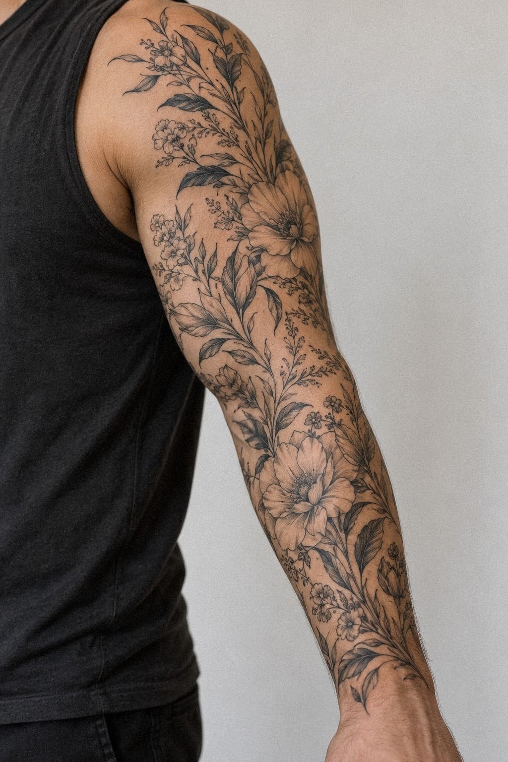
Birth flowers can make a sleeve feel deeply meaningful without turning it into a literal family tree. Forest green, rust, and natural-oak brown create a powerful, organic palette for the blooms.
Build Meaning Before You Build Density
If several people matter to you, begin with family flowers, then decide which one deserves the largest bloom. That hierarchy will make the sleeve feel intentional. Adding every symbol at the same size can flatten the emotional story.
I’d write down the private meaning behind each personal reference before your consultation. You don’t have to publish that explanation or place words beneath the flowers. The notes simply help your artist understand what should feel central.
7Strip It Back: Minimal Florals and Negative Space

Minimal floral sleeves depend on restraint. Dusty rose, charcoal, and brass accents can make thin botanical stems feel sleek and understated while leaving broad areas untouched. The result works especially well if you prefer a tattoo that can disappear beneath a sleeve when you need it to.
This is the Negative-Space Ladder. Begin with one focal bloom, add a smaller bud above it, then leave a deliberate stretch of bare skin before the next cluster. You’ll create visual pacing without filling every gap.
I’d rather see one graceful pause than several filler dots.
Tiny black leaves can frame the flowers, but they shouldn’t become decoration for its own sake. Ask yourself whether each mark supports the composition.
If you’re unsure, remove one. Minimal tattoos often become more powerful after the least necessary detail is gone.
But minimal doesn’t mean careless. Your artist still needs to consider line weight, wrist movement, and how the design will look when your arm bends. Crisp outline ink should remain readable at a glance, while the open skin keeps the piece light.
If you’re drawn to this approach, save the minimalist floral sleeve tattoo guide. Look for healed photos, not only fresh studio work. You’ll learn which lines stay sharp and which details may soften.
That information will help you choose a timeless design.
8Let the Vine Move: A Romantic Sleeve That Wraps Naturally

Climbing vines create a romantic sleeve because they suggest movement rather than a fixed bouquet. Warm white, camel, and black accents can give curving rose stems a graceful, expressive path from the wrist toward the shoulder, with small flowers opening at uneven intervals. The design feels alive when the vine doesn’t follow a perfect ladder.
I use the Vine-Over-Grid Principle for this kind of layout. Let the main stem bend naturally around the arm, then position the leaves where the curve needs balance. You’ll want the composition to look graceful from several angles, not only when your arm is held straight.
Fine thorn details can add an edgy note without making the sleeve harsh. I’d keep them sparse, because repeated thorns can distract from the blooms. A single darker leaf near the elbow gives the design a sharp turn and keeps your eye moving.
Your artist can make the romance subtle with small petals, narrow leaves, and gentle spacing. Or you can push it toward a more ornate style with overlapping blossoms.
I’d skip filling every gap with ornamental curls. The vine itself already provides enough movement.
For more feminine floral references, browse floral tattoo ideas for women. Bring your favorite curves and flower shapes, but don’t force the vine to match a flat drawing. Your arm has its own contour, and the best result will follow it.
9What Makes Fine Floral Details Feel Feminine, Not Fragile?

A feminine floral sleeve can be elegant without relying on overly soft imagery. Midnight blue, copper, and ivory accents can make fine petal veining feel polished and personal, with plenty of character. The important part is choosing details that remain readable rather than adding every mark you can imagine.
The Petal Hierarchy Method gives each flower a job. One bloom carries the most detail, two support it, and the smallest buds create distance.
You’ll get a more intricate result without making the sleeve look crowded. I’d place the most ornate flower where you want attention first.
Delicate stipple shading can add texture around the petals, particularly when the artist keeps the dots spaced apart. Too much stippling may soften the clean outline, so ask to see healed examples. Your artist’s hand matters more than the label attached to the style.
And feminine doesn’t have to mean fragile. Add a sharper leaf, a darker center, or a slightly uneven stem for contrast.
That tension makes the tattoo feel expressive and personal. If you’re worried about the design becoming too sweet, one bold anchor will give it balance.
You can compare this direction with floral tattoo designs and meanings. Save examples that still look refined without heavy ornament. A stylish sleeve should feel like yours, not like a template chosen because it photographed well.
A healed portfolio tells you more than a bright appointment-day photograph. I’d study line edges, spacing, color softness, and whether the smallest leaves remain distinct. Fresh tattoos can look dramatic; healed work shows the artist’s actual control.
Look for consistent linework across several clients, not one impressive example. Ask how the artist handles fine details on your skin tone, what they recommend for placement, and when a reference needs to be simplified.
10From Vintage Botanical Plates to Skin
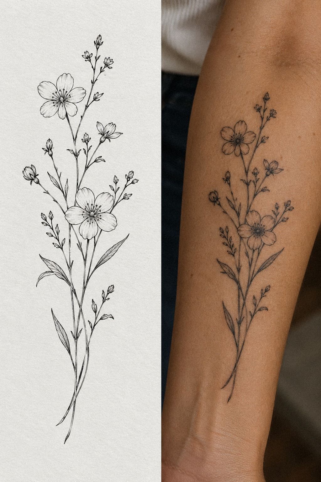
Vintage botanical references bring an iconic, almost archival quality to a sleeve. Sage green, warm cream, and natural-wood brown accents can give the design a timeless, storybook character. Keep the distinctive leaf shape, petal arrangement, or seed head, but simplify the tiny marks.
I call this the Archive-to-Skin Edit. Start with an old botanical illustration, then remove details that won’t survive tattooing. Your artist can preserve the mood without copying every printed line.
Sepia-inspired grey shading can suggest an antique reference, although I’d avoid muddy brown unless your artist has strong healed color work. Crisp black outlines keep the sleeve polished. A small vintage label, date, or frame may work, but it shouldn’t overpower the flowers.
Why settle for a copied antique plate when your own story can shape the design? Choose a plant connected to a place, a book, or a person you remember. That personal detail will make the reference feel meaningful instead of merely decorative.
If you’re still collecting references, look through floral tattoo symbolism ideas. Your artist can combine a classic flower with a modern placement and a more minimal scale. That contrast feels timeless, but it still belongs to you.
11Lunar Intervals: Floral Sleeves With Moon Phases

Moon phases can give a floral sleeve a sacred, ethereal feeling without turning it into a crowded celestial collage. Terracotta, stone, and olive accents can connect the lunar symbols to the botanical forms in a restrained, memorable way.
A Practical Budget for Your Appointment
Your appointment budget should account for consultation time, drawing revisions, the session itself, and possible touch-ups. A low quote isn’t always the best value if the artist lacks healed botanical work. Ask what the estimate includes before you place a deposit.
An artist’s hourly rate may matter less than their precision and pacing. A slower artist can create a cleaner result, while a faster session isn’t automatically a better deal. Compare portfolios, policies, and healed outcomes before judging the cost.
For another scale reference, browse small floral sleeve tattoos. You’ll get a clearer sense of how line density, placement, and appointment length affect the final total.
Why Delicate Floral Sleeves Still Feel Personal
I’ve changed my mind about delicate tattoos. I used to think a meaningful design needed a large symbol, heavy shading, or an obvious story.
Then I saw a small wildflower sleeve with uneven stems and one nearly hidden bloom. It was understated, but the owner knew exactly why every part was there.
That’s the appeal of this style in 2026. People want tattoos that can carry memory without announcing it.
A personal botanical reference might honor a birth month, a difficult season, a friendship, or simply the flower you noticed outside your childhood home. You don’t need a dramatic explanation for the design to matter.
The practical side matters, too. Fine lines can widen, colors can soften, and areas exposed to UV need protection.
I’d rather see a crisp, well-spaced tattoo age naturally than a packed sleeve that looks impressive for one photograph. Your artist should show healed work, explain line weight, and tell you when your idea needs editing.
And don’t choose a placement only because it looks good on someone else. The forearm, upper arm, thigh, and shoulder are often more tolerable than the ribs, feet, hands, or sternum, but your own pain response will be personal. A thoughtful placement plan protects both the design and your experience.
If you’re weighing styles, start with delicate floral sleeve tattoo inspiration, then narrow your references to three clear directions. Your final sleeve should feel intricate but readable, symbolic but not forced, and timeless enough that you’ll still recognize yourself in it years from now.
The Questions I Get Asked Most
How much does a delicate floral sleeve tattoo usually cost?
A delicate floral sleeve tattoo often falls somewhere around $100 to $300 for a smaller piece, while a boutique may set a $50 to $100 minimum and established artists may charge about $100 to $250 hourly. Your artist, region, placement, size, and detail will change the total. I’d request a written estimate.
Are delicate floral sleeve tattoos a good idea for a first tattoo?
Yes, they can be a good first tattoo if you choose a manageable placement and an artist with healed fine-line work. An outer forearm or shoulder is often more tolerable than ribs, feet, hands, or sternum. I’d still plan carefully for healing, sun care, and the time commitment.
How do I choose a tattoo artist for delicate floral sleeve tattoos?
Review a portfolio with clean healed linework, healed photos, and botanical examples similar to your idea. I’d choose an artist who explains placement, hygiene, line weight, and aftercare clearly. Look for consistent work, not one impressive photograph.
The consultation should feel detailed, calm, and personal.
How much do delicate floral sleeve tattoos hurt?
Pain varies by person and placement. The forearm, thigh, and shoulder are often more tolerable, while ribs, feet, hands, and sternum can feel sharper.
I’d tell the artist when you need a pause. Your comfort matters, and pushing through silently won’t improve the result.
How long do delicate floral sleeve tattoos take to heal?
The surface usually heals in about two to three weeks, while complete healing can take about two to three months. I’d follow the artist’s instructions, wash gently, moisturize as directed, and avoid direct sun and swimming during the early healing period.
What’s the best placement for delicate floral sleeve tattoos?
The forearm offers strong visibility and a relatively steady canvas, while the shoulder gives a softer, more flowing silhouette. I’d consider sun exposure, work requirements, pain, and how the flowers wrap when your arm bends. Placement should serve both the design and your daily life.
Where I’d Start First
If I had to pick one, I’d start with the small delicate floral sleeve with fine linework. Its open spacing keeps each flower readable, and the forearm placement makes the design easy to live with.
Pin it for later, then bring your artist three references and one personal meaning. Worth keeping!